Pages

Total Pageviews

Showing posts with label GIS. Show all posts

Wednesday, 11 May 2016

When Spatial Join saved my time....


* Due to confidentiality, the names of the organizations and what the data was representing are not revealed.

*This content has been modified to accommodate new content for Intersect tool and better clarity for the procedure of Spatial Join
Recently, one of my senior colleague requested my GIS expertise to produce new insights on mutiple Excel spreadsheets. Basically, I was provided with:

  1. MapInfo tab (which was converted to shapefile subsequently) file of a linear route (polyline). It had two rows of data - File A
  2. MapInfo tab file of a polygon of the route with the segments (90+ rows) - File B
  3. Excel spreadsheets over the years of condition data based on hundreds of points.
My first assignment with the project was to identify the need of adding a new asset or not on 90+ segments of this linear route. This was done through visual assessment of Street View. Since I am predominatly trained in the ESRI world, all the spatial data was converted into shapefile using QGIS Translating tools ('Save as' the MapInfo Tab as shapefile)

Intersect


Problem


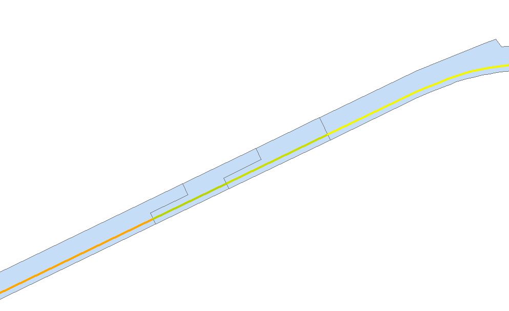
The second part of the project was to calculate the distance of each segment of the polygon route (File B). It is clear that the automatic way of calculating distance for a polygon is not possible. Calculate Geometry tool only calculates perimeter or area of the the segment. However, we have File A where it is a polyline (where Calculate Geometry is able to compute distances).

File A (polyline) highlighted in blue and File B (polygon) lying below the polyline.

Solution

  1. For this case, File A has two rows. I remove the shorter row as I need to calculate the maximum distance of each segment. Choose Edit mode and highlight the segment to be delete. Press the Delete ('X' sign)
  2. Ensure the polygon file (File B) has valid geometry. If the polygon has 94 rows, each segment must be touching at each other and not overlapping or having gaps. For a successful Intersect to occur, geometry must be validated and errors must be rectified. I opted to use QGIS for geometry validation as it has easier to understand validation tool (Topology checker)
  3. We have reached the most important part, how can I bring the 94 segments of polygon (File B) across to the single row of poyline (File A). We have two options here to consider : Union and Intersect. An output of union would create a polyline file of the File A and the perimeter of File B (see below) 
    Union of File A (polyline) and File B (polygon)
  4. Clearly from the above image, the Union does not produce the desired results. Let's look at the option called Intersect.
  5. Under Geoprocessing, choose Intersect and populate the dialog box as shown below. Input the two features (File A and File B) in the dialog box
    Intersect Tool
  6. Choose the output as line and let's bring all the attributes of the polygon to the polyline. Output as below.
    Intersect output
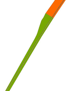
  7. To verify the Intersect went well, do two checks on the dataset. Firstly, is the number of rows of the new polyline (File C) the same as the number of rows in polygon? This can be done viewing through the Attribute Table of the new polyline. Secondly, do a visual check. Overlay the new polyline with polygon of File B.Does it visually match? Refer to image below:
    Visual check. Is there any suspicions on the green line? Use the Information Tool to check the IDs

Spatial Join


Problem

However, the important part of this short blog post is about the third part. My consultant has an Excel spreadsheet of hundreds of points carrying condition and X and Y coordinates. He wants to know the relationship between points and File B (polygon segment). In short, he wants an updated Excel spreadsheet showing the condition points and the road segment it is attached to.

There are two ways to do this : manual visual check or a Spatial Join


Solution


Part A
  1. Each Excel spreadsheet had approximately hundreds of coordinate points with the condition data. To display them, the file was saved as a .csv file and brought into ArcMap. 
  2. Subsequently, I chose display XY data (ignore the part you need to convert into layer) to visualize the hundreds of points on ArcMap. Please nominate the correct projection.
  3. To proceed to the next stage, the csv output has been converted to point based shapefile.
  4. Overlaying the condition data (point based) and File B (polygon file), you will see the results as below:

Demonstration of hundreds of points being overlayed over polygon.

Part B

Here is a situation where spatially, the Excel output and File B are located on the same place but from an attribute perspective, they have no relationship. My consultant wants to see the relationship of segments of File B and points. As mentioned before, there are two ways : Manual or Spatial Join.

The manual process is guessing the locations of points using ArcMap and populating them according to Excel. This is very tedious process. I am pretty sure that I wasn't consulted for tedious method, but for a GIS automatic process.

I contacted ESRI for assistance as I want to avoid the manual method. They recommended the Spatial Join.
  1. Overlay the condition point data over File B.
  2. Please ensure the polygons of File B do not overlap or have invalid geometry.
  3. Go to ArcToolbox > Overlay>Spatial Join.
  4. In the dialog box, please pay attention to important details as shown below.
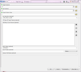
    Spatial Join Tool

    1) Identify who is the Target feature - this is where the information (from adjoining file) will be carried across.
    2) Match Option - Since the join is done purely on spatial location basis, we do need to clarify the join is based on a particular premise. For this instance, points must wholly enclosed by segment - Completely Within.
  5. In this case, we want to know the segment ID for each point. The Target Feature will be the points and the Join Feature is file B. Though optional for Field Map section, it is important to nominate the fields to be carried across to the output. The segment ID should be carried over.
  6. Press Ok and the output (File D) comes out.
  7. Overlay File D over File B. Perform a visual check. Change the symbology of File D and File B to reflect the distinctions of Segment ID. Refer to Image below.
    Spatial Join Output 
  8. Does the output make sense? Do check the points at the boundaries of the polygon segment.

Essentially, I was attaching the segment ID with thousands of points. As my consultant wants two Excel Outputs per year, this Spatial Join did a wonderful job in delivering desired result.

Once the new shapefile is produced, I pushed out the attribute information into Excel. Subsequently, I replicated the same procedures for all other Excel spreadsheet. I do recommend that everyone who opt this method should verify the results after the join is performed.

Below here is a video on how to do Spatial Join:


If you want to seek further clarification, please drop me a message below here or at the contact me page.

Wednesday, 27 May 2015

QGIS Sample Atlas

Recently, I have been pushing myself to test my capability in generating high quality cartographic works in QGIS. Since I took on a mini project on Malaysian state of Kedah, this atlas was truly a combination of open source data and open source software.

For data in Malaysia, I manage to obtain through third party sources for district, subdistrict and voting locality boundaries. In Malaysia, these sorts of data are super hard to find (generally all forms of datasets for large scale maps of Malaysia are not for free). The roads, railways, rivers and land use data was sourced from Open Street Map (I recommend http://extract.bbbike.org/). Avoid choosing QGIS tool for Open Street Map as you get good coverage of the dataset with minimal attributes (making them redundant). The terrain is not exactly open source as it came from ASTER GDEM and hence, it restricts anyone to produce commercial maps.

The software I used was QGIS. In order to produce 200+ page atlas (based on sub district levels), I used Print Composer. It is the equivalent of Data Driven Pages in ArcGIS. I have made full use multi map concept where I can pinpoint the reader where they are (the inset maps). The legend size remains difficult thing to adjust (now I realized there is legend customization through filter) as it dominates a significant chunk of the map. The scale is tricky part and I resorted to numeric figure as QGIS hasn't improved on the variable scale legend. Now, I also realized there are better options to choose from for the North Arrows.

How about the map itself? I used pretty much standard colour schemes for every dataset for the atlas. Hillshading worked out very well  for the Bandar Padang Mat Sirat and Bandar Yan (impressed with QGIS capability). Choosing the colour of roads required much judgment as the terrain colouring exerted its influence significantly. The text visibility has been controlled after much playing around and deliberation. The original dataset of roads showed many road segmentation, Using the blending option, I was able to show a full continuity for the highways.A lot of judgement was used to determine how many layers are relevant to the atlas and which ones need to be kicked out.

Below here are some examples of urban, semi-urban and rural settings of Kedah (viewed through maps). When the final product came out, I was impressed with QGIS capability. For more maps, please contact me here.


Sunday, 24 May 2015

DMS QGIS Forum

Speaker from Responsible Gambling Foundation (Victoria) on how QGIS is applied
for assessing the proximity of pokies (gambling areas) and gamble help centres
On 14th May 2015, in the beautiful Crown Towers site, Digital Mapping Solutions (DMS) hosted a well-attended QGIS Forum. They brought city councils, companies and freelance cartographers together to listen about the progress in QGIS and its application in real scenarios. DMS is the forefront in advocating QGIS to many of its clients, active participant in QGIS development and conduct many training of QGIS. For those who don't know, QGIS (formerly Quantum GIS) is an open source GIS and increasingly adopted globally.

Despite being hosted in expensive Crown Towers (next to the Casino), DMS surprisingly hosted the morning session about QGIS with sumptuous breakfast for FREE! They are generous indeed especially the heavy breakfast! For this discussion, I will point out specific things you need to know about QGIS (which was discussed in the forum).

  1. How can I submit an issue or feature request for QGIS? Proceed to the website here
  2. How can I retain the layer file in QGIS? The .qlr file is the equivalent of ArcGIS layer file . Refer here
  3. Group layers in QGIS. Refer to this YouTube link
  4. You can import a CSV file containing a particular font setting which allows QGIS to customize the labeling based on the imported CSV.
  5. How can I produce a map where the main focus stands out as a figure? Use Mask and watch this YouTube link :                                   
  6. In the print composer, you can add the raster image as background and use blending tool to adjust the visibility strength of raster image
  7. How can I customize a legend that is only relevant to the map content? I would like to have the legend to show the layers visible on the map. Use the filter (in Legend). Refer here (Go to Legend Items)
  8. Presets can control the number of map layers viewable and it is useful for the multimap concept in print composer. Refer here
  9. QGIS is not just for desktop maps, it is also for publishing web based maps. Use qgis2leaf and read here for more details.
  10. In the forum, we have seen the demonstration of city councils of utilizing custom forms in QGIS. Refer here on how to create QGIS custom forms
From the presentations, I have noted city council organizations have been slowly dropping off the commercial GIS software in favour of QGIS. This is because the councils would like to lower the software maintenance cost and cheaper GIS distribution within the organizations, However, before embarking such transitions, each organization must undergo fundamental training in QGIS. 

I hope you find the 10 tips above allow you to explore more in depth the power of QGIS in various aspects.


Thursday, 30 April 2015

Map is Power

The map above converts complex statistical information to
chunks of  relevant knowledge pieces
This is part of my submission to International Map Industry Association (IMIA) blog
Like many cartographers, I am always fascinated with maps. I could be staring at any floating globe or spending quality time with my atlases. Maps has been one of the best graphical tools to convey knowledge. Knowledge is Power. Hence, Map is Power too!
Through my personal globe and many atlases, I came to know the vastness and complexities of the world. Maps simplify the complexity of world into chunks of knowledge relevant for the audience. For example, atlases have many thematic maps which shows the interrelationships of nature and mankind. A thematic map reduces multiple relationships to a simpler one where you and I can understand the world. Since the dawn of mankind, maps has served to further progress of humanity. From finding food to 3D modelling of disasters, maps have informed us what to do. Hence, Map is Power!
Like what other blog contributors mentioned, most of the map history is dictated by the professional surveyors and cartographers. Vast majority of the populace lives by and accept the standards and shapes determined by map-makers. Hence, the power of maps and the knowledge conveyed to the world is predetermined. With the advent of technologies and global geographical volunteers, the centre of power has shifted away from the map-makers. Today, non-cartographers(or surveyors/GISers) are the forefront in providing the new geographical information and most importantly, new maps.
I captured a lot of free geographic information for many years but there wasn’t a platform for me to make it publicly available. Then, I stumbled upon the OpenStreetMap and it was Power in action. As I am from Malaysia, freely available datasets (we take granted this in developed world) is very hard to be obtained. OpenStreetMap provided me and other geographic volunteers to break down the mammoth dataset barrier in front of us. Before Google Maps showed all the bus stops locations of my home state, I filled up the bus stops and route paths on Open Street Maps. Other users also chipped in by updating the attributes. It is clear example how new technologies are bringing power of maps to a bigger audience. Maps impact people and people impact maps.
With the advent open source datasets and open source technologies, maps are empowering more people than ever. Civil society and individuals are creating maps more than ever in history of mankind and interpreting the world in their unique ways. Barriers are coming down and map mashups are everywhere. Geographical analysis is advancing further and giving new insights to businesses and governments. We know exactly where to put our store or next school. We can visualize predictions using time-lapse features of various GIS software. Don’t you feel map is so empowering? Map is Power.
In conclusion, in our current lifetime, we have seen how maps have empowered us. More importantly, we, both the consumers and producers, have been empowered to shape the maps. Maps will continue to evolve (from drawings on ground to virtual reality) but always to stick to its main purpose. Conveying knowledge in a simplified manner and giving us the power to act. Map is Power!
Danesh Prakash Chacko, volunteer/pro-bono GIS consultant in Melbourne (Australia)

Saturday, 18 April 2015

Creating an 'Atlas' using ArcGIS and QGIS

Usually when I produce maps, I produce a single map based on single theme. However, back in my uni days and work training, I have learnt an important cartographic component in ArcGIS and QGIS.

A sample Local Government Area map of New South
Wales built on ArcGIS
It was about building an 'Atlas' in GIS. Multiple maps stored in one PDF and ready for print. This knowledge was put to the test when one of my Account Manager said he wants a map of all his clients (October 2014). His clients are spread over one state and he had a list of them in Excel. Good thing was they were Local Governments only.

In April 2015, another Account Manager approached me and asked me to produce a map of local governments and water authorities in New South Wales. You may think why do we need an Atlas style product for these two instances?

In this discussion, I will be discussing the challenges behind making these two 'atlases' and some comparisons between QGIS and ArcGIS.

Challenges/Issues to Consider 

  • Data - In Australia, they have free data for Local Government Areas. However, the free data they had for the road network and localities are nearly 10 years old (Sourced from Geoscience Australia).
  • Intended Audience - Account Managers use these maps as rough guides where their clients and prospective ones are found. Sometimes they may use for rough planning when they traveling around to see multiple clients. Hence, just showing the local government areas (LGAs) is not enough. I cannot expect my audience to know every LGA by name and location. Due to that, I incorporated roads and localities to give good geographical insight
  • Level of Information Displayed - This becomes an issue on how many towns and cities the map should contain. If you refer to the first figure above, I classified the localities strictly to towns and cities. My Account Managers doesn't need to know every town or populated area in LGA. They need to know LGA name, the main town (s) and some roads connecting between towns.
  • Scale - The most difficult issue I faced. New South Wales has over hundred LGAs of varying size and it is impossible to have clean map with all names of LGA. That is why the concept of mapbook was used in these two instances. ArcGIS and QGIS uses one shapefile to break down the mapbook into regions. I used Tourist Regions to divide the various states in Australia to produce multiple maps. However, in the context of New South Wales, I felt Tourist Region is very general division. I chose Statistical regional divisions to show more zoomed-in views of Sydney area. Sydney has many smaller size (only area we talking about) LGAs. 
  • Text Layout - Text is necessary evil. I have ZERO intention of using any other graphic software to beautify the map. I am producing the map on the go and would like to deliver fast to my Account Managers. I fully capitalized Maplex Label Engine (in ArcGIS) to position text at best. 
  • Software - I have used mapbook approach twice (in real life situation) so far in my cartographic career. The first instance, I was motivated to use QGIS to produce mapbooks for many states. The second instance, I used ArcGIS as I have not used Data-Driven pages before.Both instances they were learning curves for me.

ArcGIS/QGIS

I was very much grounded to ArcGIS (the only GIS software I knew at university). I came to know QGIS through my current work and learned further through QGIS training. Some opinions:
  • In both GIS software, the final layout and content to be displayed are nearly the same. You can change the paper size, adjust the legends and placing inset maps in ArcGIS and QGIS
  • From my experience, time consumed from the collecting data to final output are nearly the same for both software.
  • However, the KEY difference between ArcGIS and QGIS I have noticed is the cartographic presentation. In ArcGIS, they have more in-built colour schemes than QGIS. Hence, I spend less time in determining on one of the fundamentals of maps. In text labeling, I was pleased both in performance by ArcGIS and QGIS
If you ask my stance, I tilt to ArcGIS due to my longer exposure comparatively to QGIS. However, the essence of this blog post is not about which software is better than other. In these two instances which used two different software, it is principles of mapping that played a big factor:
  • Who is my Audience?
  • How much information my Audience needs to see?
  • Is the datasets needed for the map readily available?
  • What scale level should I utilize? Should it be fixed or dynamic
  • What is the best position for the labels
  • Is the overall map layout conveys the right information the Audience needs to know?
Resources I used for building the map books using QGIS and ArcGIS

Atlas Generation in QGIS  and map book in ArcGIS: 


Thursday, 21 August 2014

IMIA Asia Pacific Conference: Part 2b

Cloud

New South Wales Trade & Investment - the agency who advice geological and mining matters to government, corporations and mining sectors - want to develop a tool for the public to know the mining activity of the state. They approached Spatial Vision, one of the leading GIS companies in Melbourne to develop a Cloud Based application called Common Ground to convey mining information. Previously, the information of mining was largely confined to industry professionals market. Common Ground is making the mining information widely accessible and built on authoritative datasets. It would be map based using CartoDB. Below here is workflow process (the product is not complete yet)

Full Credits: Hiroki Gota (Spatial Vision) 2014

GIS in Public Transportation

Translink Queensland Works
 Disclaimer: This part of the article remains under construction                                   
Next presentation was focusing on how GIS assist state subsidized public transportation for their students. The presenter has his own consultancy firm, Jan Simpson Consulting. He was contracted some time ago to work with Translink Queensland. This state organization manages all public transport systems (i.e. buses, trains, ferries) for the whole state of Queensland. One of the key programs organized by Translink is Student Travel Assistance Scheme (STAS). 

STAS provides subsidized transport to school children. It costs the state approximately $150-160 million annually to fund this program. It serves 2321 state schools or 500 000 students across the state. In order to qualify for STAS program, a student must:
Primary school : He or she must be more than or equal to 3.2km from the nearest state school to his or her residence
Secondary school : He  or she must be more than or equal to 4.8 km from the nearest state school to his or her residence

Hence, his project would revolve around GIS (as it is geographical problem) and he needs to develop a system for a non-technical audience to operate it in a fast manner. IT involved a big collaboration work between the government, public and developers

One of the main criteria for STAS eligibility is the shortest distance. For this instance, shortest distance refers the shortest trafficable route from student residence to the school access point. Restrictions were added into the GIS program where private roads (e.g. gated communities), four wheel drive tracks, non- constructed roads, one way roads, ferries and busways were excluded in the calculations. The system will calculate nearest school to student residence and takes into account of all restrictions incorporated in GIS. The results are stored in the GIS and DBMS. The challenge was to compute shortest distance between 2.4 million address points and schools. This resulted 20 million calculations and if were to be done continuously, it would have consumed 22 days of work (non-stop)

Over time, he devised three level classifications for STAS program: Are you in the STAS area (based on distance criterion), are you out of STAS area or in the marginal area? This helps the STAS staff to deduce whether potential students are eligible for the program quickly.

He integrated his system with Global GBM for Software-as-a-Service (SAAS) and developed in tandem with GBM a web-based interface for the STAS staff.

Wednesday, 20 August 2014

IMIA Asia Pacific Conference: Part 2a

Power of Location

Conference information
The whole conference revolved around the theme: Power of Location. Majority of the speakers presenting the conference came from Australia with handful came from India, New Zealand and United States (representing IMIA Global and Americas). To kickstart the presentation, the Chief of Staff of USGS (National Geospatial Technical Operations Center) updated the delegates on latest activities of USGS.

United States Geological Survey (USGS)


Chief of Staff of USGS Topo presents USGS works
The signature  USGS product is the 7 1/2 min topographic maps. Every American user associates these maps with USGS. USGS very much remain in the business of producing these maps. In this digital age, USGS topographic maps have went electronic and are available for free for download and able to integrate with GPS devices easily. USGS produced 70-80 maps every day and in future, there will be push for users to build their own custom maps using USGS datasets on the website. In an era of constraint funding, USGS collaborated with federal, state and local government agencies to leverage funding to access new datasets. 

USGS is home to Centre of Excellence for Geospatial Information Science which works with universities and conducts significant research on mapping elements. It is also the manager of National Atlas, the online atlas of United States.A recent study shown that areas such as flood risk, agriculture precision, geologic resource assessment, hazard mitigation and infrastructure management are top beneficiaries of USGS data. 

Since 1994, USGS has started to incorporate Volunteered Geographic Information (VGI) as part of dataset update. The VGI program was suspended on and off basis until 2010, where a full scale revival on VGI matter was initiated. USGS do award its VGI collectors with historical survey instruments as recognition of significant contributions. To ensure dataset accuracy, USGS  has a validation program to monitor the quality of VGI.

In terms of funding, the current funding is half of 1990 levels. USGS is able to do much of its operations with technological efficiency. Concept do more with less prevails. However, funding sequestration of 2013has put hold on LIDAR program to improve elevation dataset quality.

Geospatial Overworld


HERE Representative speaking on Overworld

The second Presentation was the race for the Geospatial Overworld and presented by Nokia HERE Business Development Chief. Firstly, we need to define what is Overworld. It is a term comes from computer games environment. It is top down visual perspective of the fictional environment within the game that precisely maps and describe its geospatial construction. This includes levels, terrain, boundaries, buildings, foliage, recruits, characters and associated interactions. Now, let's define Geospatial Overworld or Spatial Data Infrastructure (SDI). It presents a precise virtual representation of our real world, hopefully would be complete in 3D format and the information is updated in real time.

The foundation of SDI is built on high quality maps produced by geospatial professionals. The biggest investors ins SDI are ESRI (ArcGIS Online), Google (Google Map Engine) and Nokia (HERE). It is estimated USD 1 BILLION is invested to build the HERE Platform (Geospatial Overworld). The main buyers of Overworld data (not in order) are:

  1. Utilities
  2. Transport & Logistics
  3. Education
  4. Public Safety
  5. Natural Resources
  6. Health
  7. Financial Services
  8. Government
  9. Defense
  10. Property
  11. Media
Now focusing HERE Platform (SDI), the presenter focused on data cloud infrastructure where the Overworld is running on. It is built on multiple data centres across the world with highly scalable technologies. Next, we need to understand the building blocks of SDI Model:
  • Index: Capture a reference index of the real world
  • Platform: Essential for location services. Computing the right answer on the fly anywhere
  • Experience: Rich, interactive consumer experience for driving, mobility and enterprise.
SDI is delivered through Application Program Interface (API) and Software Development Kits (SDKs). One of the goals of SDI is hosting 3D Models on its platform. HERE, like Google, embarked huge street camera data capturing mission with a difference. They use LIDAR to capture the structure of every feature with high accuracy.

In today's world, it is fact the transition from 2D to 3D and vice versa is not seamless. However, in future, maps would fuse analytics and interactivity. Data would be fully visualized in 3D format with spatial attributes and integrating with user expectation. To bring a step further, internal building plans would be digitized and loaded into SDI. We are seeing this in various overworld platforms where user can zoom to airport, commercial centre or university to building layout and attributes.

Sunday, 17 August 2014

IMIA Asia Pacific Conference: Part 1

Map Hack Day


This is my third time attending the International Map Industry Association (IMIA) conference since 2010. Those who have been following the blog  would have noted I have written about the conference a year ago. The conference experience is getting better each time.

As an associate member of IMIA, I decided to attend the Strategic Planning Meeting of IMIA on 16th August. Here I got the chance to witness a comprehensive plan to extend the reach of IMIA in the Asia Pacific Region and increase member benefits. It was a short two hour session to cover many matters.

On 17th August, IMIA Conference officially opened up with MapHack Day - first of its kind for this conference. The aim of this session is to get students and professionals to utilize open source data and non-mainstream GIS (free one) to produce a story map. Roughly 30 people rocked up on early Sunday morning (10.00 a.m.) for the whole day session. It was hosted and coordinated by one of the leading GIS companies in Melbourne - Spatial Vision. From 10.00 a.m. to 11.00 a.m., we had briefing by Spatial Vision staff on how to use CartoDB (non-mainstream online GIS) and where to source free GIS datasets.

After splitting into groups, my group brainstorm the topic, sourced datasets and restructure the excel data. The youtube video above explains my group's project and the workflow from conception to completion.

Lessons:

  1. Being Flexible: Our group had intention to focus on creating two layers - one showing ethnicity and one showing linguistic distribution. However, we realized it can distract the user from the core of the map. We adjusted our goals to ensure we can finish the project within time frame. 
  2. Being Structured: Our key strength in our group is splitting in two groups. Two of us focused on GIS datasets and other two focused on Excel data of attributes. By splitting right from start, our workload was smoothly spread out and we progressed quickly. Me and my team mate also learned QGIS in the process to deliver the datasets in neat format. In Excel data, the whole team eventually got involved one way or another as number crunching got complicated
In other aspects, all of us successfully pooled our skills together to make the product successful: IT skills, Excel formulas, QGIS expertise and coordination skills. Map Hack Day was successful:
  1. Coordinated by successful Spatial Vision team who are familiar with CartoDB 
  2. Great platform for students to network and work with potential employers
  3. Build relationship between disparate conference delegates
  4. Opportunity to practice your presentation and marketing skills.

Sunday, 25 May 2014

Mapping? What is that?

Courtesy of Maps of the World.com

A common question I receive: "What do you do" or back in my university days, "What do you study?"
When I reply "Mapping", question mark appears in everyone's head. "What's that?" My standard response to these questions is Google Maps, GPS etc. However, is mapping all about that? Today, I will discuss a general idea of mapping, the profession and why it is so important nowadays to know this field.

Mapping, first of all, is a generic term I use for people to understand. The official term the map-makers use are Spatial Science, Geospatial Science, Cartography, Surveying, Remote Sensing, Geoinformatics etc. In an essence, mapping is all about representing and modelling the Earth. It could be in 2D (flat maps), 3D (Google Earth) or 4D (with time lapse). In order to receive the final product (the map), all of us must know and appreciate 3 steps involved in a map production:
  1. Collection of map (spatial) data. It could be done through field surveys, satellite images, computer databases, high quality photos from aeroplanes or other sources.
  2. Analysis of spatial data. This includes making sure the coordinate system is correct, 3D modelling, applying geographical analysis (e.g. what is the closest shop to my place)
  3. Presenting of spatial data. This process where cartography (marriage of art and science) truly comes into light. The maps must be meet its own purpose (e.g. environmental map), reader friendly and ensures the user focus on the map message (purpose)
One may perceive all the time maps 100% but they are never correct. The changing world, errors in data collection or in analysis and mistakes in cartography all dither the accuracy of maps. We, the map-makers, must make sure the maps serve its purpose to user and that influence level of accuracy we display on maps.

How do you call a map-maker in the right term? There are heaps of official terms: Spatial Scientist, GIS Technician, Cartographer, Surveyor, Image Analyst etc. We are an unique clique and throughout history, our percentage of the workforce population is more or less the same (very small). We make so much impact in our daily lives yet we are unknown to the world since dawn of humanity. The most we could relate to environmental scientists, geographers, architects, IT groups and civil engineers.

However, the world is changing as technology is pushing the mapping concepts beyond our professional scopes. This leads to my final point - why it is important for you to know us and our concepts:
  1. If you are in government, the government of any day dictates what is placed in the maps, standards and licences of them. At the same time, using advanced geographical analysis, maps power government in service delivery in good and bad times. If you watch disaster movies, you can see how emergency departments pull up maps or display 3D models on the fly to make decisions
  2. If you are in business, location intelligence is so critical nowadays to understand your customers. You make the decision (based on maps) where to put next fertiliser for your winery, to determine a new store location, to close down a bank branch and many more decisions. Businesses working with government clients develop new technologies with mapping applications to help service delivery
  3. If you are in NGO or a citizen, knowing how to use mapping tools is absolutely useful keeping checks and balances on governments and businesses. Maps could be used to track the movements of endangered species, the impact of new highway on properties around, to check on gerrymandering or mapping out corruption abuses.
While maps has its own controversies, I personally believe everyone should learn how to use some map tools (beyond Google Maps or GPS) so that you will truly understand on how we relate to each other and the natural world. That is the final objective and purpose of the map: Understanding the relationship between entities that make up the world and how each affect another.

Happy Mapping!

Sunday, 20 April 2014

Story of Mauritius

Final Product: Terrain of the Site
Few days ago, a friend of mine called me, "Danesh, can I get a map of my area - middle of Mauritius?" I said yes without asking much detail. Then, he messaged me, could you focus on Plaines Wilhems (state in Mauritius). With this little detail, I hastily pulled out the datasets required for Mauritius. After all, the concept of producing the map is the same but when it comes datasets, it becomes trickier.

For the terrain data, I relied upon ASTER GDEM. When it came to the roads, boundaries, rivers and lakes, I pulled out from DIVA GIS. You would notice how generalized these datasets (DIVA GIS) look in comparison to the terrain data. This map you see above is 1:100 000 and DIVA GIS datasets weren't exactly the best for the scale context.

One of the challenges I faced was capturing the terrain feeling of this area. This area (Plaines Wilhems) is rising plain area with steep cliffs marking its borders in the west. After much experimenting with the colours, I utilized 10 colour classes to give smooth transition of the terrain (hillshading was pixelated at 1:100 000 scale).

Within 3 hours, the map was completed (with all necessary items added) and emailed to my friend.  He was happy and then he asked me, "Can you do a 3D Model?" From my previous experience, I said yes and thinking in 2 days, a  3D Model would fit his requirement. Turned out, there was problems indeed.

Lessons Learnt:

  1. Do you charge a friend? I am no longer a student and now, I am professional. I am entitled to charge you. That's what you think. Of course, there is nothing wrong except you need to know the restrictions found for the datasets. ASTER GDEM strictly made it clear, you cannot commercialize their datasets. From my understanding, I CANNOT CHARGE a single cent on my friend despite spending 3 hours to make a map. DIVA GIS datasets do not seem to have these restrictions. Can anyone clarify what you mean commercialize in geospatial data context?
  2. Learn to get full details. I am happy to hear that my friend actually researched on when sourcing the terrain data. When he struggled, then he came to me. I should have asked him bit more details of the map project (Does he want 2D or 3D?). In heat of my excitement, I overlooked these information
  3. I do not why ArcScene could not read the elevation heights of the terrain datasets. After all, it has an attribute called value (which is elevation cell). I explored what ArcGIS, QGIS and Google Earth could do representing the 3D Model of the site location. However, I told my friend something is wrong with terrain data and I can't help him on that. Fortunately, he saw the site location was largely flat and the 3D Model would be unnecessary
In short, I was excited to this project but there are couple of lessons learnt when it comes to produce maps for people. I just need someone explain to me why terrain data is not being displayed in 3D format in ArcScene!!

Friday, 14 March 2014

Hiatus in the Blog


Courtesy: http://zenrevolution.files.wordpress.com/2012/07/silence.jpg

Wondering why the silence in my Blog? Yes, I would be taking break at the moment in updating the blog. I have lined two part series articles on Naming issues. So, what I have been up to

Venezuela Atlas Project

Draft of my Venezuelan A1 Size Map
If you scroll in the blog archive, I did mention about my big Venezuelan Map Project (http://daneshatlas.blogspot.com.au/2013/08/creating-a1-size-map-of-venezuela.html). I was assembling the datasets and started working on cleaning and updating them from June to October. Then, I suspended the project for three months for another project (mentioned below). On 1st February 2014, I officially resumed the project. The whole of February was devoted to complete the first round of dataset cleansing of every state in Venezuela (primarily road checking). On 1st March, the BIG MOMENT came! For the first time in my life, I am print out A1 size map (I was imagining the size while going to the print shop). With the draft map, I have begun the scrutiny of the map and scouting every possible error. This month would be devoted to add the cities and their population data across Venezuela. For other months, I haven't planned out the project scope. I hoping to conclude the project tentatively on 30th June 2014. Time is short

Tindak Malaysia Delimitation Project

My proposed Kedah map demonstrated in the Tindak Malaysia Forum
Part of the reason Venezuelan Atlas project was suspended is because I was involved in the Delimitation Project. Refer to http://daneshatlas.blogspot.com.au/2013/09/mapping-and-elections-part-2.html for details. I was involved in the project from July 2013 to February 2014 (where the forum is the culmination of Tindak Malaysia's Delimitation project). This NGO based in Malaysia created a network of volunteers of map-makers (hardly anyone came from cartography/geospatial background). After experimenting different softwares, we made a shift to non-GIS based softwares to speed-up the completion of national election mapping project. This project aims to redistrict the mal-apportioned electoral boundaries in Malaysia fairly. As the pressure grew to finish the project, me, being the lone GIS user was rushing through (in the wee hours of the morning) to complete Kedah map (the state I was allocated with). Two proposed maps were produced, matched the publication specifications and finally submitted in early February. Forum was held on 15-16th February, since then our maps (including mine) would have been viewed or questioned by many people at the forum or outside.

The purpose of these maps is to challenge potential Malaysian Election Commission (EC) Maps. It was rumoured that EC will start the drawing in March (no further updates since then). Meantime, this NGO and other election related in NGOs in Malaysia have been engaging the public to get involved in electoral redelineation project. Tindak Malaysia's approach conducted without on ground voter consultation. However, if EC were to do their maps soon, this NGO's maps could be used by the public to object them.

I am still involved with them and still advising them on GIS matters.

Basically, these two projects made my blog very quiet. So don't panic about the blog being abandoned. I hope I can release new articles towards the end of the month.

Saturday, 8 February 2014

Visualizing Data

In one of my recent projects (back in January), I was working on converting text data of Wifi locations in Penang (Malaysia) to an online map of internet hot spots. Basically, I was visualizing boring wordy and lengthy data to graphically pleasing locator tool.

Refer to: Penang Free Wifi Project
Presentation from Geoplex

Thursday ago, through a friend of mine, I came to know an open event in Melbourne about Visualizing Data. It was hosted by GIS consulting & solutions firm, Geoplex and around 30-40 people (I think) attended for this exciting event. We had four speakers: Geoplex, City of Melbourne, The Age (newspaper) and Flink Labs. The first presentation was visualizing traffic accident data using CartoDB. Geoplex built an interactive web map whereby user can estimate the risk of accident on a specific route (they are travelling on). However, I couldn't understand the workflow from sourcing the information to the final product.

Melbourne Urban Forest Visual

 The second presenter came from City of Melbourne and he was talking about CityLab projects. Basically, CityLab is a physical and virtual space for the council and the community to engage to resolve urban problems. At the same time, there is push in City of Melbourne on the concept of open data (free datasets for public to download and use). While open data enhances transparency and accountability, there is a lot of challenges. For example, datasets relating to utilities comes from energy & telcos companies while dataset of tree & parking location come from the council. However, both datasets cover the same area (i.e. Melbourne). The push of open data would be obstructed as different policies govern about datasets in different institutions (e.g. telcos, council). Second challenge of open data is what and how much to share the datasets. Should we make all the datasets for public view or how much of utilities information can be downloaded free? Anyway, City of Melbourne has collaborative project with its concerned citizens on air quality (Citizen Science in action). For example, citizen scientists armed with air sensor networks feeds on air quality information to city of Melbourne. Yes, the city of Melbourne has its own network of air sensors but with citizen scientists, a lot of gaps in data are filled up. Whether it is related to CityLab or not, City of Melbourne developed online map showing all the trees in the council. Called as Melbourne Urban Forest Visual, users can click any of the trees and get basic information. For the council, it is great planning tool as they can identify which trees need to be removed (if they are dying soon). For users, interestingly, you can email to the tree and state your feelings towards each tree.

Map of Car Thefts incidents per council in greater Melbourne (The Age)
Third presentation was about data journalism and the speaker came from The Age (leading papers in Melbourne). Data journalism essentially is getting the story from datasets and nowadays, data literacy is critical for journalists to back up their stories with evidence. Data Visualization of particular topic (i.e. feelings of people of the day) opens more stories and exploring micro trends in local community. For example, The Age (with collaboration with Trend Maps) created a map of Twitter feelings in greater Melbourne. Interestingly,visualization presented concentration of positive feelings in shopping centres and negative feelings along train lines & stations. Similarly, in 2013, with collaboration with volunteers, The Age created a map of locations of high-risk cycling accidents in Melbourne.

Flink Labs project of visualizing trolley movements in shopping centres

Final presentation came from FlinkLabs. This company focuses heavily on data visualizations. Some of their interesting projects they did were visualizing movement of shopping trolleys in shopping centres (trolleys equipped with RFIDs) and dynamic cartograms of shifting world trademark applications from Japan to China. In the case of trolley movement, this visualization helps store managers to know which aisle is most frequented of and deduce some reasoning of the frequency (likewise for less frequented sections too). Visualization is growing rapidly as it creates 'techie' feel in every project done. However, the problem today a lot of visualization is data poor and lack of substance. This becomes more true with 3D printing as this visualization is not so much of data analytics tool, but for more artistic purposes. The speaker stated (following on what The Age journalist speaking on) data visualization is not the end product and it is tool for pattern analysis and stimulating ideas.

In short, Data visualization is converting long,wordy and boring Excel (and other data formats) into visual pleasing graphics to stimulate our thinking process. Expect more and more of data visualization in the years to come as tools of data visualization is being integrated more and more with our simple tools (i.e. Excel)

Saturday, 16 November 2013

Implementing GIS to tackle local government issue - Part 3

Part 2: http://daneshatlas.blogspot.com.au/2013/11/implementing-gis-to-tackle-local_13.html

Steps Required Making the Product:

     1) All the datasets are compiled and stored in a geodatabase. The metadata and the projections used in these datasets are checked to ensure consistency. Functions needed are data inputs into geodatabases (network, feature datasets)

         2) Since the product (Current Accessibility of City of Yarra) involves various maps, analysis on datasets are done separately to simplify the operations. For example, GIS analyst focusing on clinical accessibility would use datasets on population characteristics, transportation network and clinical locations. The analysis would involve network analyst and geocoding addresss. The GIS analysts may consider imposing index values for accessibility.

     3) Once the maps are done, the GIS analyst(s) should ensure the maps produce meet good quality cartographic standards. These maps initially produced in hardcopy format are submitted to town planning officers to assess the current accessibility.

     4) A web-enabled GIS is created meantime integrating the spatial data used in the project. GIS analyst(s) and/or cartographic technicians will design the website and the necessary characteristics of the online maps. This website is accessed to city council’s intranet. At the same time, list of existing facilities and the total targeted population (income disadvantaged) served are produced in documents (hardcopy formats).

Frequency of Use:
Function
Number
Dataset Input
1
Geocoding addresses
4
Creating Network dataset
2
Population characteristics input
4
Spatial Analysis (Closest Facility)
2
Create ArcGIS reports
1
Cartographic Editing
1
Printing
1
Display in website
1
Updating
4
List/other documents production
16

Product
Annual Production
Maps (Hardcopy)
80
Lists/Documents generated
80
Website
1

Logical Linkages:
Logical Linkages
Examples
List to graphic entity
Street address to community service facilities
Map to map
Topological network of the map overlayed on residential maps
Facility map showing locations to community service facilities
Attribute to attribute
Population characteristics to census collection districts
Type of clinic to clinic locations
  
 Error Tolerances:
Error Type
Error
Tolerance
Referential
Incorrect facility attributes
Incorrect facility names
5%
5%
Topological
Disconnect in street networks
Disconnect in public transportation network
0%
0%
Relative
Incorrect locations of public transport stops (wrong side of street)
+ 5m
Absolute
Incorrect street address

+2.5m

Wait Tolerance: Low (10-60seconds) and Medium (1-5 minutes). These tolerance categories are justified for the products as there are not urgent in production and they have limited dynamics.

Response Tolerance: For hardcopy maps, the time required from start to finish is 8 hours minimum. This has taken into consideration of the GIS officer has 1 year working experience in GIS and the analysis involved in producing the map. If the product was requested for the first time, it will be 16-24 GIS hours work due to datasets cleaning and other associated works. For the website, it will be additional 8 hours minimum, in addition of 2 hours of integration of GIS data into the online system. The updates to the online GIS system roughly consume maximum of 3 hours.

Current Costs:

      1) GIS dataset costs

Datasets
Cost
Address
$756
Administrative Boundaries
$1584
Planning
$223
Property
$893
Transport
$112
Total
$3568

      2)   Labour, other related and Total costs


Hours
Annual Cost for making
Total Costs (AUD)
Labour (hardcopy)
60
$192*(1 product)
$15360
Labour (website)
22
$506
$506
Miscellaneous


$200
Datasets


$3568
Total


~$19700
           *-Excluding website cost. Hourly rate is minimum $23 per hour

Benefit Analysis:

      1) Financial savings category: With implementation of GIS in this strategy, it would eliminate costs required to hire consultants.

      2) Direct benefits to organisation: With GIS, the town planners are able to make informed decisions of providing facilities. They too would be able to estimate appropriate costs involved through the output maps.

c    3) External benefits: The general public will be well served indirectly through GIS implementation. The future facility and affordable housing will be well placed to serve the disadvantage population. The state government is able to access these maps or web-GIS to assess the achievements of city council.

Sign off: The head of SPU will be signing off the IPDs and benefit analysis statements. Finally, every sample hardcopy product must require signature of the head to demonstrate his/her satisfaction of the product.