Pages

Total Pageviews

Showing posts with label Malaysia. Show all posts

Saturday, 9 May 2026

Historical Maps of Petaling Jaya

 Introduction

Continuing on the ongoing work of finding historical maps of Malaysia of the contemporary era, this post will take you on a journey showing maps of Petaling Jaya.

Petaling Jaya was born as a response to the growing urbanisation (and its pain) of Kuala Lumpur. Conceived in the 1950s, it evolved into a major city of Selangor (Kuala Lumpur was separated from Selangor in 1974)


If the map is not accessible due to size, please consider downloading it and viewing the contents.

Highly recommended that you cite the original source should you use it beyond your personal use

Maps of Petaling Jaya from the 1960s

1962/63


1965


Source: University of Wisconsin-Milwaukee Library (https://collections.lib.uwm.edu/digital/collection/agdm/id/2695/rec/1)

Maps of Petaling Jaya from the 1980s

An important aspect appeared in the Petaling Jaya map of this decade - an inset map of the newly formed Subang Jaya township

1980s (A) - Help us to establish the year of this map


1980s (B) - Help us to establish the year of this map
Our guess is pre-1985


Source: Personal Collection of Danesh Prakash Chacko

Saturday, 1 February 2025

Historical Maps of KL from 1957

This blog post hosts and will host historical maps of Kuala Lumpur over the years

The maps embedded in the blog post are a sneak preview of the full-scale map.

1957 Map

For optimum viewing: https://drive.google.com/file/d/1zmiLzOFpzlumVQKWWv-9SVjRynp8xXAX/view?usp=drive_link

Source: University of Wisconsin-Milwaukee Libraries

1965 Map


Source: University of Wisconsin-Milwaukee Libraries

1967 Map (Kuala Lumpur and Petaling Jaya)

For Optimum Viewing: 


Source: The Australian National University (Open Research Repository)

1973 Map


Source: The Australian National University (Open Research Repository)

1982 Map

For optimum viewing: 


Source: University of Wisconsin-Milwaukee Libraries


1993 Map

For accessible viewing:


Recommend to have associated PDF reader for detailed inspection


Source: Private Collection of Danesh Prakash Chacko

2003 Map

For optimum viewing: 


Source: University of Wisconsin-Milwaukee Libraries

Friday, 3 March 2017

Malaysian Electoral Map Series

As Malaysia gears to GE14, we will be looking what are the key factors that are impacting voters' preference for the next elections. Watch this blog space grow with new maps over the coming months.

1) Plantation Scheme Issues


How does a plantation scheme across the country can have so much bearing on the next GE 14? Felda, world renowned program to raise the income of poor rural settlers, has been beset by lower commodity prices, financial mismanagement and questionable purchases.

If you look at the map above, Felda voters are largely located at the marginal seats of the ruling government. Assuming there is one-to-one fight between government and opposition, it only takes 22 seats to change the government of the day. With the introduction of GST in 2015, the effect kicked in on Felda Settlers. A good example was the Rompin By Elections of 2015. Comparing to 2013 and 2015 results of the same seat, ruling government winning margin substantially reduced.

With the fragmentation of the opposition (PR), the possibility of multi corner fight is high. Should that happen, Felda voters will be presented with multiple choices which allows the ruling government win the seat.

2) Challenging Existing Understanding the relation of Electoral Factors


Saturday, 30 April 2016

Mapping Elections - Malaysian Style

Recently, my map mind was reminded that I need to cover a hot topic coming up in Malaysia. On May 7th, Sarawak (the Land of Hornbills) - the biggest state in Malaysia is holding a state wide elections. Unlike other states, Sarawak does not conduct the state and parliamentary elections on the same time.

Credit : Cerevisae (Wikipedia)

Interestingly, the elections in Sarawak is happening amidst two big issues rocking Malaysia:

  1. 1MDB (State Investment Firm) Scandal - global level scandal - which has destabilized the ruling (BN) federal government (of which Sarawak State government is an appendage to ruling powers in Kuala Lumpur). The leadership of Prime Minister Najib Razak has been severely attacked by within his party and the opposition for the financial mismanagement of 1MDB. A solid victory in Sarawak would bolster his position in the party and the government
  2. New test for the reborn but fractious opposition coalition for a state wide election. While it is inconceivable that opposition (previously PR, now PH) will deny the ruling state government 2/3 majority, they made great headway in 2011 elections. However, with the popularity of current Chief Minister of Sarawak and infighting in the opposition, the image presented by opposition by the voters is dented.
This post is not about political analysis but how we can use map visualizations to gauge where the voters preference lay.  Presenting to you:

  1. Sarawak 2016 Election Analysis - Toggle between three map layers to understand correlation of population density, political tendencies, seat fights and effect of 2015 redelineation on the electoral outcome. Designed by Danesh Prakash Chacko  View the Larger Map
  2. Sarawak 2nd Round of Electoral Redelineation (2015) - Switch between layers to see the correlation of ethnicity, voting preferences and impact of redelineation on the electoral outcome. This map was designed when Election Commission was still proposing the 11 new seats and changes to the borders. Designed by Danesh Prakash Chacko View the Larger Map
  3. Sarawak Electoral Redelineation 2011 and 2015  - Slide and swipe the map to see how the electoral boundaries have changed and whether the jarring gap between voters values have been addressed. Designed by Tindak Malaysia View The Map
Credits for the Information needed to build the Map : Tindak Malaysia, Borneo Post. These maps exception of 3rd map do not reflect the views of the data providers Tindak Malaysia and Borneo Post.

Please let me know what other information should I put for the map - we need to see feasibility of adding new information. Enjoy!


Wednesday, 23 September 2015

Vegetation Maps and Stimulated Minds


Recently, I have been inspired by the Human Footprint maps of National Geographic Maps. Human Footprint map of Africa was built on four layers representative human impact on the environment -Africa Human Footprint Map. I wanted to make a map similar to this for Malaysia. Unlike National Geographic Maps continental coverage map of Africa, my area coverage was 300 000 sq km or so (100 times smaller than Africa). Hence, the difficulties in finding data needed for human footprint map of Malaysia increased.

Since Malaysia do not practice open data policy, searching GIS data needed for any map is like going for treasure hunt. Fortunately, I had access to older version Open Street Map road network dataset and DIVA GIS datasets (for the rivers, lakes etc.). The key part of the map is to show the disturbance of tree cover (this may include oil palm, rubber and general forested areas) in Malaysia. I was fortunate to stumble on Global Forest Change where I got the crucial data. Once the dataset were obtained, the remaining part of the map project is purely cartographic work. Using +QGIS , I used layer blending to highlight the density of the road of various areas. I used Print Composer to create multiple maps in one map. The above map is one example of this project.

Once I begin to advertise on social media circles, I see people's mind stimulated:
  1. Why does some areas of Peninsular Malaysia is experiencing higher loss of vegetation? Is it because of the increased oil palm plantation area?
  2. Why does some map has incomplete dataset of the lakes? If you refer to the first map of the post, some of the red areas are water areas? 
  3. Why does the Sea are is coloured green or red? It can confuse people - this has been corrected
  4. People spoke highly about the quality of the map that was produced in +QGIS 
  5. For the maps of Borneo, some raised the Indonesian state borders are not accurate. I countered that  the map focuses on changes to vegetation, not so much of anything else. However, I am willing to hear any free sources of updated boundaries.
  6. A person requested similar maps for Borneo (below are the three maps I supplied him) after seeing it on the social media
  7. These maps are the few maps I made had great social media reach in terms of sharing and liking (be it promoting QGIS or the topic it covered).


Tree Cover of Borneo


Important tips in +QGIS when I was producing the map:

  1. Print Composer (For better looking North arrow, please refer to step 28)
  2. Vector Symbology (For options to feature blending - i.e. road density, refer to Layer rendering)

Ask a map or general mapping enquiry at blog contact form

Friday, 28 August 2015

Interactive Time-Based Animation Map

This Article is work in progress
by Pemanducomm


As the Post heading suggest, I am pleased to inform you that I just launched the Railway History Map of Malaysia. It was built on solid research and powered by ArcGIS Online - Malaysian Railway History

Concept

Two years ago, I designed multiple map platform to understand the nature of the Railway. It contained operational year of the railway, number of tracks and status of operation of the tracks. Refer to Malaysian Railway Portal. However, it lacked one thing - Time capability. I revisited this project and focused to create a map of railway network evolution of Malaysia.

I believe so far no one has built such a map. Why I don't start one? Make a foray into the world of time based animation.

Data

The number one challenge of the project is the data for the operational years for the railway. As railways come and go, I need to know when they first being in operation and when they became disused. I downloaded DIVA GIS for the base railway network layer. I made a policy if there is no operational dates or years for the railway, it will not be shown on the map. DIVA GIS showed a lot of unknown railways which I have no evidence to back them.

On the Attribute part, I scouted heaps of blogs, railway fan sites, Wikipedia and every possible source available online.

Accuracy

I have made every attempt to ensure the highest accuracy of the dataset. Below here is the accuracy level of dataset
  1. Railway Network of Malaya: The opening date and closure date of the network is mixture based on the year and date level accuracy. Upgrading of the railway line to double track from Padang Besar to Gemas has resulted some of the previous tracks becoming disused. No definite year or date is found when the track got disused. Disuse status of Pasir Mas to Rantau Panjang is yet to be found. Subang Jaya to Subang Airport 1980 rail link has no disuse date.
  2. Railway Network of Sarawak: The only evident railway with opening and closing year is around Kuching.The route is drawn based on 1940s army map of Borneo. Railway from Brunei to Miri is not shown due to lack of information
  3. Railway Network of Labuan: The railway track is based on 1800s map of North Borneo. It is meant for general viewing, not determining the absolute alignment of the track
  4. Railway Network of Sabah: The only railway network in Sabah is shown in the map is the passenger based route. Since there insufficient evidence for commercial plantation railways, they are omitted in the map
  5. Railway Network of Sarawak: Significant amount of assumption is required to determine the disuse dates of networks of Bukit Timah to Tanjong Pagar (via Singapore City Centre) and Tanjong Pagar to Pasir Panjang. Various websites and blogs have placed contradictory information on the alignment histories of the networks above. 
Train Station opening date accuracy varies. Most of them have accuracy to year level with few stations with complete date level accuracy.

Sources

Malaya
1.  http://searail.malayanrailways.com/KTM.htm
2.  http://history.malayarailway.com/
3. Wikipedia
4. KTMB Railway Museum in KL Old Station (For verification of Pelabuhan Klang to Pulau Indah Railway
5. MySin Chew (For opening year of Port Weld Station) 

Singapore

1. http://searail.malayanrailways.com/KTM.htm
2. https://www.ura.gov.sg/ms/railcorridor/about/history/1932#subContainer
3. National Library of Australia Online Map Catalogue
4. http://joyloh.com/blog/?p=4715

Sabah, Sarawak and Labuan

1. http://www.lib.utexas.edu/maps/ams/borneo/ (Refer to Kuching for railway alignment)
2. http://catalogue.nla.gov.au/Record/6346822?lookfor=sabah%20{access_type:%22NLA%20digitised%20material%22}%20%23[format:Map]&offset=2&max=6 (For Labuan and Sabah Railway Alignment)
3. http://www.railwaystationlists.co.uk/pdfasia/sabahsarawakandbruneirlys.pdf (Credit to Peter A. Weenink for showing timeline of Labuan railway service)
4. Wikipedia
5. http://searail.malayanrailways.com/Sarawak/Sarawak.htm (For Kuching - Batu 10 Railway Line history
I, Danesh Prakash Chacko, hereby acknowledge completely all the source listed and unlisted below in the publication. Hence, I do not exercise the ownership of the attribute data (the operational years of the railway network and train stations). Should errors and omissions are found, please submit on the blog comments as below.

Monday, 20 July 2015

My Foray into CartoDB

 One of the significant milestones of self learning this year was developing web maps using CartoDB.

My profile for CartoDB (https://daneshchacko.cartodb.com/maps)


I first learned about CartoDB through the Spatial Vision training (during the IMIA AP 2014 Conference). In this blog post, I will explore the ups and downs of using CartoDB for web map visualization

Why CartoDB? Up to 2015, the only online GIS platform I am accustomed with is ArcGIS Online. However, I would like to brush up my skills on new areas such as CartoDB. If you look at my profile above, I have developed around 6 maps for various topics .

If you want to design simple maps without much tweaking, CartoDB is easy tool to deploy web maps. They continuously improve the options for you to have for symbology or labelling. One thing that sets apart CartoDB and ArcGIS Online (from my personal experience) is the customization of the tools available in CartoDB.

If you have good programming and web design knowledge, you can exponentially enhance the experience of CartoDB maps. Let me give you a good example. Refer to this link: Sarawak Electoral Visualization

Example 1: Electoral Visualization

I was exploring myself on how to visualize electoral issues of the delimitation exercise in Malaysia. What started out as my personal hobby project, it evolved into a fully embedded map for my NGO's Homepage (http://www.tindakmalaysia.org/)

Referring to the link (Sarawak Electoral Visualization), basic tools of CartoDB weren't of much help. As I proposed CartoDB map to my NGO, they were happy to take onboard on the idea. However, my NGO has placed some expectations on the contents to be shown. After sourcing the datasets from my NGO, I was tasked to show the interrelationship between electoral seat category, representation value and its correspondence to local boundaries.

While it sounds simple, the basic tools of CartoDB could not meet the criteria of the symbology needed (i.e. the representation value or showing the symbol of administrative boundaries). I spent a significant amount of time to research html codes and examples of CartoDB to bring the source codes needed for the  visualization.

Subsequently, with close collaboration with my NGO, I spent additional time in writing out the correct terms for the legend and other necessities for the map to be understandable. Finally, I embedded the map of my NGO's website and customize the right size for the embedding. The default embedding option of CartoDB would result of compression of items in the layout.

Example 2: Time Based Visualization

Similar to ArcGIS Online, CartoDB has ventured into time based visualization (now with new enhancement). For only point based data, Torque (and Torque with category) allows the CartoDB users to visualize time based changes (which is becoming a big trend in maps). I previously designed on ArcGIS Online (and Mango Map) a static map of all the dam locations in Malaysia. It was built on intense research every possible freely available information back in 2013.

Referring to the link (Malaysian Dams), one of the big challenges I faced initially was the original dataset did not have proper timestamp needed for CartoDB. Preferably, in your shapefile or data file, the timestamp should have proper date or date-time format. I have created this dams dataset two years ago for static map and pop-up purposes.

The second challenge was the cleaning-up of classification. It was found through CartoDB upload there were duplicate classification values (i.e. Dams/Irrigation, Dams / Irrigation). I spent some amount of time in removing the duplicates in QGIS.

Since CartoDB torque visualization works for point based data (for the moment), I chose Torque with category to visualize the construction (opening date) history of 70+ Malaysian Dams and categorized them with the purposes. This allows the user to see where the dams are being constructed and see what types of dams are being related. I customized Torque category to show cumulative changes (as dams are rarely taken down). Choosing a suitable base map was another of challenge of its own as you want your content to be the Figure.

I did spend additional time to produce a understandable symbology for the dam purposes. I will be making further changes to make it more distinguishable. The rest was history. CartoDB Torque tool worked very well and now charting history of dams.

Conclusion

CartoDB has been a great tool with steep learning curve. My advice is before you embark on CartoDB maps, do consider your level of html experience and willingness to spend time, energy and (if necessary) money to develop the map. CartoDB email support is Great! They are swiftly respond to support enquiries.

Tell me your CartoDB experience...

Wednesday, 27 May 2015

QGIS Sample Atlas

Recently, I have been pushing myself to test my capability in generating high quality cartographic works in QGIS. Since I took on a mini project on Malaysian state of Kedah, this atlas was truly a combination of open source data and open source software.

For data in Malaysia, I manage to obtain through third party sources for district, subdistrict and voting locality boundaries. In Malaysia, these sorts of data are super hard to find (generally all forms of datasets for large scale maps of Malaysia are not for free). The roads, railways, rivers and land use data was sourced from Open Street Map (I recommend http://extract.bbbike.org/). Avoid choosing QGIS tool for Open Street Map as you get good coverage of the dataset with minimal attributes (making them redundant). The terrain is not exactly open source as it came from ASTER GDEM and hence, it restricts anyone to produce commercial maps.

The software I used was QGIS. In order to produce 200+ page atlas (based on sub district levels), I used Print Composer. It is the equivalent of Data Driven Pages in ArcGIS. I have made full use multi map concept where I can pinpoint the reader where they are (the inset maps). The legend size remains difficult thing to adjust (now I realized there is legend customization through filter) as it dominates a significant chunk of the map. The scale is tricky part and I resorted to numeric figure as QGIS hasn't improved on the variable scale legend. Now, I also realized there are better options to choose from for the North Arrows.

How about the map itself? I used pretty much standard colour schemes for every dataset for the atlas. Hillshading worked out very well  for the Bandar Padang Mat Sirat and Bandar Yan (impressed with QGIS capability). Choosing the colour of roads required much judgment as the terrain colouring exerted its influence significantly. The text visibility has been controlled after much playing around and deliberation. The original dataset of roads showed many road segmentation, Using the blending option, I was able to show a full continuity for the highways.A lot of judgement was used to determine how many layers are relevant to the atlas and which ones need to be kicked out.

Below here are some examples of urban, semi-urban and rural settings of Kedah (viewed through maps). When the final product came out, I was impressed with QGIS capability. For more maps, please contact me here.


Monday, 15 September 2014

57 Years: Evolution of Atlases in Malaysia

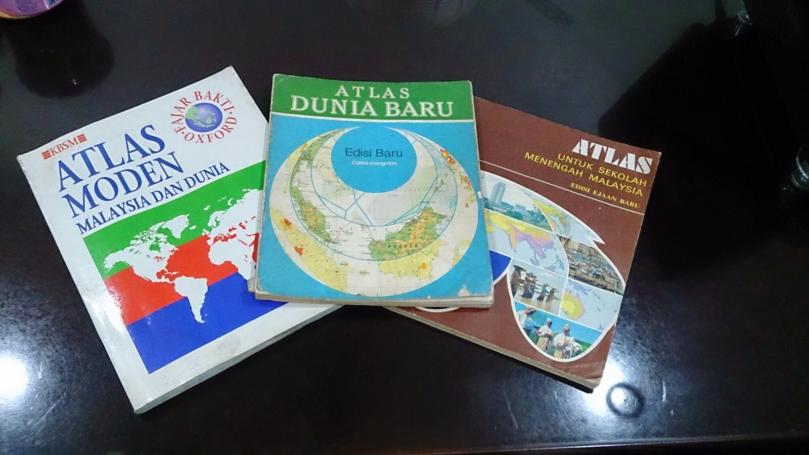
Three Atlases, Three Publishers, Three Time eras


As Malaysia recently celebrated its 57th independence day on 31st August, it is worthwhile assessing how this nation has progressed. Malaya, to be specific, got its independence from Britain in 1957 (Malaysia was formed in 1963) and hence, 57 years of independence is unique in its sense. One of the best ways to see progress and changes is to look at old and new national atlases. For this posting, I will be focusing more on Student Atlases' portrayal of Malaysia and how they have evolved over the decades. I will not comment on the production process of the atlas as the information is hard to sought by.

This study is segmented to the following parts:

Contents


Generally, I have noted the contents of the atlases from 1970s to 1990s have not changed. Most of them open up with principles of mapping (i.e. projection, scale) and proceed to Malaysian and world content. In terms of Malaysian content, it is divided into three groups: Physical Geography maps, Human Geography maps and General Reference Maps. In the General Reference Maps, Malaysian atlases do accommodate inset maps of key cities or economic activity area. These inset boxes focus on land usage and economic hotspots of the state or region. Despite constituting another half of Malaysia, Borneo Territories are not accorded with a large scale map (for general reference category). The thematic maps of atlases are generally without any years attached and if they were, they are outdated as much as 6-10 years (from the latest publication date)
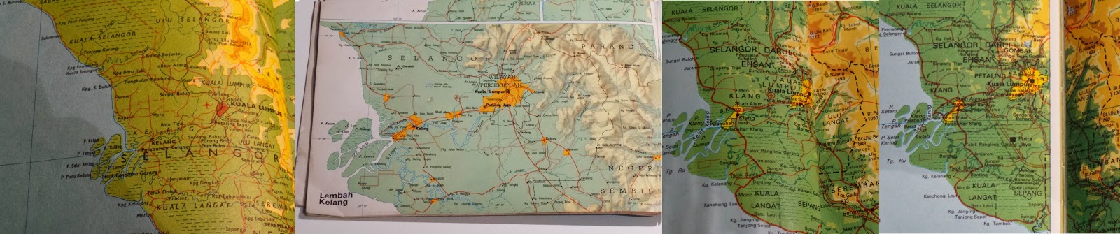
Evolution of Klang Valley (Most urbanized Area in Malaysia). From Left to Right:
1974, 1983, 1994, 1996 (2007 Edn Atlas)

New names or change of spelling for places have been reflected over the years. For example, 70s atlas used to show Muar as Bandar Maharani (primary name). From 80s onwards, Muar became primary name choice for the town on the map. District names of Sarawak (the largest state) has undergone renaming decades ago. New reservoirs appear in the 1990s maps when none existed in 70s and 80s atlases. Despite the updated height, Malaysian geography text books and atlases still carry the wrong height of Mt Kinabalu(it should be 4095 m instead of 4101 m). Emergence of highways criss-crossing the country began to appear in 1990s atlases. With the opening up of new Kuala Lumpur International Airport (KLIA) in 1998, thematic aviation maps were updated with the new location.

How did these Atlases presented the world?
Malaysian student atlases are published in accordance to the geography syllabus and textbooks. From 1970s to 1990s, the atlases had a major emphasis on Regional South East Asia (on a country-to-country basis), followed with serious coverage of Asia. For the rest of the world, these atlases gave more space for North America and Europe. As most of the atlases has their publishers one way or another related to UK, large scale maps of UK are presented in the atlases. Africa and South America, despite their sizes, are displayed in one page maps. This skews supposed Malaysian world view to Asia, Europe and North America (a bit of Australia)


Colour Scheme


My analysis and observation states that atlases produced prior to 1980s (be it Malaysian or International ones), they have strong colour contrast scheme (refer to image above). Specifically, this is very true for topographic relief. The first thing you will see on topographic maps of Malaysia and World in pre 1980s atlases is topographic relief. In this sense, this colour scheme serves the purpose. However, it makes reading of text on the map very hard. For example, Times Atlas of the World (Mid-Century Edition of 1950s) had significant contrasting colours for relief that readers struggle to deduce thousands names dotting the map. Secondly, maybe due to printer issue or other reasons, I have noticed thematic maps have colours not matching their boundary grouping. For example, if the sea is indicated white and agricultural land is yellow, it is possible to see older atlases that some white exist on the landmass. It is subtle.

From 1980s, with better technologies and other reasons, the strong contrasting colour scheme was phased out and replaced with smooth colour transitions. Colours used for topographic maps or thematic maps for atlases show gradual variation and most importantly, toned down. It still captures people attention to relief but this time, not compromising text legibility. Strong colour schemes are only used for certain cases (i.e. 3D Model - none of the Malaysian Atlases have explored this option).

Current situation of atlases


Unlike the glory days (until 80s or even 90s), number of companies producing atlases have went down in Malaysia. Prior to 90s, it was possible to see different publishers producing their own set Malaysian student atlases. Currently I believe there are two companies who produce Malaysian atlases (specifically for students or reference material)- Oxford Fajar (Oxford University Press division in Malaysia) and World Express Mapping Sdn Bhd (WEMS). Oxford Fajar updated their mid 90s Atlas Moden Malaysia dan Dunia (Modern Atlas of Malaysia and the World) until 2007. However, the update was more like changing the cover (to reflect 50 years of Oxford Fajar in Malaysia). The contents in this 2007 atlas had maps reflecting situation of late 1990s (This is a gap of a decade between the publication year and the contents)

Newer atlas from Oxford - Atlas Explorasi Geografi (Geography Exploration Atlas) released recently is more like a book with some simple maps. These newer atlas has discontinued tradition of Oxford produced maps of Malaysia and World for the past decades. The content is more geared to text and the maps were there to reinforce the geographical understanding. 

WEMS also released Atlas Geografi Dunia (World Geography Atlas) both in Mandarin and Malay. I had short glimpse on the contents of this atlas. Most of it simple topographic maps of Malaysia and World.

Conclusion


In short, Malaysia no longer has good atlases that reflect the identity of the nation. Other countries can serve a good example on continuing the strong tradition of atlases in combination with GIS and web capabilities. In Australia, hardcopy Jacaranda Atlas is updated with GIS and is accompanied with online counterpart. This atlas is standard mainstay for all geography students in Australia. Likewise, Oxford produces its Australian atlases and has similar content to Jacaranda. Malaysia no longer has any of this.

The best way forward is the existing publishing groups in Malaysia recapture the older atlas style, combined with GIS enabled updates and have online counterpart. These atlases are very dynamic, interactive and bound to make students get excited in geography.

Referred Atlases

  1. Atlas Untuk Sekolah Menengah Malaysia (Atlas for Malaysian Secondary School), 1977, Far Eastern Publishers (FEP) International Sdn. Bhd.
  2. Atlas Dunia Baru (New World Atlas), 1983, Collins So & co Ltd/ Longman Malaysia Sdn Bhd
  3. Atlas Moden Malaysia dan Dunia (Modern Atlas of Malaysia and the World), 1994, Penerbit Fajar Bakti Sdn. Bhd. (Oxford Fajar - currently it is called as)
  4. Atlas Moden Malaysia dan Dunia (Modern Atlas of Malaysia and the World), 2007, Oxford Fajar Sdn. Bhd.

Friday, 27 June 2014

Names, Names... in Malaysia

Penang Chief Minister Announcing Road Name Change after famous MP Karpal Singh
(Source: MalayMail Online)
Recently, Penang (northern state in Malaysia) announced a promenade to be renamed as Karpal Singh Drive. The name change was done as honour to the contributions of well known Penang-born lawyer politician Karpal Singh. Geographical names, wherever they may be associated with, is critical for our daily communication for us to move around and decided on matters. However, we are not much aware about the naming policy in Malaysia

Who's in charge of naming?

In simplest sense, the government of Malaysia is in charge. In 2002, Malaysian National Committee of Geographical Names (JKNG) was created to coordinate the naming policies and activities. As geographical names come under the realm of mapping, Director-General of Department of Survey & Mapping (JUPEM) chairs the JKNG. Under JKNG, they have various subcommittees tackling issue on organizing the name gazetteer, updates, island naming and state name committees.  JUPEM organized a Malaysian standard for naming conventions: MS 2256: 2009. Naming guideline has 21 principles ranging from language usage to use of personal names. 

Few years ago, JKNG subcommittee on gazetteer created a website of nearly all named places in Malaysia called Geoname. It is a repository of names of villages, towns, islands and others. Moreover, it presented current and alternative names, recorded pronunciation of features in official Malay and its local dialet and spelling in Jawi (Arabic script for Malay). It took roughly 5 years to set up this gazetteer and subsequently website plus additional works on the online names site.

You might be wondering which parties are involved in this naming process. They are JUPEM, Planning Department, National Archives, Dewan Bahasa & Pustaka (Institution in charge for Malay language), local governments, National Hydrographic Centre and other relevant parties.  Both national and state governments under JKNG are involved in the naming policy

So, how the place could be named?

For the public, the documentation about the process is weak or scarce. Let's narrow down to a general geographic feature like a new island (an anonymous one). The official groups that can name the island are Federal, State and Local governments. However, other agencies can provide the name (e.g. if the island is an artificial island, the developer may submit the name but the name needs to be approved by the naming committee). Preferably, the name should be Malay (as it is official language of Malaysia) and the way it is spelled and pronounced should be along the official Malay language. The name should not be offensive or discriminatory. If the island happened to be named after a person,  preferably the nominated person is dead (i.e. the case of Karpal Singh Drive) and made significant contribution to Malaysia or the affected area.

If this island had a common societal name before, priority should be given to retain the common name unless exceptional circumstances (i.e. offensive in nature). The naming groups/committees must do their best to remove any possibilities of duplicate names. If the island is small or big, emphasis can be added (e.g. Pulau Kecil - Small Island). If the island happens to have alternative names, the maps should indicate these names in brackets -  "Pulau Kecil (IJM Island)". Should the island in future requires a name change, a significant reason (s) needs to be presented for change. After all, names are used by the public for direction purpose and name change significantly affects personal mental maps.

I strongly encourage those who can read Malay to refer Malaysian Naming Guideline for the 21 principles behind naming. Those who need rough translation, contact me.

Examples of names in Malaysia

The traditional names you may find in rural areas in Malaysia (hence the common names) could stem from legends or folklores . For example, Pulau Dayang Bunting in Langkawi derives from the legend that a maiden lady who immerses herself in lake (in this island) would be pregnant. 

Some of the names are derived from flora, fauna or geographical feature. For example, Gua Tempurung in Perak is named after the coconut shell shaped caves. Langkawi is named after the sea eagle.

Some towns are named after the economic activities they represent. For example, Batu Arang in Selangor literally means charcoal stone and once was a site of coal mining activities.

Since Malaysia has rich history of interaction with outside world, place names are influenced by different world culture. For example, Taiping (Perak) in Chinese means heavenly kingdom 

Like any other country, after independence in  1957, Malaysia progressively adopted new names to replace the British Version. For example, Port Swettenham (name of British administrator) was renamed to Klang (main port in Malaysia). In 1982, Teluk Anson (once the shipping port of rich tin fields of Perak) was renamed as Teluk Intan. However, not all British names were replaced like George Town (Penang) - named after King George III.

Though local governments are empowered to determine names of entities (e.g. roads, buildings) to be line in Malaysian identity, these rules are not regularly enforced. One may notice the adoption of English or global names for shopping centres in Kuala Lumpur and other urban areas.

Controversies with naming

As Malaysia is a developing country, one of its weaknesses is the poor or lack of community consultations. This has affected to naming policies in Malaysia. For example in 2010, in rural Sarawak, a name change of a road without much notice created so much confusion and led drivers lost in their journeys (Borneo Post, 28/7/2010). Not only because of no notice, locals were infuriated that the new road name change does not reflect the local identity.

In 2014, one of the political parties in Sabah criticized the state government (Sabah) for naming villages or areas without any proper understanding of indigenous languages or identities. However, they welcome renaming of a suburb of Kota Kinabalu (Sabah's capital) to reflect the indigenous spelling (Menggatal to Manggatal).

In Penang, in late 2013, false allegations that second biggest island in the state (Pulau Jerejak) was renamed lead to heated debate in state parliament. According to the state opposition leader, the island was renamed to Pulau Mazhu by the island temple operator.

References


  1. Jawatankuasa Kebangsaan Nama Geografi, Garis Panduan Penentuan Nama Geografi, 2005, Kuala Lumpur, http://www.mygeoportal.gov.my/sites/default/files/Garis%20Panduan%20Penentuan%20Nama%20Geografi.pdf
  2. MacGDI, Pangkalan Data Nama Geografi dan Gazetir Kebangsaan,  Kementerian Sumber Asli dan Alam Sekitar (NRE), http://www.mygeoportal.gov.my/sites/default/files/pdng.pdf 
  3. Pusat Infrastruktur Data Geospatial Negara (MacGDI), Surat Pekeliling Pelaksanaan Infrastruktur Data Geospatial Negara (myGDI) Bilangan 1 Tahun 2012, 2012, Kementerian Sumber Asli dan Alam Sekitar (NRE), http://www.mygeoportal.gov.my/sites/default/files/Surat%20Pekeliling%20Penyebaran%20&%20Perkongsian%20maklumat%20Geospatial_bil12012.pdf
  4. Abdul Ghani, R & Mohamed Husin, N. Place Names (Preserving Cultural Heritage, Reflecting National Identity), 2013,UNGEGN South-East Asia Seminar, http://202.4.179.107/ungegn_ase/data/_uploaded/file/Rusli%20-%20Place%20names%20(Preserving%20Cultural%20Heritage,%20Reflecting%20National%20Identity).pdf
  5. The Star, Pulau Jerejak never renamed Mazu Island, says CM, 20th December 2013,  http://www.thestar.com.my/News/Community/2013/12/10/Pulau-Jerejak-never-renamed-Mazu-Island-says-CM/
  6. Free Malaysia Today, What's in a name? 3rd March 2014,  http://www.freemalaysiatoday.com/category/nation/2014/03/02/whats-in-a-name/
  7. MalayMail Online, Penang to Rename Jelutong Sea front 'Karpal Singh Drive', 19th April 2014, http://www.themalaymailonline.com/malaysia/article/penang-to-rename-jelutong-sea-front-karpal-singh-drive

Thursday, 9 January 2014

Revitalizing Malaysian Geography Syllabus


When one mentions about Geography, people instantly think about capability of memorizing world capitals or naming top mountains. This is very much misguided view of Geography and more so, Geography is a neglected topic in the broader educational issue in Malaysia. There is a lot of controversies going with the History syllabus and concern of declining standards in English, Maths and Science. However, Geography as a subject is being overlooked.

 Looking at the current situation, our Geography subject is only thought as compulsory subject for lower secondary schools and thereafter, it becomes an elective for remaining school years. This means Geography teachers have 3 decisive years to ensure students to be Geo-literate before Form 4. First issue in Malaysian geography syllabus is the lack of definition and importance of the subject. In History and Science subjects, the text books clearly indicate what defines these subjects and why they are important for the world. In Geography text book, both of them do not exist at all. By not placing them, students would be wondering about the significance of the subject. Geography is basically the study of interactions between nature and human beings. It isn't about memorizing but it is about how the world works, world interconnections and implications of interactions and interconnections. New text books must highlight the role of Geography for society.

 Second issue is MOE previously favoured Science subjects to Arts (60:40) for schools. Since Geography is treated as an art subject, it gets neglected pretty much in many Malaysian schools. The problem becomes more obvious in upper secondary as Form 4 Geography syllabus covers topics of natural disaster and basics of geology. Malaysians must be educated through Geography on how natural disasters happen (as Science subjects do not cover them) so they can be prepared in future (i.e. tsunamis). New core Geography syllabus must cover some basics of natural disasters (especially climate change).

 Third issue is Geography syllabus do not highlight much about potential careers in this field. When the importance of the subject is not being highlighted and lack of knowledge of geographical careers, no one see the value of Geography. One view as a subject just to get 'A' and then forget about it. Today's world have witnessed the unprecedented usage of maps (No.1 geographical tool) in humanity's history. Malaysia, as it continually evolves, need people who are educated in Geography and Mapping Science. Everything from business to medicine to community work has a location aspect. Geography syllabus must highlight careers in growing field. Teachers should contact Geographers/Map-makers to visit schools to introduce exciting careers.

 Fourth issue is Geography syllabus and teachers must integrate new technologies to teach the subject. This must include new mapping technologies (i.e. Google Earth, web maps) to bring excitement in learning. After all, Geography is all about exploring the world we live in. Visualizing Geography through story telling or organize outdoor visits allows the students to appreciate the world around them. Moreover, introduction of mapping technologies will spark interest in students to consider a career in Geography.

 Fifth issue is Geography syllabus should challenge the general perceptions of the developing and developed world. The core Geography syllabus tend to highlight problems existing in developing world (i.e. overpopulation) and less so for developed world. As the world changes rapidly, geography syllabus must highlight alternative advances made in developing world (i.e. sustainable agriculture) and focus less on developed world. Malaysian worldview is skewed knowing a lot of Western World & Asia but very limited for other parts. This could be rectifying by presenting balanced view on issues in developing world.

 In Summary, Geography syllabus in Malaysia needs a refocus to be more relevant and useful. Though Malaysians would better rate understanding the world than Americans, five issues must be addressed to revive a subject of significance importance. Geo-literate Malaysians would be capable understanding their environment, make wise decisions and knowing the implications of actions they do in the world we live in.

Tuesday, 5 November 2013

Selangor Housing Type and Price


View Larger Map
(Press the View Large Map to view more layers)

For this month, I have used ArcGIS Online to display the housing prices in Selangor for 2nd Quarter 2013. At beginning of October, I asked my friends what map should I produce. They requested:
1. Housing Prices
2. Topography
3. Crimes
4. Location of free-Wifi Spots in Penang

I chose Housing Prices (Median Price) and narrow down for Selangor. I sourced the Data from Jabatan Penilaian dan Perkhidmatan Harta (JPPH)- Property Valuation and Service Department,  http://napic.jpph.gov.my/portal/portal/eps/Online+Services/Publication/PublicationPortletWindow?uri=/Publication_EN/PSRMain_EN.htm&action=2
For Population Density, it came from Klang Municipal Council and Malaysian Statistics Department,  http://www.mpklang.gov.my/c/document_library/get_file?uuid=b9bbc4fb-2f76-4231-b6ed-58fa36eab0a4&groupId=283929 
For Spatial Data, from DIVA GIS and was modified to show the modern district boundaries (with some inaccuracies).

Housing Stock Type


What I am Really Interested is how the users feel toggling between multiple layers of the online map. It is advisable that you should turn one layer at one time. I think it is challenging for me to host so much data in online GIS as the audience would be largely from non-GIS background.

-I, Danesh Chacko, disclaim from myself from inaccuracies arises from the data, portrayal of the data or any misuse of the data for other purposes. The maps above should be strictly for general reference purposes or personal-use.

Wednesday, 25 September 2013

Mapping and Elections: Part 2

Mapping in Addressing Election Issues


Voter Registration Outreach Program
Since most countries around the world practice democracy and conduct elections, the success of elections is determined by the percentage of voter participation. The fate of the country and its future depends on voters and it takes sometimes a small number votes to change history. Voter participation fluctuate on election basis and could be strengthen if the election offices extend the registration of new voters. Depending on the country, local councils or states or federal government would be responsible in reaching out to new, unregistered voter. In order to create awareness, these institutions need to find ways to market the idea of registration in effective manner and GIS proves a decisive tool in this process.

Let's take an example, a council, south of San Francisco, (San Mateo) wanted an effective way of distributing resources in reaching out under-represented ethnic minorities in the area (targeting the Latino voters). The resources would be sending personnel familiar with Latino culture and voter materials that suit the needs of the community. The major question would be WHERE to send these resources. This is where GIS (or mapping in general) plays critical role.
GIS Voter Registration Process
Application of GIS in identifying potential voter registration program
In the case of this council, they asked the service of GIS company to produce maps for this program The company intersected the datasets (refer to diagram above) in the GIS. The polygon data of the datasets were adjusted according to election boundaries and with that, the population per election district were quantified. Moreover, the maps produced showed where voter registration was low and how it correlates to the percentage of Latino community per election district.

The outcome would be reduced time, energy and financial costs in finding areas of low Latino registered voters. Secondly, the council can organize effectively to distribute culturally trained personnel and relevant language pamphlets to potential voters. Hopefully, it would have translated increased registrations.

Election Redistricting
Depending on each country, election redistricting (boundary delimitation) is done to balance the population of election districts. Any manipulation of election redistricting will result in gerrymandering and malapportionment (unequal voting distribution across election districts). Redistricting impacts the future of political process of the country and the funding allocated to the election districts. Prior to GIS, election officials would have used paper-maps and it is time cumbersome process and may result in unfavourable boundary outcomes. With the advent of GIS, census data (critical information for redistricting) can be overlayed on other election boundary data easily.

On top of that, some political institutions and selected American States have started using GIS to show transparency in election redistricting. These proposed election districts are shown online for the public to review. In the case of America, the users can propose back to election office of new election districts while able to access other documents related to election redistricting. All in all, this would allow better decisions to create fair distribution of electoral areas:

Malaysian Election Problem
In the case of Malaysia, the boundary delimitation rules stipulated in the constitution is vague. This becomes more obvious when election districts should not be redistricted in such a way that impact rural areas or reaching to voters become difficult. The ratio of the largest constituency to smallest constituency in Malaysia range from 1-4 (only 3 out 13 states had ratio between 1-2). In Projek Tindak Malaysia research, Durack, federal election (Australia) seat is 4.8 times of Malaysia and 50 times bigger than the biggest electoral district in Malaysia. Using Malaysian logic, Durack MP in theory have extreme difficulty in reaching the voters. While this is true, today's technologies will narrow the distance gap. Moreover, using Malaysian logic, Durack should be split in many districts. Basically, Malaysia has gerrymandering and malapportionment problem. Since election redistricting is geographical problem, GIS plays an important role in addressing gerrymandering in Malaysia.  GIS can:
  • Identifying areas where election districts have too many voters and too little voters.
  • From this, we can zoom to election precinct level (in Malaysia called as daerah mengundi). At this level, election precints can be adjusted to the respective electoral areas with population thresholds. The GIS is able to overlay election boundaries and census data.
However, there are some challenges if voluntary election organization had to go through in any delimitation exercise
  • Volunteers recruited have different mapping standards
  • GIS data for election districts is hard to find or might be expensive for a voluntary project
  • Malaysian Election Commission (SPR) maps have different geographical clarity and quality, thus complicating the delimitation mapping exercise
  • Choosing the right software to draw the boundaries and subsequently display them for public viewer
Election Issue Awareness
Finally, maps are used by NGO groups or organizations to highlight and pinpoint issues pertaining to elections. Maps can piece complex data stories of elections into easy but powerful tools for election monitoring. For today's post, we'll take examples from Burma (Myanmar) and Malaysia

Burmese Election Tracker Home Page


Above website documented the election violations that happened in Burma. The homepage shows a Simple Burma Map using Open Street Map as the base map. The red proportional circles highlight the number of election violations per region. From the homepage, the user can go to election violation subcategory. The circles on the map changes to reflect the spatial distribution of the violations. Having said that, clicking on the circle only provide the number of violations of the city or area. Specific incidents to election violations are only found via the text links on the website.

For Malaysia, Sarawak Report with other media groups used MapBox (online mapping tool) to produce Election & Bribe Abuse Map of Malaysia.
Election Bribe & Abuse Map (Malaysia)

This online map, compared to other to Burmese one, is better (I would say) as the user can share the link on social media, tweet and contribute reports to build the map more complete. The pop-ups have contain personal account or news report of election violation with combination of photos, the ability to comment and share the story. However, not all pinpoints are at the correct location plus some pinpoints contain news without much geographical component (i.e. cities). Moreover, the base map is bit too dark and should consider using another map instead. All in all, this online mapping tool is very useful and could be dynamic during election time

Sticking back to Malaysian election 2013 issue, BERSIH 2.0 (Coalition of Free and Fair Elections)- broad based NGO fighting for election improvements- posted on its Facebook page of a simple map on how Election Commission (SPR) arbitrarily divided voters in different constituencies.
Kampung Abdullah Voter Registration Pattern (courtesy of Bersih 2.0)
Referring to this village, Kg Abdullah in Selangor (opened in 1940s) was arbitrarily divided into two constituencies. Referring to map above in detail, you can observe the division hardly make sense. During the People's tribunal on elections recently, this map was shown to demonstrate how families were 'divided' up when it came to voting in which constituency (in this case P140 and P141). The witness, Mr Ong Guan Sin said:

"The map shows how our village, Kg Abdullah, established more than six decades ago in the late 1940s, being divided arbitrarily by the Election Commission in 2003. We plotted each of the voters according to their registered address and the map is the result: each red dot is a voter of P140 Segamat, and each blue dot is a voter of P141 Sekijang.
......We have known for a while that some of the voters were transferred out from the original P140 Segamat constituency to the newly created P141 Sekijang. But little did we know that it was so arbitrary, so 'unnatural' that the division bears absolutely no consistent patterns or principles of any sort. Many households ended up with "divided family" - some family members vote in P140 while the rest vote in P141. "

The map alone itself received 117 likes and was shared 169 times.

In short, the above examples illustrate how maps are effective communicator of election discrepancies and elections. Maps are just mere tools for the wider change. With more and more free online mapping tools (such as free base maps of Google or software like MapBox) available, activists and NGO are being more literate in using maps to communicate their ideas.

Sources:

Tuesday, 10 September 2013

Mapping and Elections: Part 1

Recently, Australia concluded its general election. Likewise for any other country, any election is a turning point in country history and electorate is bombarded with analysis and statistics. In terms of analysis and statistics, we are presented through commentators exchange, numbers popping up on the television, table of results on papers and finally,MAPS. The most obvious use of maps for election purpose is to show the final/exit results of the elections. For the case of Malaysia : STAR (the main English daily) partnered with ESRI to create an interactive online GIS platform in displaying the results: http://elections.thestar.com.my/get13.aspx

Sample Section of STAR Interactive Election Map of Malaysia 2013
For the case of Australia, http://www.abc.net.au/news/federal-election-2013/map/ show greater insight on predictions, change of seats and the linkages to greater analytical tools.
Sample Section of ABC Interactive Election Map of Australia 2013

It's plus side, through full results link (refer above), ABC has visualized the changes in boundary demarcation for some electorates (i.e. Melbourne).

However, this post would not be focusing on the obvious application of mapping in elections. We'll be examining Mapping in Election Strategy and Mapping in Addressing Election Issues

Mapping in Election Strategy

          Australian Labor Party using Maps to 'scare' the voters on geographical
basis  if opposition takes control
The above map illustrate a simple, yet powerful mapping technique employed by election strategist to capture attention of potential voters. It hardly require much geographical data (but need more attribute data) to identify the geographical distribution of Liberal National Party Cuts. Through this approach, voters will know up and close of the cuts and how it will impact them directly (refer below). This in turn influence the voters mind (but for this election, GIS didn't give much needed boost for dying Labor Party)
 Examining Liberals's Planned Cuts and Labor's Planned Policies for
Melbourne (3000)
From this tool, we can conclude GIS or mapping in general is quietly being used by election strategists. Since most of world's data has a geographical component, in terms of elections, this would mean understanding geographical distribution of voters and their characteristics. Here are some data would be used by election strategists:

  1. A base map (let say a Google map or traditional GIS map)
  2. Census boundaries for the area
  3. Voter characteristic (e.g. gender, income, age)
  4. Political or economic maps (if needed)
 What the GIS does with these datasets above is it can integrate these geographic information and analyze voters' patterns and behavior. A lot of these datesets above could be sourced in government databases (depending on country's spatial policy) which in turn can be tapped by existing or upcoming politicians. On top of that, election campaigners source other data about the voters and issues through phone calls, sms and emails. In GIS, all these are mapped out and spatial distribution of behavior is displayed in good maps.
Election Strategy
How GIS might be used for election strategy
The above diagram shows the summary of application of GIS in election strategy. In terms of planning, GIS is wonderful resource where to distribute energy, time, money and volunteers to hit the voters. Using the map, politicians know where the target audience are. On top of that, when volunteers hit the streets, with the GPS on mobile devices, campaign managers can track the progress and see what other areas to progress further. If time is on the side of politicians, campaign strategists can use GIS to do predictions and use these data for coming elections.

In Summary, I have discussed two areas where GIS is used for election strategy. One is used to create scare campaign of the opponents and another on how to reach to the voters. Most of us just do not know whether this spatial technology gets applied in elections. The second part of the discussion would be on mapping/GIS and Addressing Election Issues.

Sources