Pages

Total Pageviews

Monday, 4 July 2016

ESRI Directions & User Conference: Key Points

ESRI User Conference from Hoyts Cinema in Melbourne
Recently, I have attended two key sessions organized by ESRI Australia - Directions Live in May and User Conference (a special style) in June. In this blog post, I will highlight some key insights to ESRI ArcGIS new capabilities that you may want to consider:


  1. ArcGIS Online: Does your organization or group host an ArcGIS Online Portal? Have you wondered on how to make it looking professional and reflect your organizational identity?
    1. Configuring your home page - This documentation talks about adding your organizational feel to the home page of your portal 
    2. Customizing your home page - Resources for developers and who have additional time to create a great welcome to ArcGIS Online
    3. Creating an Easy access to your web map applications - Wonder on how people can access your web map applications easily? Consider adding a sliding banner to home page.
    4. Uploading your Print Template for Online Maps - ArcGIS Online has printing capacity for all the web map applications (based on your configurations). If you want the user to print a map according to your standards, you need ArcGIS server to stream the standardized printing layout to ArcGIS Online
  2. Drone2Map: Combining drone technology and ESRI software powered by Pix4D, this tool is gaining a lot of traction in the mining industry and irrigation network management in Australia. In the mining industry, drones are much more efficient and cheaper in calculating the volume of rocks and earth moved around. Drones can be send to remote places where it is unsafe for humans to be in person for monitoring. Drone2Map has the capability to generate photorealistic 3D models.
  3. Insights for ArcGIS: Drag and drop your data and generate instant maps. Create multiple charts and query the results you want. Find out more here.
  4. ArcGIS Maps for Adobe Creative Cloud: For cartographers and communications professionals, this beta tool bring maps straight into Adobe Creative Suite. Find out more here.

Case Study

From the four pointers above, I have implemented in the key points for ArcGIS Online. In my company, we have an ArcGIS Online portal with groups (aggregate of users who produce, use and distribute the online maps). As the unofficial administrator for ArcGIS Online, I discussed with one of the groups who use my designed maps a lot for business. Fresh learned from ESRI Directions, I was interested to bring those ideas into action.

I discussed with this group and scoped their requirements. I came to know that

  • They are finding difficult to see the maps they want
  • Tag or Putting an Image that are suitable for the popular maps being used
Applying on the knowledge I have learnt, I began to modify the home page of my company's ArcGIS Online. With help of ESRI Australia, I placed a banner of the popular maps for the group to see by default first view. I customized the front page to reflect my Company's logo and business profile.

Currently, I am working on the best identifiers for the popular maps. Apparently, my group wants to see an image of map for every web application. A map that reflects the content of web map application. For them, that is the best way for them to identify their applications, not the title nor generic images.

Interested to find out more about capabilities of ArcGIS Online?

Contact me either on the contact form or drop a blog comment.

*This blog is not sponsored or endorsed by ESRI Australia/ ESRI in general. It is purely author's opinion

The author at ESRI User Conference
AECOM utilizing ArcGIS Online to convey their largest engineering work in Australia (ESRI Directions)


Friday, 17 June 2016

Map : How is it made?


Have you wondered a modern map is made?

Is there a lot of work needed to produce a map?

Today, we will watch the video (above) where I tell you the story on how a map is made.

By the end of the video, you will better idea on how maps are made and appreciate the efforts of a cartographer in producing your product.

Interested in a map? Want a wonderful graphic visual for your stories?

Contact me through my blog contact list (on right hand side) or drop a comment under the article.

Wednesday, 11 May 2016

When Spatial Join saved my time....


* Due to confidentiality, the names of the organizations and what the data was representing are not revealed.

*This content has been modified to accommodate new content for Intersect tool and better clarity for the procedure of Spatial Join
Recently, one of my senior colleague requested my GIS expertise to produce new insights on mutiple Excel spreadsheets. Basically, I was provided with:

  1. MapInfo tab (which was converted to shapefile subsequently) file of a linear route (polyline). It had two rows of data - File A
  2. MapInfo tab file of a polygon of the route with the segments (90+ rows) - File B
  3. Excel spreadsheets over the years of condition data based on hundreds of points.
My first assignment with the project was to identify the need of adding a new asset or not on 90+ segments of this linear route. This was done through visual assessment of Street View. Since I am predominatly trained in the ESRI world, all the spatial data was converted into shapefile using QGIS Translating tools ('Save as' the MapInfo Tab as shapefile)

Intersect


Problem


The second part of the project was to calculate the distance of each segment of the polygon route (File B). It is clear that the automatic way of calculating distance for a polygon is not possible. Calculate Geometry tool only calculates perimeter or area of the the segment. However, we have File A where it is a polyline (where Calculate Geometry is able to compute distances).

File A (polyline) highlighted in blue and File B (polygon) lying below the polyline.

Solution

  1. For this case, File A has two rows. I remove the shorter row as I need to calculate the maximum distance of each segment. Choose Edit mode and highlight the segment to be delete. Press the Delete ('X' sign)
  2. Ensure the polygon file (File B) has valid geometry. If the polygon has 94 rows, each segment must be touching at each other and not overlapping or having gaps. For a successful Intersect to occur, geometry must be validated and errors must be rectified. I opted to use QGIS for geometry validation as it has easier to understand validation tool (Topology checker)
  3. We have reached the most important part, how can I bring the 94 segments of polygon (File B) across to the single row of poyline (File A). We have two options here to consider : Union and Intersect. An output of union would create a polyline file of the File A and the perimeter of File B (see below) 
    Union of File A (polyline) and File B (polygon)
  4. Clearly from the above image, the Union does not produce the desired results. Let's look at the option called Intersect.
  5. Under Geoprocessing, choose Intersect and populate the dialog box as shown below. Input the two features (File A and File B) in the dialog box
    Intersect Tool
  6. Choose the output as line and let's bring all the attributes of the polygon to the polyline. Output as below.
    Intersect output
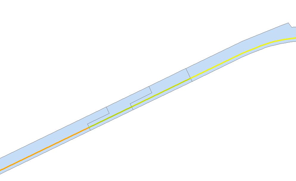
  7. To verify the Intersect went well, do two checks on the dataset. Firstly, is the number of rows of the new polyline (File C) the same as the number of rows in polygon? This can be done viewing through the Attribute Table of the new polyline. Secondly, do a visual check. Overlay the new polyline with polygon of File B.Does it visually match? Refer to image below:
    Visual check. Is there any suspicions on the green line? Use the Information Tool to check the IDs

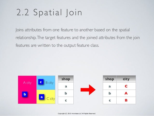
Spatial Join


Problem

However, the important part of this short blog post is about the third part. My consultant has an Excel spreadsheet of hundreds of points carrying condition and X and Y coordinates. He wants to know the relationship between points and File B (polygon segment). In short, he wants an updated Excel spreadsheet showing the condition points and the road segment it is attached to.

There are two ways to do this : manual visual check or a Spatial Join


Solution


Part A
  1. Each Excel spreadsheet had approximately hundreds of coordinate points with the condition data. To display them, the file was saved as a .csv file and brought into ArcMap. 
  2. Subsequently, I chose display XY data (ignore the part you need to convert into layer) to visualize the hundreds of points on ArcMap. Please nominate the correct projection.
  3. To proceed to the next stage, the csv output has been converted to point based shapefile.
  4. Overlaying the condition data (point based) and File B (polygon file), you will see the results as below:

Demonstration of hundreds of points being overlayed over polygon.

Part B

Here is a situation where spatially, the Excel output and File B are located on the same place but from an attribute perspective, they have no relationship. My consultant wants to see the relationship of segments of File B and points. As mentioned before, there are two ways : Manual or Spatial Join.

The manual process is guessing the locations of points using ArcMap and populating them according to Excel. This is very tedious process. I am pretty sure that I wasn't consulted for tedious method, but for a GIS automatic process.

I contacted ESRI for assistance as I want to avoid the manual method. They recommended the Spatial Join.
  1. Overlay the condition point data over File B.
  2. Please ensure the polygons of File B do not overlap or have invalid geometry.
  3. Go to ArcToolbox > Overlay>Spatial Join.
  4. In the dialog box, please pay attention to important details as shown below.
    Spatial Join Tool

    1) Identify who is the Target feature - this is where the information (from adjoining file) will be carried across.
    2) Match Option - Since the join is done purely on spatial location basis, we do need to clarify the join is based on a particular premise. For this instance, points must wholly enclosed by segment - Completely Within.
  5. In this case, we want to know the segment ID for each point. The Target Feature will be the points and the Join Feature is file B. Though optional for Field Map section, it is important to nominate the fields to be carried across to the output. The segment ID should be carried over.
  6. Press Ok and the output (File D) comes out.
  7. Overlay File D over File B. Perform a visual check. Change the symbology of File D and File B to reflect the distinctions of Segment ID. Refer to Image below.
    Spatial Join Output 
  8. Does the output make sense? Do check the points at the boundaries of the polygon segment.

Essentially, I was attaching the segment ID with thousands of points. As my consultant wants two Excel Outputs per year, this Spatial Join did a wonderful job in delivering desired result.

Once the new shapefile is produced, I pushed out the attribute information into Excel. Subsequently, I replicated the same procedures for all other Excel spreadsheet. I do recommend that everyone who opt this method should verify the results after the join is performed.

Below here is a video on how to do Spatial Join:


If you want to seek further clarification, please drop me a message below here or at the contact me page.

Saturday, 30 April 2016

Mapping Elections - Malaysian Style

Recently, my map mind was reminded that I need to cover a hot topic coming up in Malaysia. On May 7th, Sarawak (the Land of Hornbills) - the biggest state in Malaysia is holding a state wide elections. Unlike other states, Sarawak does not conduct the state and parliamentary elections on the same time.

Credit : Cerevisae (Wikipedia)

Interestingly, the elections in Sarawak is happening amidst two big issues rocking Malaysia:

  1. 1MDB (State Investment Firm) Scandal - global level scandal - which has destabilized the ruling (BN) federal government (of which Sarawak State government is an appendage to ruling powers in Kuala Lumpur). The leadership of Prime Minister Najib Razak has been severely attacked by within his party and the opposition for the financial mismanagement of 1MDB. A solid victory in Sarawak would bolster his position in the party and the government
  2. New test for the reborn but fractious opposition coalition for a state wide election. While it is inconceivable that opposition (previously PR, now PH) will deny the ruling state government 2/3 majority, they made great headway in 2011 elections. However, with the popularity of current Chief Minister of Sarawak and infighting in the opposition, the image presented by opposition by the voters is dented.
This post is not about political analysis but how we can use map visualizations to gauge where the voters preference lay.  Presenting to you:

  1. Sarawak 2016 Election Analysis - Toggle between three map layers to understand correlation of population density, political tendencies, seat fights and effect of 2015 redelineation on the electoral outcome. Designed by Danesh Prakash Chacko  View the Larger Map
  2. Sarawak 2nd Round of Electoral Redelineation (2015) - Switch between layers to see the correlation of ethnicity, voting preferences and impact of redelineation on the electoral outcome. This map was designed when Election Commission was still proposing the 11 new seats and changes to the borders. Designed by Danesh Prakash Chacko View the Larger Map
  3. Sarawak Electoral Redelineation 2011 and 2015  - Slide and swipe the map to see how the electoral boundaries have changed and whether the jarring gap between voters values have been addressed. Designed by Tindak Malaysia View The Map
Credits for the Information needed to build the Map : Tindak Malaysia, Borneo Post. These maps exception of 3rd map do not reflect the views of the data providers Tindak Malaysia and Borneo Post.

Please let me know what other information should I put for the map - we need to see feasibility of adding new information. Enjoy!


Thursday, 14 April 2016

CEOs, booths... Locate Expo 2016


Locate16 is one of the big conferences of spatial sciences and surveying which draws audience from Australia and New Zealand. Though I did not attend the conference, I manage to convince my supervisors that I should attend the Expo (which is a free event).

My original intention is to attend the continuous lightning talks in the Expo. However, I found that lightning talks in a huge auditorium with many booths are not done in right setting. You, as a listener, get easily distracted by all the booths and connections you want to meet.

I spend most of my time in reconnecting with my old networks and visiting one booth to another. Guess what? I am very across on your business with latest updates. But on the flip side, you don't know much what my company do. However, the highlight of the Expo is to reconnect with CEOs who are keen to do business with my company. All I need is to approach these CEOs (they have done business with my company previously) as friends and next thing, they want talk about collaboration. Just need to mention the name of my company and everything flows - no sales pitch, no product selling...

What did I learn from the Expo:
  1. I think a lot of geospatial conferences is targeted to a walled community. The people who are the industry and converted to think geospatial solutions is everything. Have you seen a medical person coming to an conference or Expo like this? No, despite ESRI may have geofencing solution for ambulance management.
  2. It is difficult for me to be convinced that some associations can help my business to the next level. My company is not in the geospatial world but we do have partners in that realm. Yes these associations can partner my company with other vendors here and beyond. However, I am not convinced about the value addition to my company.                                                       When you join an association, ask yourself on how does it benefit you and your business or what can you contribute?
  3. How do CEOs talk? Most interesting aspect of the Expo wasn't the booths or technology. It was the time I spent with business owners. Why do I say so? Observe how enthusiastic they were about their solutions and trying to pitch to me on integration. To show their business will make our solutions the master and driven on good quality spatial data. They don't even have to say to me the superiority of their solutions but just stressing we can be complementary partners. 
That's my opinion about the Expo. What is your take on the geospatial conferences or Expos you have attended?

Friday, 26 February 2016

What should I put in and design for a Map?

Recently, it has been quiet on my blog post. I have been producing some random maps based on the topics I enjoyed. But is it worth writing a report on my maps? I put some thought about it and bang, an idea came out.

Though you may associate a lot of my works as GIS outputs, I prefer to be identified as a cartographer first, then GIS analyst second. Recently, I read an article on bad maps where maps are known to lie, maps built on dodgy sources and thematic colouring built on poor classification.

Today, we will be looking through some of my sample maps and explore the concept and design of the map.

Maps of LIDAR and 3D Visualizations
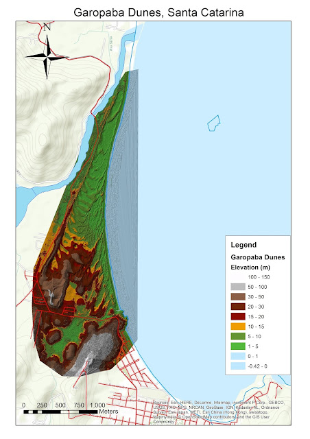
Garopaba Sand Dunes derived from LIDAR Data


Recently, I found out that my company had access to free 10 ESRI courses. I signed up one of them -Creating 3D Data Using ArcGIS. Though I have learnt this back in university, it was a good refresher course. It exposed to me many principles I need to consider when developing a 3D model. Subsequently, I signed up for another course of managing LIDAR data (Laser and Detection Ranging) but only to realize my ArcMap account in my company had restricted licence. My GIS hands became itchy and sourced LIDAR data and make a 3D Model.

I was happy to find that high quality LIDAR data are freely available on the website (Open Topography). For this map discussion, we will not be dwelling on how I converted the massive file into a beautiful TIN. The study site is the sand dunes of small section of Santa Catarina state in Brazil. LIDAR Data provided shown two areas : Garopaba and Itapiruba. Due to the massive amount of data, I decided to produce a map of one region - Garopaba.

The map I produced above was the first step for my 3D fly through of the video. This map is an example of my effort to produce maps purely using ArcMap. Yes, purely ArcMap product without the intervention of Illustrator. Some of the challenges producing the map above:

  1. What kind of data is needed to show for the area? The road network, water areas etc.
  2. The difficulty in finding a dataset that fits for this large scale map. This area is extremely small part of large Brazil
  3. How much data should I put for this area? Remember, the focus is on the sand dunes, not the cities around it.
  4. Classification of the elevation heights of Sand Dunes. I will not accept the categorization given by ArcMap. Unfortunately, some of the elevation heights included the Atlantic Ocean (shown in the map above). Choosing a colour scheme representative of the reality of the ground is tricky. I want the users to 'feel' the sand dunes
  5. How much information should I put in the Legend? Is the Legend sufficient for a lay person to comprehend the map?
  6. ArcMap has couple of options for you to add dynamic text: service credits, author name. By choosing one of the options (i.e. service credits for datasets), is there too much information?

3D Visualization of Batu Reservoir (Selangor, Malaysia)

The above map was purely a screen grab from ArcScene. Now, I ask you some questions for the above map.

1) Does this 3D visualization need a legend?
2) Is the Reservoir clearly visible for your eyes?
3) In this visualization, which stands out most for you? The road network, the lake or the mountains?

Environmental Map of Yasuni - Map built on complete thought process

Environmental Map of Yasuni
Now, let's examine this environmental issue map of Ecuador. Yasuni is one of the most biodiverse area in the world and is home to big oil reserves for the country. It has divided the country's political scene for many years after the failure of Yasuni-ITT initiative (Ecuador don't touch the forest for oil extraction and get compensated - world has failed Ecuador in 2013).

This map I have circulated on social media garnered many likes and 1 pluses. One of my more popular maps I have to say. However, let's understand the context on why I produce this map.

Firstly, I had an original plan to produce a gift map of Ecuador. I was inspired by one of the Yasuni maps shown in National Geographic Magazine map. Tested myself whether I can produce a map of similar quality to National Geographic purely from ArcGIS. This map was built on with proper thought process.

Since this is an environmental issue, I have identified that location of oil fields, forest areas, indigenous settlements and road networks are critical for the user the factors of this issue. How did I figure out what kind data needed? A lot of reading of articles and doing deduction from the articles.

After listing out, the search of the data commenced. I pulled as much data as possible and documented the sources. However, not all layers are going to be used in the map. I placed all the possible layers in ArcMap.

Subsequently, I did the classification of the elevation layer and choosing right colours for other layers. After this stage, I reached an important turning point - placing the labels. Since the map is to be done completely in ArcMap, I utilized Maplex Label Engine to have my labels at the best possible positions. It was here that I decided which layers ought to be removed and ought to be kept. Too many data layers clutter the map, makes the labels not legible and distract the user.

With labels placed, I have experimented significantly the colour schemes to ensure the map is legible and easy to understand.

When this map was posted on social media, I received insightful comments (aside 'nice work'):

  1. Do we need to tell the users the red lines are roads in Legend?
  2. The user spotted that a river line in the scale bar. Maybe need to find where in ArcMap scale bar setting you can make the changes
  3. Should I make the roads thicker and river lines thinner? As roads are more important than rivers for this map context?
  4. A better location for the North Arrow?
  5. Should I put an inset map the location of this area in a wider region?

Thematic Map of Diaspora Communities
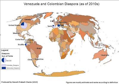
Simple Distribution Map built on strong research

Similar to my other products, this thematic map on diaspora communities was inspired by stories elsewhere. This map was built on much research and minimal effort on GIS part. To produce a map of diaspora like this, I faced numerous challenges:

  1. When searching the figures of the diaspora, I was challenged at many times what is the definition of diaspora? Does diaspora include permanent migrants and temporary migrants? How about refugees?
  2. The data currency was big issue. I want the latest data of diaspora community based on latest year. However, latest year figures vary from country to country. Hence I made a decision, the year variation should be kept less than 5 years.
  3. The source of data. It must come from credible source, not from Wikipedia. All Wikipedia sources have been checked thoroughly.
  4. I was bit disappointed that ArcMap did not a good job in creating the pie charts in the map above. There were some deficiencies which I found when I was formulating symbology for the diaspora figures

Conclusion

All in all, when producing maps, there are so many factors in producing and designing a map:
  1. What is your theme?
  2. Is it easy to get the data you need for the map?
  3. Does all the dataset you brought in are relevant for the map?
  4. What is the main focus of the map?
  5. Is your map legible, presentable and truthful?
When you consult me for a map, these are factors I taken into consideration to produce a thought provoking, beautiful and legible map!


Friday, 22 January 2016

Throwing a fishnet for an Atlas


Fishnet for an Atlas? You wonder about the title of the post - Does it make sense? By the end of the article, you will clearly understand why.

* Due to privacy issues, the name of the council and final output of this project are not shown

Problem

Recently, I was asked to print a massive (I mean massive) CAD file of all the roads and minor lanes for a council. I was given a PDF of the CAD file which had given me a context of the size of the map. This map (CAD file) is for field inspection of roads and it is full of annotation. If I were to print out from the PDF on A3 or even A0, a lot of the details (i.e. indicators) on the CAD files would remain obscure. We are talking about the high level of detail and we do realize the downside of CAD file - Text labels cannot be re-sized dynamically for different scales.

First Attempted Solution

With this problem in mind, (from my past experience), data driven pages and mapbook approach of ArcGIS is the way to go to solve the problem. We need to segment this problem of printing of CAD file into couple of parts:
  1. Can the Drawing file (.dwg) imported straight into ArcGIS or QGIS? 
  2. What is the scale of the map that it should be designed so that users can read the maps?(legibility)
  3. Does the CAD file has/ require a projection?
  4. How can I divide the council into a proper grid for data driven pages
As my computer does not have AUTOCAD, we need to address the first issue. Which software I should choose to view the CAD (.dwg) File. For ease of conversion, I opted for ArcGIS 10.3. Refer to this link for the process of conversion

Once the file was brought across, I exported selected number of useful element of CAD file into shapefiles. On the layout option of ArcGIS, I temporarily created a layout of the map and other map elements.  Meantime, I found out that dwg. file had no projection. The council could not find the projection of the file. Hence, I temporarily projected into a projection that was suitable for the region.

However, looking back on the completed the projection, this print work may not require a projection in the first place. 

As the work to design the map for print was unfolding, I felt the projection was required. This is because I will be using other projected datasets to be basis of the grid for Data Driven Pages. Hence, all the datasets including .dwg file.

I experimented with two scale levels for legibility test. One was 1:2000 and  another was 1:5000
It was clear 1:5000 does not show the information the user needs on the field. Let's look at 1:2000 example

After my supervisor agreed that 1:2000 scale was the way forward, now we reach the final question - How to divide the CAD file into multiple sheets?

My old (initial approach) was to find other freely available datasets which are suitable for large scale maps. After hours of experimenting with them and data driven pages, I wasn't satisfied. The scale of the map was either too large or too small.

Meantime, I made some moves to beautify the maps for the ease of reading. However, the question remains unanswered - how to divide the dwg. file into evenly spaced (with a good scale of 1:2000) for the entire region ?

Creating Fishnet

I googled my answer and stumbled on GIS Stack Exchange, the answer I was seeking for. The commentator suggested that we should use Create Fishnet in ArcGIS. Please watch the video below to understand Fishnet.


Bingo! The answer I was looking for is ready for implementation. I did some initial experiments for some regions and found this is workable. Eventually, I implemented the Fishnet for the entire region (after couple of rounds of experimenting) and the grid I desired has emerged.

I placed the Grid into Data Driven Pages and it generated 135 maps at the scale of 1:2500 (which is good enough). I exported them into PDF and filtered many which are not useful sections for print.

Conclusion

Looking back, Create Fishnet approach eliminated the need for me to find other dataset to create customized grid. In my opinion, this approach works well when you don't have the desired dataset for the grid formation.

Hope all of you learned one new thing in ArcGIS!