Pages

Total Pageviews

Monday, 29 December 2014

Mapping Tale in South America: Venezuela

My blog went to a state of silence once more in December as I traveled to Venezuela and Ecuador. While the purpose of the trip wasn't aimed for mapping in mind, I manage to incorporate mapping elements in the holiday.

Venezuela

Atlas Story

Before I traveled to Venezuela in December, I came to know that Venezuela recently released its first official atlas in 35 years! I was placing high hope to obtain this atlas (Atlas de la República Bolivariana de Venezuela). I asked my tour guide before hand to sought the atlas. Unfortunately, I received the bad news that the atlas was retracted from the market due to the errors. Instead, I manage to get an old atlas in the street market in Bella Artes, Caracas.

Atlas Teduca, 1980s atlas of Venezuela
Atlas Teduca is a window what is like to be in a 1980s world. It placed all continents on equally footing (meaning same level detail and focus, not being biased to North America and Europe). Maps of the world are placed in front of the order while maps of Venezuela were organized towards the back of the book. When I looked at maps of Venezuela in the atlas, I noticed one state in Venezuela was missing: Vargas (home to the main airport and port in the country). A quick search online pointed that Vargas was created around 1998. 

The atlas presented standard topics of the country (geology, population etc) and most importantly, a series of maps of Venezuelan history. One thing important you need to know is Venezuelan maps show half of Guyana as claimed territory -Guayana Esequiba. It is long territorial dispute way before Guyana became independent in 1966.

Moreover, the atlas did incorporate relevant images to demonstrate economic, natural and man-made landmarks relevant to the regions. The atlas divide Venezuela based on regions to show large-scale maps. However, there was Big Disappointment! I found that Atlas was missing critical pages on large scale maps of many regions in Venezuela. It is publication error that I found after I purchased.

Ministry of Indigenous Affairs

Under the new government that has been ruling in Venezuela, there is push to recognize the role of indigenous people in history and culture. More importantly, there is ongoing push to give recognition of indigenous land rights. With promulgation of a new constitution in 1999 and subsequently new laws, Indigenous people were given legal titles of their land holdings. Ministry of Indigenous Affairs was created in 2007 to supervise various activities on Indigenous rights and development including the demarcation of land holdings.

After 2001 law of Indigenous People and 2005 Organic Law of Indigenous People (Organic Law in Venezuela providing a framework for future related laws), the government commenced the demarcation of boundaries. The demarcation is based on:
i) Social Area
ii) Legal Status
iii) Physical landscape of the area

Historical research was done on identified original borders of the area (wherever the former Spanish presence was much stronger). However, southern areas of Venezuela such as the Amazonian area, the demarcation got even harder. Due to low historical presence of the Spanish rulers, original documentation of indigenous areas were low. To overcome, staff at the ministry and those who are in charge of demarcation discussed with indigenous people and sought their 'mental maps'

Things get more complicated when you have non-Indigenous peoples working in Indigenous areas. Since non-Indigenous people has land rights, these people will be consulted in the demarcation process. In demarcation process, sometimes it is possible that non-Indigenous people only owns the structures (i.e. houses) and the crops but not the land (it belongs to indigenous people). Even after the demarcation, there is lingering issues and conflicts on the borders (especially with non-Indigenous residents). When such conflicts arise, the government helps the indigenous people to buy the land from non-Indigenous residents. Yukpa people in far-western state of Zulia (on border with Colombia) have been pushed of their lands because farming. In this case, the government helps to buy semi-formally the lands to be given to indigenous groups. If the land is fallow (owned by non-Indigenous in Indigenous areas), the land will pass its hands to the indigenous community.

After the demarcation on the ground is completed, a detailed map is drawn and shown to the community. An example map that was shown to my group was in Anzoategui. It showed the key control points of the border on the map. An assembly of Indigenous Community needs to approve the demarcation control points. If the community rejection, it is back on the drawing board. Once approved, it is send to Commission of Demarcation and subsequently, to relevant authorities to create the title deeds

If the Indigenous lands happens to be on municipal land, the municipality will give a lot of concessions to Indigenous communities on land governance. Sometimes, the government exert pressure to municipalities to return the lands to indigenous communities.

Up to now (2014), 93 land titles were given and 2.9 million hectares of land has been transferred back to indigenous community. Some places of indigenous lands will have signage as the community decide the need of putting them. This become more prominent when the indigenous lands are close proximity to urbanized areas. Placing signage in Amazonas state would take approximately 2-3 months due to remoteness of the territory while in urban areas, it would only take 2-3 days.

Demarcation still encounter many issues. There is huge difference between the original indigenous lands and legally recognized indigenous lands. The political tension behind the demarcation is rooted on existing colonial mindset and obstruction by opposition mayors. Due to historical migration patterns, it is difficult to obtain old title deeds of the indigenous peoples.

Additional Resources on this matter:


Thursday, 27 November 2014

My Biggest Map : My Biggest Challenge

"It is always a dream of a cartographer to see his or her finished product. Roots are bitter but fruits are SWEET!"
After long hiatus, I am back at my blog (before I take a long break once more). Some of the readers may wonder why I have disappeared. I have been busy in finalizing Map of Venezuela (2014).

First of all, let's do a recap on this project. Back in August 2013, I wrote a post on early stages of the Map (refer to Creating an A1 Size Map of Venezuela). The idea of this mammoth project was conceived in April 2013 and intense research was done to source out the geospatial datasets. Officially, the project started at 1st June 2013 and scheduled to complete on December 2013.

Guess what, the project was finally completed on 21st November 2014. If you read at my old post (link above), the final product is different to the proposed outcome of June 2013. In this post, we will learn the complexities involved in this project:

  • SIZE:
    • The chosen size was A1
    • Positive: Capture the size of the country, able to retain more descriptive information of the country. A user would be able to stare and appreciate the map and the country
    • Negative: Difficult to find a tubular casing that fit A1 for delivery purposes, printing cost, final product - Adobe Illustrator file was +100 MB- which slowed down the computer performance
    • Given the magnitude of the project size, it was impossible to complete the project in 6 months and this resulted in delays
  • PROJECTION:
    • It was toughest and contested issue that I yet to resolve
    • Multiple datasets came with multiple projections. The nominated common projection for the whole project was Mercator (Sphere). 
    • Looking back, I should have spend two weeks in getting proper answers on projection and trialing them out.
  • DATASETS:
    • Spend intense two weeks (14 hours total) to find out, document and compile the datasets. The aim of the project was to use free datasets for the entire map. 
    • However, due to copyright restrictions and other obstacles, this Map is NOT FOR SALE. I operate at loss every time I print
    • As the project progressed deeper, quite number of datasets were removed and not used to reduce complexity 
    • There  was mistake I made when I was cleaning up the datasets. When it came to the rivers, I did not populate all the names of the river on ArcGIS. Rather, they were populated on Illustrator file. There is no direct means of transfer of information from AI file to GIS.
    • Terrain Dataset: I could have chose better resolution to make pixelation on printing less evident
  • CONTENT:
    • I am referring to the attributes, When I come to my maps, my Signature Strength is the level of research behind it. Though the map was initially geared for myself (to adore it myself), since September, I have made intention to give the map away to a Venezuelan.
    • This meant the standard in the map must be high and the content must be reflective of Venezuelan Situation. Hence, I made sure the name of the rivers, cities, states and other data that has description have correct spelling and not outdated. Cross checking with official maps was a must.
    • One of the aims of the project is to minimize sourcing out copyrighted data. This is to prevent copyright damages leveled on me. Wherever there is a map that is in public domain, I use it as my main source of information
    • Road Hierarchies; The official maps of Venezuela has different way to interpret the road hierarchy - the material that makes up the road. I used multiple references to make my personal judgement in determining which was highway and dirt track.
    • The whole map is in Spanish. I should have spend time to contact Spanish person to check the Spanish content in the map. Hopefully, it is understandable. 
  • PRINTING:
    • This was challenge that I did not consider until the day of drafts and final product came to fruit.
    • As mentioned in the size category, the printing cost was something I need to factor in. Assuming I make no profit, I would sell this map for AUD22 for printing and AUD35 for lamination.
    • I contacted various printers to get the best quotes
    • When the first main product I appeared, I want to be laminated. However, one thing I realized laminated products were super hard to be rolled in tubular casing.
    • The person who would be receiving the map would see purely printed map without lamination. I would be keeping the laminated one and will producing an English version.
  • TIMING:
    • Original Scope was 6 months
    • However, two months into the project, I signed up for NGO GIS works which interrupted 3 months of project time in 2013 and 2 months in 2014.
    • The bigger the project, the momentum I initially held would decelerate quickly
    • However, once I confirmed my trip to Venezuela in August 2014, I accelerated the mapping project to full completion
    • One thing I learn in mapping is you have to CUT IT in correcting mistakes. You can fix them permanently and you never get your map done.
    • Total time scope of the project: 11-12 months
I have big SENSE of Achievement in realizing my dream. Though not perfect, it is huge relief to see the project completed and I can adore it anytime in my life.

Thank you for all your support to helping me through realizing my Dream!

Tuesday, 23 September 2014

Mapping (Cartographic) 'Consulting'

Excerpt of Venezuelan Map Project


"Danesh, I would like to get your tips on cartographic aspects of map of my work" (rephrased). This opportunity is one thing I can't pass. However, it is not easy as you and I would think. This post will be focusing my recent experiences in terms of cartographic consulting.

If you have seen in my previous posts (3D visualization for housing, Mauritian map project and Coordinate capture), the 'clients' had minimal idea of principles of cartography and GIS. The recipients would have no clue on GIS software and very much depended on me to produce the desired outcome. In short, my expertise is meant to deliver a product

Things are bit different with experiences in August and September. In August, I attended the International Map Industry Association (IMIA) Conference in Melbourne and attended Map Hack Day. Please refer to the post for details. In the process of making an online map, my team was divided into two : One group to focus on attributes data and number crunching and another focuses on spatial data preparation. Although it was not consulting, I had a unique experience of educating my ex-employer on how to use QGIS for preparing the data. I have used QGIS before at work and went for training one day to advance my skills. Though not fully utilized, it became handy as my team member struggled on QGIS. For this case, my team member is well versed with GIS, but not in QGIS. I showed him where to do clipping, how to do selections and other aspects of QGIS. In short, my expertise was to impart my knowledge for product build-up.

September Experience

A week ago, I received an email a friend of mine. He is well versed with GIS technologies and cartographic principles. He needed some views and tips on how to enhance map presentation. For me, this was a challenge as there was expectation (bit high one). I am now being viewed as a person from GIS Industry and has cartographic work experience. I would be advising him on ArcGIS and potentially on advanced QGIS.

The day came where my advice would come into play. He presented his projects, his current map templates and the cartographic styling being used. Turnout out, after 1 1/2 hour discussion with him, I learnt a lot of new things from him (specifically on ArcGIS):
  1. Bookmarks: Which saves one particular view
  2. Convert to Graphics: I can convert a Legend in ArcGIS and break the components as individual pieces
  3. Style Sets: A library of style sets (for symbology purposes) can be crafted and reloaded back into Symbology library
  4. Relative pathnames: If your shapefiles are stored in different places (in same directory I believe), this tool allows quick retrieval of files should they move around
From my side, I showed how dissolve can merge all the divisions of a shapefile into one. However, we encountered some issues when summing up totals (of population of attributes) for the dissolving shapefiles. I showed him that in ArcGIS there are two different tool bars he need to be aware for map production. Data Frame toolbars and Layout Frame toolbars may look the same but difference can be noted. Panning in Data Frame means moving the map while its equivalent in Layout moves the paper behind the map.

As our discussion progressed, the questions I was receiving was pushing the limits of my knowledge. I have been insulated from the tips and tricks that can greatly improving my mapping Production process. I hope to be more exposed to advance cartography through these opportunities.

I would like to thank my readers and my friends for offering me challenging opportunities.

Contact me via the blog through the links at the right navigation pane for cartographic consulting


Monday, 15 September 2014

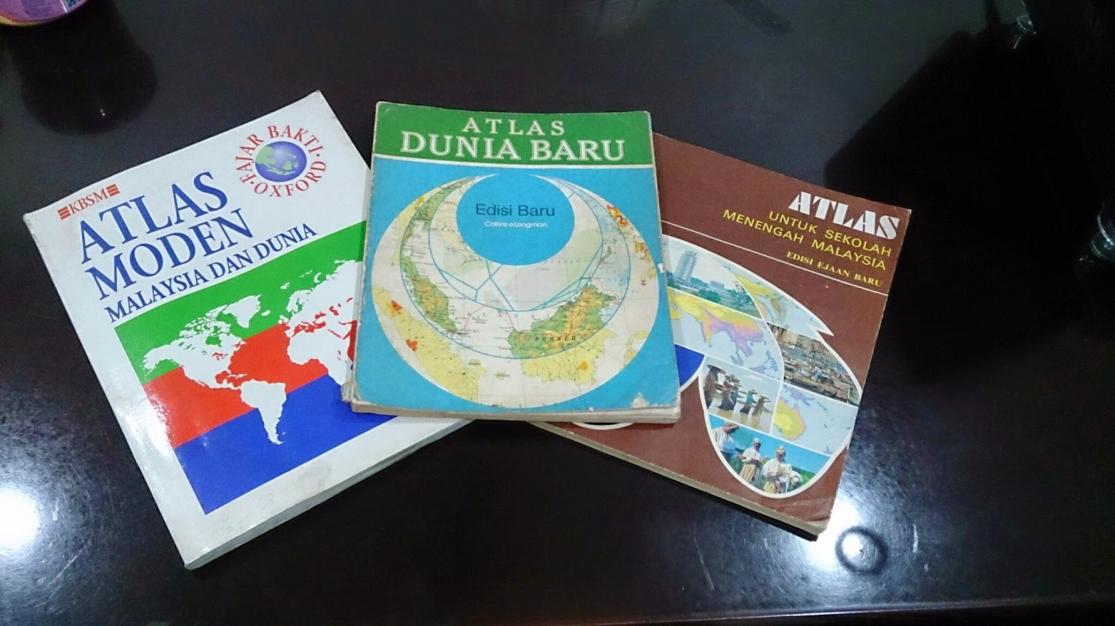
57 Years: Evolution of Atlases in Malaysia

Three Atlases, Three Publishers, Three Time eras


As Malaysia recently celebrated its 57th independence day on 31st August, it is worthwhile assessing how this nation has progressed. Malaya, to be specific, got its independence from Britain in 1957 (Malaysia was formed in 1963) and hence, 57 years of independence is unique in its sense. One of the best ways to see progress and changes is to look at old and new national atlases. For this posting, I will be focusing more on Student Atlases' portrayal of Malaysia and how they have evolved over the decades. I will not comment on the production process of the atlas as the information is hard to sought by.

This study is segmented to the following parts:

Contents


Generally, I have noted the contents of the atlases from 1970s to 1990s have not changed. Most of them open up with principles of mapping (i.e. projection, scale) and proceed to Malaysian and world content. In terms of Malaysian content, it is divided into three groups: Physical Geography maps, Human Geography maps and General Reference Maps. In the General Reference Maps, Malaysian atlases do accommodate inset maps of key cities or economic activity area. These inset boxes focus on land usage and economic hotspots of the state or region. Despite constituting another half of Malaysia, Borneo Territories are not accorded with a large scale map (for general reference category). The thematic maps of atlases are generally without any years attached and if they were, they are outdated as much as 6-10 years (from the latest publication date)

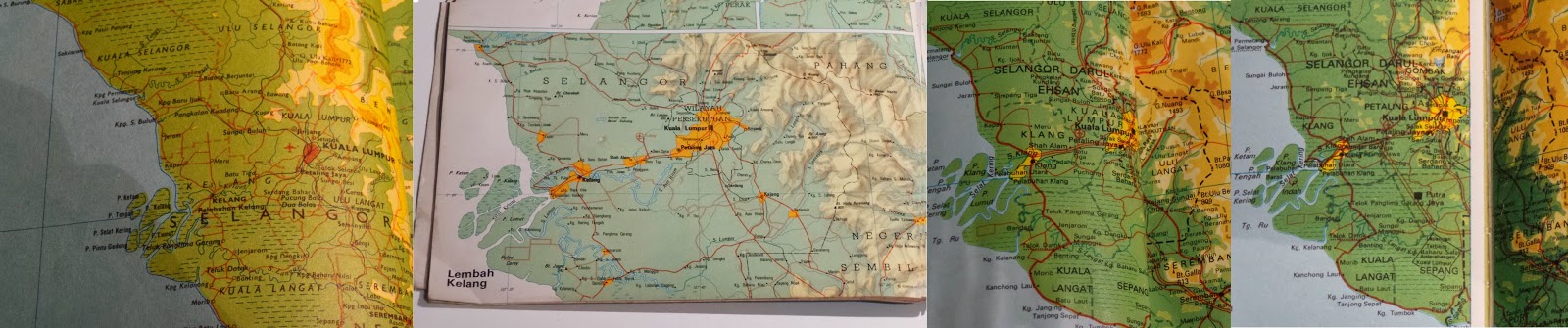
Evolution of Klang Valley (Most urbanized Area in Malaysia). From Left to Right:
1974, 1983, 1994, 1996 (2007 Edn Atlas)

New names or change of spelling for places have been reflected over the years. For example, 70s atlas used to show Muar as Bandar Maharani (primary name). From 80s onwards, Muar became primary name choice for the town on the map. District names of Sarawak (the largest state) has undergone renaming decades ago. New reservoirs appear in the 1990s maps when none existed in 70s and 80s atlases. Despite the updated height, Malaysian geography text books and atlases still carry the wrong height of Mt Kinabalu(it should be 4095 m instead of 4101 m). Emergence of highways criss-crossing the country began to appear in 1990s atlases. With the opening up of new Kuala Lumpur International Airport (KLIA) in 1998, thematic aviation maps were updated with the new location.

How did these Atlases presented the world?
Malaysian student atlases are published in accordance to the geography syllabus and textbooks. From 1970s to 1990s, the atlases had a major emphasis on Regional South East Asia (on a country-to-country basis), followed with serious coverage of Asia. For the rest of the world, these atlases gave more space for North America and Europe. As most of the atlases has their publishers one way or another related to UK, large scale maps of UK are presented in the atlases. Africa and South America, despite their sizes, are displayed in one page maps. This skews supposed Malaysian world view to Asia, Europe and North America (a bit of Australia)


Colour Scheme


My analysis and observation states that atlases produced prior to 1980s (be it Malaysian or International ones), they have strong colour contrast scheme (refer to image above). Specifically, this is very true for topographic relief. The first thing you will see on topographic maps of Malaysia and World in pre 1980s atlases is topographic relief. In this sense, this colour scheme serves the purpose. However, it makes reading of text on the map very hard. For example, Times Atlas of the World (Mid-Century Edition of 1950s) had significant contrasting colours for relief that readers struggle to deduce thousands names dotting the map. Secondly, maybe due to printer issue or other reasons, I have noticed thematic maps have colours not matching their boundary grouping. For example, if the sea is indicated white and agricultural land is yellow, it is possible to see older atlases that some white exist on the landmass. It is subtle.

From 1980s, with better technologies and other reasons, the strong contrasting colour scheme was phased out and replaced with smooth colour transitions. Colours used for topographic maps or thematic maps for atlases show gradual variation and most importantly, toned down. It still captures people attention to relief but this time, not compromising text legibility. Strong colour schemes are only used for certain cases (i.e. 3D Model - none of the Malaysian Atlases have explored this option).

Current situation of atlases


Unlike the glory days (until 80s or even 90s), number of companies producing atlases have went down in Malaysia. Prior to 90s, it was possible to see different publishers producing their own set Malaysian student atlases. Currently I believe there are two companies who produce Malaysian atlases (specifically for students or reference material)- Oxford Fajar (Oxford University Press division in Malaysia) and World Express Mapping Sdn Bhd (WEMS). Oxford Fajar updated their mid 90s Atlas Moden Malaysia dan Dunia (Modern Atlas of Malaysia and the World) until 2007. However, the update was more like changing the cover (to reflect 50 years of Oxford Fajar in Malaysia). The contents in this 2007 atlas had maps reflecting situation of late 1990s (This is a gap of a decade between the publication year and the contents)

Newer atlas from Oxford - Atlas Explorasi Geografi (Geography Exploration Atlas) released recently is more like a book with some simple maps. These newer atlas has discontinued tradition of Oxford produced maps of Malaysia and World for the past decades. The content is more geared to text and the maps were there to reinforce the geographical understanding. 

WEMS also released Atlas Geografi Dunia (World Geography Atlas) both in Mandarin and Malay. I had short glimpse on the contents of this atlas. Most of it simple topographic maps of Malaysia and World.

Conclusion


In short, Malaysia no longer has good atlases that reflect the identity of the nation. Other countries can serve a good example on continuing the strong tradition of atlases in combination with GIS and web capabilities. In Australia, hardcopy Jacaranda Atlas is updated with GIS and is accompanied with online counterpart. This atlas is standard mainstay for all geography students in Australia. Likewise, Oxford produces its Australian atlases and has similar content to Jacaranda. Malaysia no longer has any of this.

The best way forward is the existing publishing groups in Malaysia recapture the older atlas style, combined with GIS enabled updates and have online counterpart. These atlases are very dynamic, interactive and bound to make students get excited in geography.

Referred Atlases

  1. Atlas Untuk Sekolah Menengah Malaysia (Atlas for Malaysian Secondary School), 1977, Far Eastern Publishers (FEP) International Sdn. Bhd.
  2. Atlas Dunia Baru (New World Atlas), 1983, Collins So & co Ltd/ Longman Malaysia Sdn Bhd
  3. Atlas Moden Malaysia dan Dunia (Modern Atlas of Malaysia and the World), 1994, Penerbit Fajar Bakti Sdn. Bhd. (Oxford Fajar - currently it is called as)
  4. Atlas Moden Malaysia dan Dunia (Modern Atlas of Malaysia and the World), 2007, Oxford Fajar Sdn. Bhd.

Monday, 25 August 2014

IMIA Asia Pacific Conference: Part 2c

Mobile & Web Solutions with Open Source

Open Source Integration in Spatial Solutions
The next presenter hailed from India and he presented solutions basing on open source. In this conference, there is a strong emphasis on free datasets and open source solutions to build mapping products. His company has developed an interactive globe (a physical globe like viewed on a mobile device). It is home to over 50 000 Points of Interests, multilingual and meshed with multiple datastets. Secondly, he also developed interactive world atlas which is built on raster and vector maps. The user can draw, write, add points and print your own maps. Some of his developed applications are built on primarily on open source data and open source solutions (e.g. leaflet.js). The core of his presentation focused on 3 factors to be considered on open source material and utilization for projects:
  1. Cost: Though open source is deemed free, it is actually far from the truth. This is because of licence issue, customisation cost and server fees. However, the cost would be marginal in comparison to proprietary solutions 
  2. Customization : The user has a product end in his or her mind but open source may not able to fulfill
  3. Support : Some open source solutions do offer paid support. However, majority of open source solutions support come through community based forums.

ESRI Advances further...

ArcGIS real-time capabilities for disaster management
ESRI presenters from Australia are always on the go to show how ESRI is always ahead of the GIS curve. No doubt this has been demonstrated this year. The presenter talked about Real-Time GIS and how ArcGIS is incorporating and adapting to this type of data. Real time GIS data is continuous stream of events flowing from various sensors. Smart technologies are widespread and each of them are sensors (geo-enabled). This includes tweets, sms and other form alerts that occur during disaster time. ArcGIS Geo Event working hand-in-hand with ArcGIS Server able to capture, analyse and visualize spatial distribution of real-Time GIS data. From here, the data is transmitted through applications or through connectors (e.g.alerts on fire). ArcGIS Online was used in demonstration as the visualization tool of real-time GIS Data

Queensland furthers Open Spatial Data Revolution

Queensland Globe: Gateway to Free Spatial Data
In my posting last year on the conference, Queensland government was in its early stages of implementation of open data policy. This included the spatial data from state government and it is transmitted to the public via Queensland Globe. Quick brief on Queensland Globe:
  • Google Earth is the platform where the data is hosted publicly
  • It's Free
  • Training is not essential to use it. However, videos are in the website to show the users on how to move around Queensland Globe. A novice user can access the data through Google Earth platform
  • Up to 357 layers (as of August 2014) are freely available
The push needed for the implementation of Queensland Globe (April 2013) came from:
  • Flood mapping (As Queensland was wracked with floods recently and the disaster relief appeal
  • Huge demand for timely, authoritative mapping
  • Overwhelming positive response from government, business and citizens on data access
The final plan is all state government data (spatial data ) to be free for public downloads. This meant a new Globe Framework needs to be implemented for the bigger data release. There are couple types of globes for spatial data. Queensland Globe offers foundation and base maps and Category Globes have 17 themed maps. Different globes (e.g. Coal Seam Gas, land valuation) are released in stages. In April 2014, statistical data (census blocks) from Australian Bureau of Statistics were integrated into the globes. To ensure continuity, New South Wales Globe (Free data site for neighbouring state) is integrated in the Queensland multiple globe framework.

In future, historical imagery, geology, Building Information Models (BIM) and paid searches would be added in next globes. Queensland government is trying to entrench the open data policy into law. This will in turn obligates state government agencies to release data freely. The push to transform this policy into a law is to establish business confidence and encourage investment and innovation in the state.

Another initiative as part of open data policy of the state is QTopo. It is open topographic data site and users can explore Queensland topography in virtual manner. It is also web based browser application and 100% of Queensland territory is covered with topographic maps (with scale up to 1:18,084). Users can print their own topographic maps using recommended map sheets or customized areas (and zoom levels)

Transforming Spatial Business

Business Transformation is relatable to Explorer's journey
The final presentation of the day (Monday) had an interesting approach. He was from HEMA Maps, a leader in 4WD expedition publishing, related to his business transformation with his regular travels in outback Australia. Part of his business transformation, he recaptured the purpose of his business (HEMA) - helping navigators to explore. Any expeditions to Outback Australia may have some issues on the way and hence, the explorer needs to revisit his plans and reset the trip. Likewise the presenter iterated that spatial businesses be prepared to revisit their business plan. HEMA has started off and still is a family business. When initially it started, HEMA's target market was in the offline environment. There was no internet a fair while ago. However, with the digital age dominating modern times, HEMA needs to adjust to environment and be ahead of the curve. This is to ensure steady revenue flow. 

Another crucial part of the business is how to engage the customers of HEMA. This would include social media where HEMA social media admin interacts with customers experience in Outback Australia. However, any business must not be viewed as being pushy towards customers as this may chase existing customers. HEMA emphasizes the importance to engage with their own team. This includes cartographers, drivers etc. The positive environment is needed so that team remains intact and deliver better.

Thursday, 21 August 2014

IMIA Asia Pacific Conference: Part 2b

Cloud

New South Wales Trade & Investment - the agency who advice geological and mining matters to government, corporations and mining sectors - want to develop a tool for the public to know the mining activity of the state. They approached Spatial Vision, one of the leading GIS companies in Melbourne to develop a Cloud Based application called Common Ground to convey mining information. Previously, the information of mining was largely confined to industry professionals market. Common Ground is making the mining information widely accessible and built on authoritative datasets. It would be map based using CartoDB. Below here is workflow process (the product is not complete yet)

Full Credits: Hiroki Gota (Spatial Vision) 2014

GIS in Public Transportation

Translink Queensland Works
 Disclaimer: This part of the article remains under construction                                   
Next presentation was focusing on how GIS assist state subsidized public transportation for their students. The presenter has his own consultancy firm, Jan Simpson Consulting. He was contracted some time ago to work with Translink Queensland. This state organization manages all public transport systems (i.e. buses, trains, ferries) for the whole state of Queensland. One of the key programs organized by Translink is Student Travel Assistance Scheme (STAS). 

STAS provides subsidized transport to school children. It costs the state approximately $150-160 million annually to fund this program. It serves 2321 state schools or 500 000 students across the state. In order to qualify for STAS program, a student must:
Primary school : He or she must be more than or equal to 3.2km from the nearest state school to his or her residence
Secondary school : He  or she must be more than or equal to 4.8 km from the nearest state school to his or her residence

Hence, his project would revolve around GIS (as it is geographical problem) and he needs to develop a system for a non-technical audience to operate it in a fast manner. IT involved a big collaboration work between the government, public and developers

One of the main criteria for STAS eligibility is the shortest distance. For this instance, shortest distance refers the shortest trafficable route from student residence to the school access point. Restrictions were added into the GIS program where private roads (e.g. gated communities), four wheel drive tracks, non- constructed roads, one way roads, ferries and busways were excluded in the calculations. The system will calculate nearest school to student residence and takes into account of all restrictions incorporated in GIS. The results are stored in the GIS and DBMS. The challenge was to compute shortest distance between 2.4 million address points and schools. This resulted 20 million calculations and if were to be done continuously, it would have consumed 22 days of work (non-stop)

Over time, he devised three level classifications for STAS program: Are you in the STAS area (based on distance criterion), are you out of STAS area or in the marginal area? This helps the STAS staff to deduce whether potential students are eligible for the program quickly.

He integrated his system with Global GBM for Software-as-a-Service (SAAS) and developed in tandem with GBM a web-based interface for the STAS staff.

Wednesday, 20 August 2014

IMIA Asia Pacific Conference: Part 2a

Power of Location

Conference information
The whole conference revolved around the theme: Power of Location. Majority of the speakers presenting the conference came from Australia with handful came from India, New Zealand and United States (representing IMIA Global and Americas). To kickstart the presentation, the Chief of Staff of USGS (National Geospatial Technical Operations Center) updated the delegates on latest activities of USGS.

United States Geological Survey (USGS)


Chief of Staff of USGS Topo presents USGS works
The signature  USGS product is the 7 1/2 min topographic maps. Every American user associates these maps with USGS. USGS very much remain in the business of producing these maps. In this digital age, USGS topographic maps have went electronic and are available for free for download and able to integrate with GPS devices easily. USGS produced 70-80 maps every day and in future, there will be push for users to build their own custom maps using USGS datasets on the website. In an era of constraint funding, USGS collaborated with federal, state and local government agencies to leverage funding to access new datasets. 

USGS is home to Centre of Excellence for Geospatial Information Science which works with universities and conducts significant research on mapping elements. It is also the manager of National Atlas, the online atlas of United States.A recent study shown that areas such as flood risk, agriculture precision, geologic resource assessment, hazard mitigation and infrastructure management are top beneficiaries of USGS data. 

Since 1994, USGS has started to incorporate Volunteered Geographic Information (VGI) as part of dataset update. The VGI program was suspended on and off basis until 2010, where a full scale revival on VGI matter was initiated. USGS do award its VGI collectors with historical survey instruments as recognition of significant contributions. To ensure dataset accuracy, USGS  has a validation program to monitor the quality of VGI.

In terms of funding, the current funding is half of 1990 levels. USGS is able to do much of its operations with technological efficiency. Concept do more with less prevails. However, funding sequestration of 2013has put hold on LIDAR program to improve elevation dataset quality.

Geospatial Overworld


HERE Representative speaking on Overworld

The second Presentation was the race for the Geospatial Overworld and presented by Nokia HERE Business Development Chief. Firstly, we need to define what is Overworld. It is a term comes from computer games environment. It is top down visual perspective of the fictional environment within the game that precisely maps and describe its geospatial construction. This includes levels, terrain, boundaries, buildings, foliage, recruits, characters and associated interactions. Now, let's define Geospatial Overworld or Spatial Data Infrastructure (SDI). It presents a precise virtual representation of our real world, hopefully would be complete in 3D format and the information is updated in real time.

The foundation of SDI is built on high quality maps produced by geospatial professionals. The biggest investors ins SDI are ESRI (ArcGIS Online), Google (Google Map Engine) and Nokia (HERE). It is estimated USD 1 BILLION is invested to build the HERE Platform (Geospatial Overworld). The main buyers of Overworld data (not in order) are:

  1. Utilities
  2. Transport & Logistics
  3. Education
  4. Public Safety
  5. Natural Resources
  6. Health
  7. Financial Services
  8. Government
  9. Defense
  10. Property
  11. Media
Now focusing HERE Platform (SDI), the presenter focused on data cloud infrastructure where the Overworld is running on. It is built on multiple data centres across the world with highly scalable technologies. Next, we need to understand the building blocks of SDI Model:
  • Index: Capture a reference index of the real world
  • Platform: Essential for location services. Computing the right answer on the fly anywhere
  • Experience: Rich, interactive consumer experience for driving, mobility and enterprise.
SDI is delivered through Application Program Interface (API) and Software Development Kits (SDKs). One of the goals of SDI is hosting 3D Models on its platform. HERE, like Google, embarked huge street camera data capturing mission with a difference. They use LIDAR to capture the structure of every feature with high accuracy.

In today's world, it is fact the transition from 2D to 3D and vice versa is not seamless. However, in future, maps would fuse analytics and interactivity. Data would be fully visualized in 3D format with spatial attributes and integrating with user expectation. To bring a step further, internal building plans would be digitized and loaded into SDI. We are seeing this in various overworld platforms where user can zoom to airport, commercial centre or university to building layout and attributes.