Pages

Total Pageviews

Sunday, 6 November 2016

Tutorial: How to Map Ethnic Distributions?


Have you wondered how to do multivariable map of ethnic distribution? It has baffled me for a year or more as I was guessing on how atlases and magazines manage to produce highly detailed linguistic or ethnic maps of countries.
Ethnic Map of Chicago (Penn State University)
Recently, I just found the way to do so. In Malaysia, obtaining micro level data (at census collection district level or lowest level population divisible unit like U.S or Australia) is impossible. The closest lowest level demographic data I could obtain was electoral polling district level. It is not a complete representation on the ground but a very good sample set.

In this blog post, I will show you we can imitate those multivariable ethnic maps.

  • Excel Part
    1. Obtain Excel data on population data of the region you want to explore 

      Watch this video below on key things you need to consider in ensuring your Excel data is ready for a join in ArcMap. 
    2. As you can see the above Excel example, each row represents a polling district level data (for this instance). However, in order to produce those ethnicity maps as shown above, we should only consider the Majority ethnicity for the polling district level
    3. For this case, we should only consider percentage figures. 
    4. The question is how can I choose the column header (ethnicity) of the maximum row value of percentage (percentage of selected ethnicity). Refer to this article to implement -https://www.extendoffice.com/documents/excel/2547-excel-find-highest-value-in-a-row-and-return-column-title.html 
    5. Once we determined the majority ethnic group per polling district level, we need to classify them of varying percentage brackets (i.e. 30%-50%, 50%-70%, Above 70%). Two additional columns are to be added.
    6. For the first column, we will figure the percentage of majority ethnic group. We use the MAX function and highlight the attribute values (Refer here : http://www.accountingweb.com/technology/excel/identifying-largest-and-smallest-values-in-an-excel-list)
    7. Once completed, the second column with categorization is added. Using filters, group your data and label the data correctly.
    8. Prior to exporting to ArcMap or QGIS, copy and paste values only all the figures. This will remove all formulas as GIS system will not accept them
    9. Save the cleansed polling district data in a .csv format. Watch the following video for recap or clarification of the steps above. 

  • ArcGIS part

    1. In ArcMap, bring two datasets on the map using Add Data: .csv file of Population Figures and spatial data
    2. It is absolutely important that the file format and value of Identifiers of two datasets are identical. I couldn't stress about this more because the attribute joins depends on commonality of the values and format
    3. Right click the spatial dataset and choose Joins. Nominate the .csv file and choose the unique identifier. Run the Join
    4. Ensure all the features are joined. Identify which ones fail and rectify them either in spatial or csv datasets
    5. Once the Join is successful, go to Properties
    6. In Properties, proceed to Symbology and choose categories. The field for Symbology visualization would be predominant ethnic group percentage classification.
    7. Symbolize them with appropriate colour
    8. Click Ok to apply the colour scheme
    9. Check whether the desired map matches to your liking. Watch this video for recap or clarification of the steps above. 
Happy emulating my example!


Wednesday, 14 September 2016

Mapping the Mega Mining Project


The Map of The Orinoco Mining Arc (Do not copy without prior permission)
* For bigger image and clarity, please click here

Gold, coltan, illegal mines, malaria, environment, money... So many things we can explain the Venezuelan Orinoco Mining Arc Project. Amidst of economic downturn, Venezuela opened up to massive transnational foreign investment for massive mining project. Venezuela is home to one of the biggest reserves of gold and coltan in the world (something we do not associate with Venezuela - home to world's largest reserves of oil)

This map I designed above documents the key things that would be affected by the Mining Project and also impact of artesanal mining (often illegal) in Orinoco region. While it is difficult to locate and place every possible impact of the project, these three maps will navigate you the context of the project


*I explicitly make it clear that I do not claim the ownership of any of the data needed for the map. The map is not for commercial use.

*Contact me here for any corrections or updates

Below here is the sources of the data (for the map)

  1. http://www.el-nacional.com/sociedad/control-logrado-extraccion-ilegal-Guayana_0_644935743.html 
  2. http://www.warscapes.com/art/dirty-diamonds-south-america
  3. http://www.arepadigital.com/nacionales/horribles-imagenes-de-la-devastacion-causada-por-el-arco-minero-en-nuestra-canaima-fotos-satelitales/
  4. http://www.el-nacional.com/sociedad/Efectos-mineria-ilegal-Bolivar_5_893360657.html
  5. http://www.el-nacional.com/siete_dias/riqueza-arrasara-arco-minero_0_839316160.html
  6. http://www.el-nacional.com/siete_dias/bosque-pierde-terreno_NACIMA20160430_0045_1.jpg
  7. http://www.desdelaplaza.com/raiz/lo-debes-saber-arco-minero-del-orinoco-infografia/
  8. http://www.eluniversal.com/noticias/economia/arco-minero-ambiente_247568
  9. http://periodicoellibertario.blogspot.com.au/2016/08/mapas-para-entender-al-arco-minero-del.html
  10. http://www.opensourceinvestigations.com/latin-america/venezuelan-jungle-massacre/ 
  11. https://www.icij.org/projects/coltan/venezuela-emerges-new-source-conflict-minerals
  12. https://venezuelanalysis.com/analysis/11980
  13. https://venezuelanalysis.com/analysis/11938
  14. https://venezuelanalysis.com/analysis/12417
  15. https://www.icij.org/projects/coltan/map-where-illegal-coltan-mining-thrives
  16. http://www.wsj.com/articles/armed-gangs-confound-venezuelas-bid-to-exploit-gold-mines-1463477408
  17. http://www.nytimes.com/2016/08/15/world/venezuela-malaria-mines.html?_r=1
  18. http://agoracom.com/ir/Rusoro/forums/discussion/topics/289438-rusoro-knows-mining-the-venezuelan-way-metals-news/messages/1006058
  19. Capa descargada de http://tapiquen-sig.jimdo.com. Carlos Efraín Porto Tapiquén. Orogénesis Soluciones Geográficas. Porlamar, Venezuela, 2015
  20. DIVA-GIS
  21. http://www.waterbase.org/download_data.html


Saturday, 9 July 2016

Mapping My Story

Open the map link in a different browser


Three months ago, me and my team embarked the biggest challenge in our life. While the whole exercise is about the fundraising and pushing our mental and physical barriers, there are many ways to document our story.

Being a seasoned GIS professional, I know there is way to document the story in a such way that leverages my GIS skills without require much coding. Presenting to you: ArcGIS Online Story Map Journal.

Author at the far right of the photo


This post isn't dedicated on how to build the map story journal. However, I will be focusing more on key elements I have learnt in building my story using ArcGIS Online.


  • Q: Why use a map to convey the story? Wouldn't photos and writing is sufficient?
  • A: I firm believer that this challenge has a strong spatial aspects. Since Victoria (Australia) practice open data, it removed a big hurdle for me to download the datasets I needed to document the track. Live tracking wasn't needed as Oxfam website was keeping tabs on all teams. The map platform allows the user to relieve every key event of our experience as though they are walking on our footsteps.
  • Q: Why ArcGIS Online as opposed to other platforms for journaling the story?
  • A: I have encountered three to four major mapping platforms: ArcGIS Online, CartoDB, MangoMap and MapBox. As I am bringing pictures, graph images and creating multiple pages for the story, ArcGIS Online has a simple platform for bringing them together without requiring developer's knowledge. All other platforms would require significant coding to match ArcGIS Online standard
  • Q: What are the challenges in building the map story?
  • A: Much of my time was spent in obtaining the datasets of the track and extracting the relevant sections for the map. Secondly, choosing suitable colours and adjusting the base map transparency was a challenge. I want the users to be attracted to the tracks and key points rather than the background map.
  • Q: What are key resources or learning I have learnt/acquired in building the map story?
  • A: I leveraged the online documentation of ArcGIS Online Story Map Journal to build my platform. Click here to learn more. More importantly, my audience was my other resource. Some of them spent time in asking me to improve some content that has been delivered. I received consent of all my team members to advertise this map application
Interested to start your mapping journey? Contact me through a comment below or fill up your details to you right.

Monday, 4 July 2016

ESRI Directions & User Conference: Key Points

ESRI User Conference from Hoyts Cinema in Melbourne
Recently, I have attended two key sessions organized by ESRI Australia - Directions Live in May and User Conference (a special style) in June. In this blog post, I will highlight some key insights to ESRI ArcGIS new capabilities that you may want to consider:


  1. ArcGIS Online: Does your organization or group host an ArcGIS Online Portal? Have you wondered on how to make it looking professional and reflect your organizational identity?
    1. Configuring your home page - This documentation talks about adding your organizational feel to the home page of your portal 
    2. Customizing your home page - Resources for developers and who have additional time to create a great welcome to ArcGIS Online
    3. Creating an Easy access to your web map applications - Wonder on how people can access your web map applications easily? Consider adding a sliding banner to home page.
    4. Uploading your Print Template for Online Maps - ArcGIS Online has printing capacity for all the web map applications (based on your configurations). If you want the user to print a map according to your standards, you need ArcGIS server to stream the standardized printing layout to ArcGIS Online
  2. Drone2Map: Combining drone technology and ESRI software powered by Pix4D, this tool is gaining a lot of traction in the mining industry and irrigation network management in Australia. In the mining industry, drones are much more efficient and cheaper in calculating the volume of rocks and earth moved around. Drones can be send to remote places where it is unsafe for humans to be in person for monitoring. Drone2Map has the capability to generate photorealistic 3D models.
  3. Insights for ArcGIS: Drag and drop your data and generate instant maps. Create multiple charts and query the results you want. Find out more here.
  4. ArcGIS Maps for Adobe Creative Cloud: For cartographers and communications professionals, this beta tool bring maps straight into Adobe Creative Suite. Find out more here.

Case Study

From the four pointers above, I have implemented in the key points for ArcGIS Online. In my company, we have an ArcGIS Online portal with groups (aggregate of users who produce, use and distribute the online maps). As the unofficial administrator for ArcGIS Online, I discussed with one of the groups who use my designed maps a lot for business. Fresh learned from ESRI Directions, I was interested to bring those ideas into action.

I discussed with this group and scoped their requirements. I came to know that

  • They are finding difficult to see the maps they want
  • Tag or Putting an Image that are suitable for the popular maps being used
Applying on the knowledge I have learnt, I began to modify the home page of my company's ArcGIS Online. With help of ESRI Australia, I placed a banner of the popular maps for the group to see by default first view. I customized the front page to reflect my Company's logo and business profile.

Currently, I am working on the best identifiers for the popular maps. Apparently, my group wants to see an image of map for every web application. A map that reflects the content of web map application. For them, that is the best way for them to identify their applications, not the title nor generic images.

Interested to find out more about capabilities of ArcGIS Online?

Contact me either on the contact form or drop a blog comment.

*This blog is not sponsored or endorsed by ESRI Australia/ ESRI in general. It is purely author's opinion

The author at ESRI User Conference
AECOM utilizing ArcGIS Online to convey their largest engineering work in Australia (ESRI Directions)


Friday, 17 June 2016

Map : How is it made?


Have you wondered a modern map is made?

Is there a lot of work needed to produce a map?

Today, we will watch the video (above) where I tell you the story on how a map is made.

By the end of the video, you will better idea on how maps are made and appreciate the efforts of a cartographer in producing your product.

Interested in a map? Want a wonderful graphic visual for your stories?

Contact me through my blog contact list (on right hand side) or drop a comment under the article.

Wednesday, 11 May 2016

When Spatial Join saved my time....


* Due to confidentiality, the names of the organizations and what the data was representing are not revealed.

*This content has been modified to accommodate new content for Intersect tool and better clarity for the procedure of Spatial Join
Recently, one of my senior colleague requested my GIS expertise to produce new insights on mutiple Excel spreadsheets. Basically, I was provided with:

  1. MapInfo tab (which was converted to shapefile subsequently) file of a linear route (polyline). It had two rows of data - File A
  2. MapInfo tab file of a polygon of the route with the segments (90+ rows) - File B
  3. Excel spreadsheets over the years of condition data based on hundreds of points.
My first assignment with the project was to identify the need of adding a new asset or not on 90+ segments of this linear route. This was done through visual assessment of Street View. Since I am predominatly trained in the ESRI world, all the spatial data was converted into shapefile using QGIS Translating tools ('Save as' the MapInfo Tab as shapefile)

Intersect


Problem


The second part of the project was to calculate the distance of each segment of the polygon route (File B). It is clear that the automatic way of calculating distance for a polygon is not possible. Calculate Geometry tool only calculates perimeter or area of the the segment. However, we have File A where it is a polyline (where Calculate Geometry is able to compute distances).

File A (polyline) highlighted in blue and File B (polygon) lying below the polyline.

Solution

  1. For this case, File A has two rows. I remove the shorter row as I need to calculate the maximum distance of each segment. Choose Edit mode and highlight the segment to be delete. Press the Delete ('X' sign)
  2. Ensure the polygon file (File B) has valid geometry. If the polygon has 94 rows, each segment must be touching at each other and not overlapping or having gaps. For a successful Intersect to occur, geometry must be validated and errors must be rectified. I opted to use QGIS for geometry validation as it has easier to understand validation tool (Topology checker)
  3. We have reached the most important part, how can I bring the 94 segments of polygon (File B) across to the single row of poyline (File A). We have two options here to consider : Union and Intersect. An output of union would create a polyline file of the File A and the perimeter of File B (see below) 
    Union of File A (polyline) and File B (polygon)
  4. Clearly from the above image, the Union does not produce the desired results. Let's look at the option called Intersect.
  5. Under Geoprocessing, choose Intersect and populate the dialog box as shown below. Input the two features (File A and File B) in the dialog box
    Intersect Tool
  6. Choose the output as line and let's bring all the attributes of the polygon to the polyline. Output as below.
    Intersect output
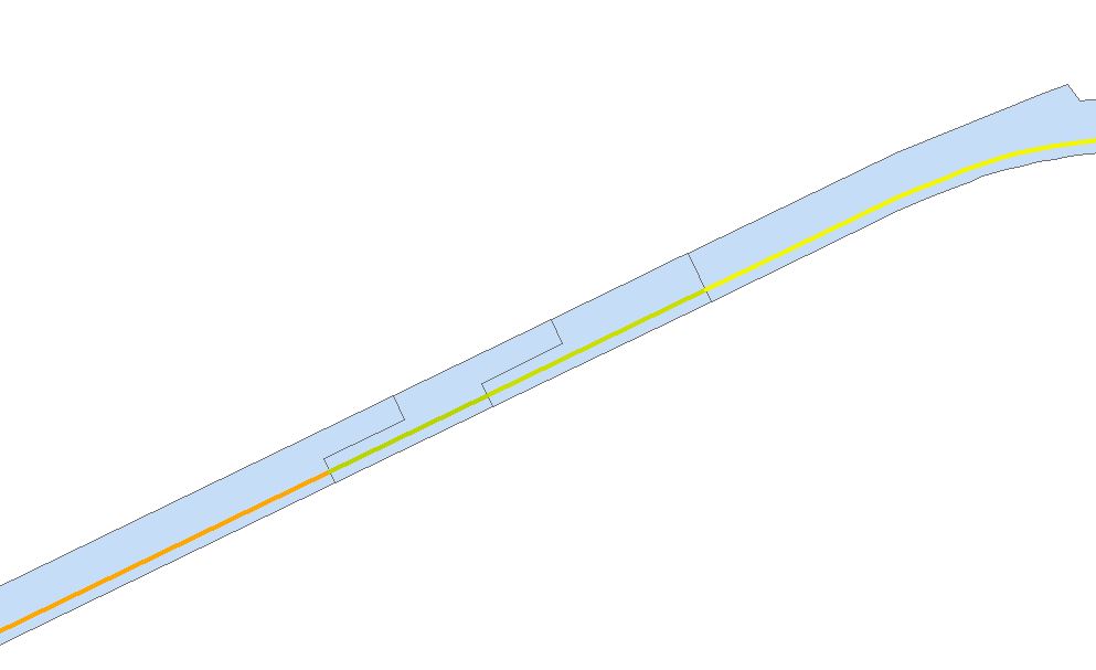
  7. To verify the Intersect went well, do two checks on the dataset. Firstly, is the number of rows of the new polyline (File C) the same as the number of rows in polygon? This can be done viewing through the Attribute Table of the new polyline. Secondly, do a visual check. Overlay the new polyline with polygon of File B.Does it visually match? Refer to image below:
    Visual check. Is there any suspicions on the green line? Use the Information Tool to check the IDs

Spatial Join


Problem

However, the important part of this short blog post is about the third part. My consultant has an Excel spreadsheet of hundreds of points carrying condition and X and Y coordinates. He wants to know the relationship between points and File B (polygon segment). In short, he wants an updated Excel spreadsheet showing the condition points and the road segment it is attached to.

There are two ways to do this : manual visual check or a Spatial Join


Solution


Part A
  1. Each Excel spreadsheet had approximately hundreds of coordinate points with the condition data. To display them, the file was saved as a .csv file and brought into ArcMap. 
  2. Subsequently, I chose display XY data (ignore the part you need to convert into layer) to visualize the hundreds of points on ArcMap. Please nominate the correct projection.
  3. To proceed to the next stage, the csv output has been converted to point based shapefile.
  4. Overlaying the condition data (point based) and File B (polygon file), you will see the results as below:

Demonstration of hundreds of points being overlayed over polygon.

Part B

Here is a situation where spatially, the Excel output and File B are located on the same place but from an attribute perspective, they have no relationship. My consultant wants to see the relationship of segments of File B and points. As mentioned before, there are two ways : Manual or Spatial Join.

The manual process is guessing the locations of points using ArcMap and populating them according to Excel. This is very tedious process. I am pretty sure that I wasn't consulted for tedious method, but for a GIS automatic process.

I contacted ESRI for assistance as I want to avoid the manual method. They recommended the Spatial Join.
  1. Overlay the condition point data over File B.
  2. Please ensure the polygons of File B do not overlap or have invalid geometry.
  3. Go to ArcToolbox > Overlay>Spatial Join.
  4. In the dialog box, please pay attention to important details as shown below.
    Spatial Join Tool

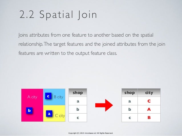
    1) Identify who is the Target feature - this is where the information (from adjoining file) will be carried across.
    2) Match Option - Since the join is done purely on spatial location basis, we do need to clarify the join is based on a particular premise. For this instance, points must wholly enclosed by segment - Completely Within.
  5. In this case, we want to know the segment ID for each point. The Target Feature will be the points and the Join Feature is file B. Though optional for Field Map section, it is important to nominate the fields to be carried across to the output. The segment ID should be carried over.
  6. Press Ok and the output (File D) comes out.
  7. Overlay File D over File B. Perform a visual check. Change the symbology of File D and File B to reflect the distinctions of Segment ID. Refer to Image below.
    Spatial Join Output 
  8. Does the output make sense? Do check the points at the boundaries of the polygon segment.

Essentially, I was attaching the segment ID with thousands of points. As my consultant wants two Excel Outputs per year, this Spatial Join did a wonderful job in delivering desired result.

Once the new shapefile is produced, I pushed out the attribute information into Excel. Subsequently, I replicated the same procedures for all other Excel spreadsheet. I do recommend that everyone who opt this method should verify the results after the join is performed.

Below here is a video on how to do Spatial Join:


If you want to seek further clarification, please drop me a message below here or at the contact me page.

Saturday, 30 April 2016

Mapping Elections - Malaysian Style

Recently, my map mind was reminded that I need to cover a hot topic coming up in Malaysia. On May 7th, Sarawak (the Land of Hornbills) - the biggest state in Malaysia is holding a state wide elections. Unlike other states, Sarawak does not conduct the state and parliamentary elections on the same time.

Credit : Cerevisae (Wikipedia)

Interestingly, the elections in Sarawak is happening amidst two big issues rocking Malaysia:

  1. 1MDB (State Investment Firm) Scandal - global level scandal - which has destabilized the ruling (BN) federal government (of which Sarawak State government is an appendage to ruling powers in Kuala Lumpur). The leadership of Prime Minister Najib Razak has been severely attacked by within his party and the opposition for the financial mismanagement of 1MDB. A solid victory in Sarawak would bolster his position in the party and the government
  2. New test for the reborn but fractious opposition coalition for a state wide election. While it is inconceivable that opposition (previously PR, now PH) will deny the ruling state government 2/3 majority, they made great headway in 2011 elections. However, with the popularity of current Chief Minister of Sarawak and infighting in the opposition, the image presented by opposition by the voters is dented.
This post is not about political analysis but how we can use map visualizations to gauge where the voters preference lay.  Presenting to you:

  1. Sarawak 2016 Election Analysis - Toggle between three map layers to understand correlation of population density, political tendencies, seat fights and effect of 2015 redelineation on the electoral outcome. Designed by Danesh Prakash Chacko  View the Larger Map
  2. Sarawak 2nd Round of Electoral Redelineation (2015) - Switch between layers to see the correlation of ethnicity, voting preferences and impact of redelineation on the electoral outcome. This map was designed when Election Commission was still proposing the 11 new seats and changes to the borders. Designed by Danesh Prakash Chacko View the Larger Map
  3. Sarawak Electoral Redelineation 2011 and 2015  - Slide and swipe the map to see how the electoral boundaries have changed and whether the jarring gap between voters values have been addressed. Designed by Tindak Malaysia View The Map
Credits for the Information needed to build the Map : Tindak Malaysia, Borneo Post. These maps exception of 3rd map do not reflect the views of the data providers Tindak Malaysia and Borneo Post.

Please let me know what other information should I put for the map - we need to see feasibility of adding new information. Enjoy!