Pages

Total Pageviews

Showing posts with label Maps. Show all posts

Saturday, 9 May 2026

Historical Maps of Petaling Jaya

 Introduction

Continuing on the ongoing work of finding historical maps of Malaysia of the contemporary era, this post will take you on a journey showing maps of Petaling Jaya.

Petaling Jaya was born as a response to the growing urbanisation (and its pain) of Kuala Lumpur. Conceived in the 1950s, it evolved into a major city of Selangor (Kuala Lumpur was separated from Selangor in 1974)


If the map is not accessible due to size, please consider downloading it and viewing the contents.

Highly recommended that you cite the original source should you use it beyond your personal use

Maps of Petaling Jaya from the 1960s

1962/63


1965


Source: University of Wisconsin-Milwaukee Library (https://collections.lib.uwm.edu/digital/collection/agdm/id/2695/rec/1)

Maps of Petaling Jaya from the 1980s

An important aspect appeared in the Petaling Jaya map of this decade - an inset map of the newly formed Subang Jaya township

1980s (A) - Help us to establish the year of this map


1980s (B) - Help us to establish the year of this map
Our guess is pre-1985


Source: Personal Collection of Danesh Prakash Chacko

Saturday, 1 February 2025

Historical Maps of KL from 1957

This blog post hosts and will host historical maps of Kuala Lumpur over the years

The maps embedded in the blog post are a sneak preview of the full-scale map.

1957 Map

For optimum viewing: https://drive.google.com/file/d/1zmiLzOFpzlumVQKWWv-9SVjRynp8xXAX/view?usp=drive_link

Source: University of Wisconsin-Milwaukee Libraries

1965 Map


Source: University of Wisconsin-Milwaukee Libraries

1967 Map (Kuala Lumpur and Petaling Jaya)

For Optimum Viewing: 


Source: The Australian National University (Open Research Repository)

1973 Map


Source: The Australian National University (Open Research Repository)

1982 Map

For optimum viewing: 


Source: University of Wisconsin-Milwaukee Libraries


1993 Map

For accessible viewing:


Recommend to have associated PDF reader for detailed inspection


Source: Private Collection of Danesh Prakash Chacko

2003 Map

For optimum viewing: 


Source: University of Wisconsin-Milwaukee Libraries

Thursday, 26 January 2017

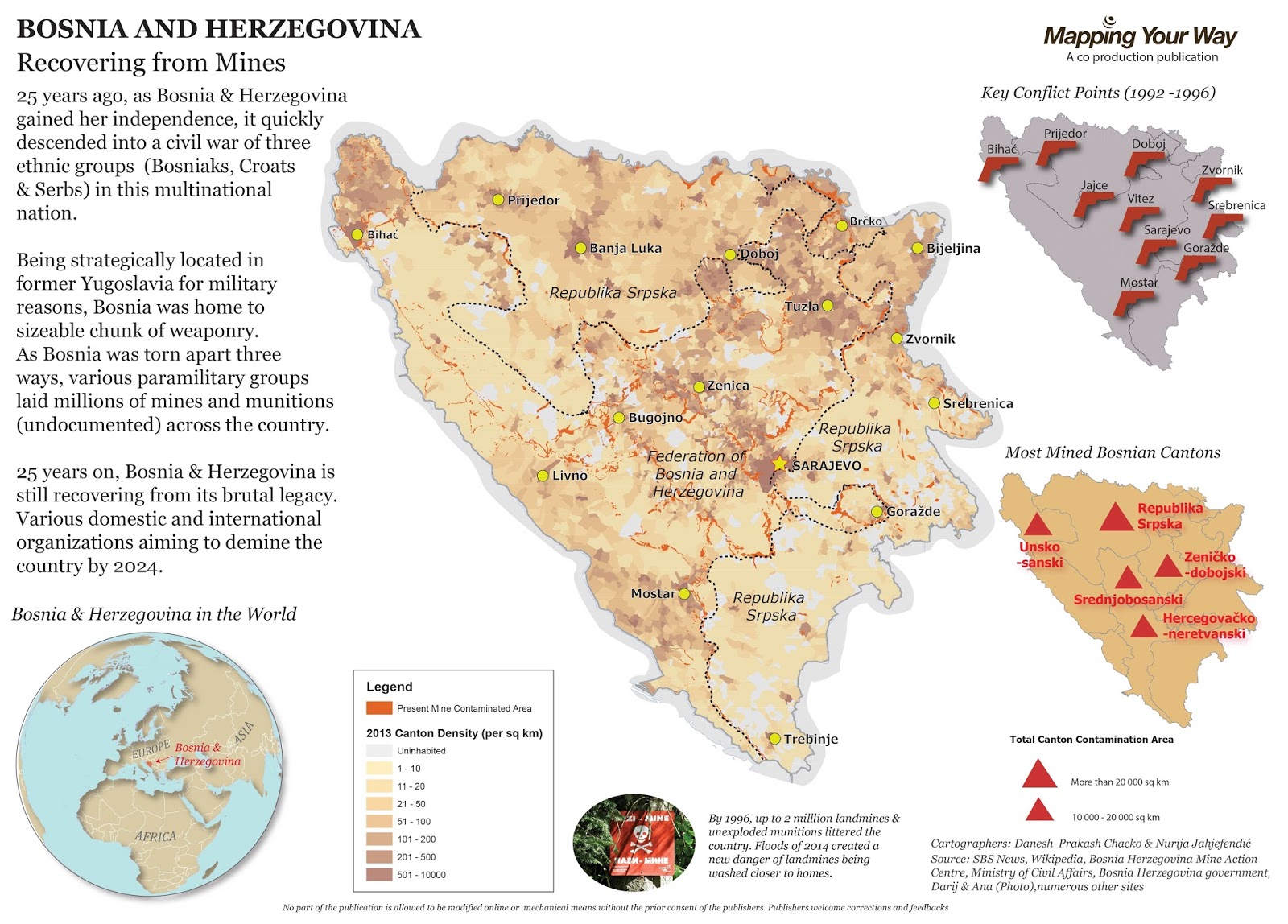
Bosnia Herzegovina Landmine Contamination Map


The PDF of the full extent of the map

Recently, with a collaboration of local Bosnian cartographer, Nurija, we have designed a map about landmine contamination in Bosnia Herzegovina. As Bosnia marks 25 years of independence this year, this timely map conveys the landmine legacy due to the civil war of 1990s.

As there are many mines (unexploded) still found in Bosnia, it continues to be a threat to anyone in the farm or during a flood time. If you want a map of a pressing topic, please contact me at the comment section and we can discuss further.


Saturday, 9 July 2016

Mapping My Story

Open the map link in a different browser


Three months ago, me and my team embarked the biggest challenge in our life. While the whole exercise is about the fundraising and pushing our mental and physical barriers, there are many ways to document our story.

Being a seasoned GIS professional, I know there is way to document the story in a such way that leverages my GIS skills without require much coding. Presenting to you: ArcGIS Online Story Map Journal.

Author at the far right of the photo


This post isn't dedicated on how to build the map story journal. However, I will be focusing more on key elements I have learnt in building my story using ArcGIS Online.


  • Q: Why use a map to convey the story? Wouldn't photos and writing is sufficient?
  • A: I firm believer that this challenge has a strong spatial aspects. Since Victoria (Australia) practice open data, it removed a big hurdle for me to download the datasets I needed to document the track. Live tracking wasn't needed as Oxfam website was keeping tabs on all teams. The map platform allows the user to relieve every key event of our experience as though they are walking on our footsteps.
  • Q: Why ArcGIS Online as opposed to other platforms for journaling the story?
  • A: I have encountered three to four major mapping platforms: ArcGIS Online, CartoDB, MangoMap and MapBox. As I am bringing pictures, graph images and creating multiple pages for the story, ArcGIS Online has a simple platform for bringing them together without requiring developer's knowledge. All other platforms would require significant coding to match ArcGIS Online standard
  • Q: What are the challenges in building the map story?
  • A: Much of my time was spent in obtaining the datasets of the track and extracting the relevant sections for the map. Secondly, choosing suitable colours and adjusting the base map transparency was a challenge. I want the users to be attracted to the tracks and key points rather than the background map.
  • Q: What are key resources or learning I have learnt/acquired in building the map story?
  • A: I leveraged the online documentation of ArcGIS Online Story Map Journal to build my platform. Click here to learn more. More importantly, my audience was my other resource. Some of them spent time in asking me to improve some content that has been delivered. I received consent of all my team members to advertise this map application
Interested to start your mapping journey? Contact me through a comment below or fill up your details to you right.

Monday, 4 July 2016

ESRI Directions & User Conference: Key Points

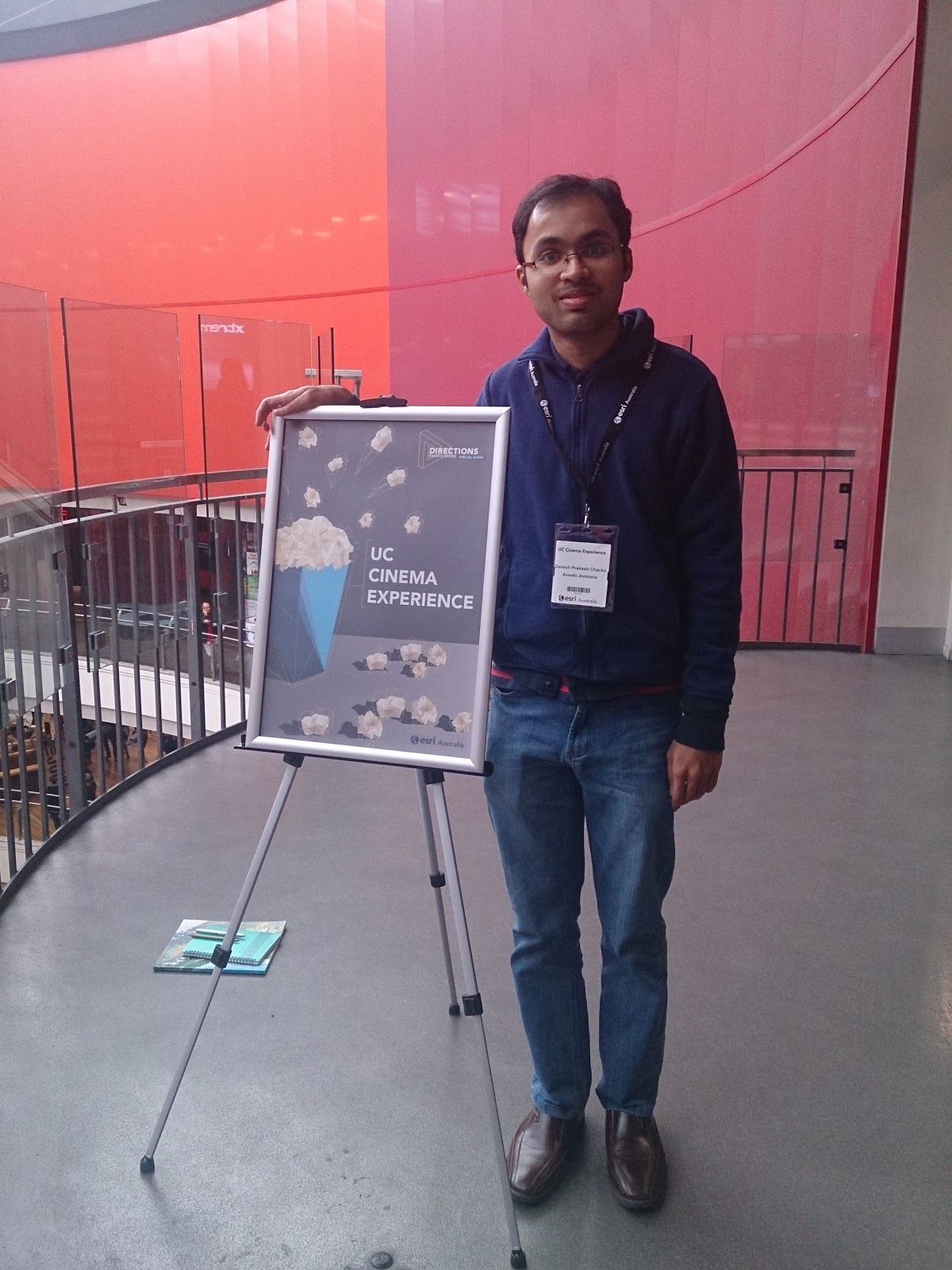
ESRI User Conference from Hoyts Cinema in Melbourne
Recently, I have attended two key sessions organized by ESRI Australia - Directions Live in May and User Conference (a special style) in June. In this blog post, I will highlight some key insights to ESRI ArcGIS new capabilities that you may want to consider:


  1. ArcGIS Online: Does your organization or group host an ArcGIS Online Portal? Have you wondered on how to make it looking professional and reflect your organizational identity?
    1. Configuring your home page - This documentation talks about adding your organizational feel to the home page of your portal 
    2. Customizing your home page - Resources for developers and who have additional time to create a great welcome to ArcGIS Online
    3. Creating an Easy access to your web map applications - Wonder on how people can access your web map applications easily? Consider adding a sliding banner to home page.
    4. Uploading your Print Template for Online Maps - ArcGIS Online has printing capacity for all the web map applications (based on your configurations). If you want the user to print a map according to your standards, you need ArcGIS server to stream the standardized printing layout to ArcGIS Online
  2. Drone2Map: Combining drone technology and ESRI software powered by Pix4D, this tool is gaining a lot of traction in the mining industry and irrigation network management in Australia. In the mining industry, drones are much more efficient and cheaper in calculating the volume of rocks and earth moved around. Drones can be send to remote places where it is unsafe for humans to be in person for monitoring. Drone2Map has the capability to generate photorealistic 3D models.
  3. Insights for ArcGIS: Drag and drop your data and generate instant maps. Create multiple charts and query the results you want. Find out more here.
  4. ArcGIS Maps for Adobe Creative Cloud: For cartographers and communications professionals, this beta tool bring maps straight into Adobe Creative Suite. Find out more here.

Case Study

From the four pointers above, I have implemented in the key points for ArcGIS Online. In my company, we have an ArcGIS Online portal with groups (aggregate of users who produce, use and distribute the online maps). As the unofficial administrator for ArcGIS Online, I discussed with one of the groups who use my designed maps a lot for business. Fresh learned from ESRI Directions, I was interested to bring those ideas into action.

I discussed with this group and scoped their requirements. I came to know that

  • They are finding difficult to see the maps they want
  • Tag or Putting an Image that are suitable for the popular maps being used
Applying on the knowledge I have learnt, I began to modify the home page of my company's ArcGIS Online. With help of ESRI Australia, I placed a banner of the popular maps for the group to see by default first view. I customized the front page to reflect my Company's logo and business profile.

Currently, I am working on the best identifiers for the popular maps. Apparently, my group wants to see an image of map for every web application. A map that reflects the content of web map application. For them, that is the best way for them to identify their applications, not the title nor generic images.

Interested to find out more about capabilities of ArcGIS Online?

Contact me either on the contact form or drop a blog comment.

*This blog is not sponsored or endorsed by ESRI Australia/ ESRI in general. It is purely author's opinion

The author at ESRI User Conference
AECOM utilizing ArcGIS Online to convey their largest engineering work in Australia (ESRI Directions)


Wednesday, 23 September 2015

Vegetation Maps and Stimulated Minds


Recently, I have been inspired by the Human Footprint maps of National Geographic Maps. Human Footprint map of Africa was built on four layers representative human impact on the environment -Africa Human Footprint Map. I wanted to make a map similar to this for Malaysia. Unlike National Geographic Maps continental coverage map of Africa, my area coverage was 300 000 sq km or so (100 times smaller than Africa). Hence, the difficulties in finding data needed for human footprint map of Malaysia increased.

Since Malaysia do not practice open data policy, searching GIS data needed for any map is like going for treasure hunt. Fortunately, I had access to older version Open Street Map road network dataset and DIVA GIS datasets (for the rivers, lakes etc.). The key part of the map is to show the disturbance of tree cover (this may include oil palm, rubber and general forested areas) in Malaysia. I was fortunate to stumble on Global Forest Change where I got the crucial data. Once the dataset were obtained, the remaining part of the map project is purely cartographic work. Using +QGIS , I used layer blending to highlight the density of the road of various areas. I used Print Composer to create multiple maps in one map. The above map is one example of this project.

Once I begin to advertise on social media circles, I see people's mind stimulated:
  1. Why does some areas of Peninsular Malaysia is experiencing higher loss of vegetation? Is it because of the increased oil palm plantation area?
  2. Why does some map has incomplete dataset of the lakes? If you refer to the first map of the post, some of the red areas are water areas? 
  3. Why does the Sea are is coloured green or red? It can confuse people - this has been corrected
  4. People spoke highly about the quality of the map that was produced in +QGIS 
  5. For the maps of Borneo, some raised the Indonesian state borders are not accurate. I countered that  the map focuses on changes to vegetation, not so much of anything else. However, I am willing to hear any free sources of updated boundaries.
  6. A person requested similar maps for Borneo (below are the three maps I supplied him) after seeing it on the social media
  7. These maps are the few maps I made had great social media reach in terms of sharing and liking (be it promoting QGIS or the topic it covered).


Tree Cover of Borneo


Important tips in +QGIS when I was producing the map:

  1. Print Composer (For better looking North arrow, please refer to step 28)
  2. Vector Symbology (For options to feature blending - i.e. road density, refer to Layer rendering)

Ask a map or general mapping enquiry at blog contact form

Friday, 28 August 2015

Interactive Time-Based Animation Map

This Article is work in progress
by Pemanducomm


As the Post heading suggest, I am pleased to inform you that I just launched the Railway History Map of Malaysia. It was built on solid research and powered by ArcGIS Online - Malaysian Railway History

Concept

Two years ago, I designed multiple map platform to understand the nature of the Railway. It contained operational year of the railway, number of tracks and status of operation of the tracks. Refer to Malaysian Railway Portal. However, it lacked one thing - Time capability. I revisited this project and focused to create a map of railway network evolution of Malaysia.

I believe so far no one has built such a map. Why I don't start one? Make a foray into the world of time based animation.

Data

The number one challenge of the project is the data for the operational years for the railway. As railways come and go, I need to know when they first being in operation and when they became disused. I downloaded DIVA GIS for the base railway network layer. I made a policy if there is no operational dates or years for the railway, it will not be shown on the map. DIVA GIS showed a lot of unknown railways which I have no evidence to back them.

On the Attribute part, I scouted heaps of blogs, railway fan sites, Wikipedia and every possible source available online.

Accuracy

I have made every attempt to ensure the highest accuracy of the dataset. Below here is the accuracy level of dataset
  1. Railway Network of Malaya: The opening date and closure date of the network is mixture based on the year and date level accuracy. Upgrading of the railway line to double track from Padang Besar to Gemas has resulted some of the previous tracks becoming disused. No definite year or date is found when the track got disused. Disuse status of Pasir Mas to Rantau Panjang is yet to be found. Subang Jaya to Subang Airport 1980 rail link has no disuse date.
  2. Railway Network of Sarawak: The only evident railway with opening and closing year is around Kuching.The route is drawn based on 1940s army map of Borneo. Railway from Brunei to Miri is not shown due to lack of information
  3. Railway Network of Labuan: The railway track is based on 1800s map of North Borneo. It is meant for general viewing, not determining the absolute alignment of the track
  4. Railway Network of Sabah: The only railway network in Sabah is shown in the map is the passenger based route. Since there insufficient evidence for commercial plantation railways, they are omitted in the map
  5. Railway Network of Sarawak: Significant amount of assumption is required to determine the disuse dates of networks of Bukit Timah to Tanjong Pagar (via Singapore City Centre) and Tanjong Pagar to Pasir Panjang. Various websites and blogs have placed contradictory information on the alignment histories of the networks above. 
Train Station opening date accuracy varies. Most of them have accuracy to year level with few stations with complete date level accuracy.

Sources

Malaya
1.  http://searail.malayanrailways.com/KTM.htm
2.  http://history.malayarailway.com/
3. Wikipedia
4. KTMB Railway Museum in KL Old Station (For verification of Pelabuhan Klang to Pulau Indah Railway
5. MySin Chew (For opening year of Port Weld Station) 

Singapore

1. http://searail.malayanrailways.com/KTM.htm
2. https://www.ura.gov.sg/ms/railcorridor/about/history/1932#subContainer
3. National Library of Australia Online Map Catalogue
4. http://joyloh.com/blog/?p=4715

Sabah, Sarawak and Labuan

1. http://www.lib.utexas.edu/maps/ams/borneo/ (Refer to Kuching for railway alignment)
2. http://catalogue.nla.gov.au/Record/6346822?lookfor=sabah%20{access_type:%22NLA%20digitised%20material%22}%20%23[format:Map]&offset=2&max=6 (For Labuan and Sabah Railway Alignment)
3. http://www.railwaystationlists.co.uk/pdfasia/sabahsarawakandbruneirlys.pdf (Credit to Peter A. Weenink for showing timeline of Labuan railway service)
4. Wikipedia
5. http://searail.malayanrailways.com/Sarawak/Sarawak.htm (For Kuching - Batu 10 Railway Line history
I, Danesh Prakash Chacko, hereby acknowledge completely all the source listed and unlisted below in the publication. Hence, I do not exercise the ownership of the attribute data (the operational years of the railway network and train stations). Should errors and omissions are found, please submit on the blog comments as below.

Friday, 9 January 2015

Mapping Tale in South America : Ecuador

After visiting Venezuela for 14 days, I visited Andean country of Ecuador. The name of the country is the living memory of French geodesic expedition of 1700s. While the purpose of my travels wasn't about mapping, I manage to integrate some mapping elements into the trip.

Instituto Geografico Militar (IGM)


IGM is the official state mapping agency of Ecuador and by reading the name, you have an idea that is under Ministry of Defence. It is perched on a southern hill in Quito (the capital) and many locals may associate IGM with the planetarium which is next door to the IGM building. As this is military area, you are required to carry your identification card and park the car according to military standards (you face car front to the road).

I visited IGM on two purposes: To obtain maps and Ecuadorian atlas and secondly, to get a proper contact within IGM. The previous day, I visited Cotopaxi which is the most famous volcano in the country. I was looking for topographic maps of Cotopaxi. It was Thursday morning and the counters were severely understaff. Most of the people walking around happens to come from the Ecuadorean military. I waited for my number and IGM was a paradise for map lovers. There was a huge (I mean huge) topographic map of Ecuador (1:500 000) - click on the link here (choose Mapa Fisico del Ecuador). Me and my friends spent our short time observing we have traveled for the past two days and where would we be going after IGM. My friends were attracted by aerial photography of key geographical sites in Ecuador which were found on the walls.

The time came for me to ask the staff what was the index number of maps of Cotopaxi. I have to purchase two maps (1:50 000) to get complete outlook of Cotopaxi - each costed around 3.60 USD (which is very cheap). This is where things got bit frustrating for me and my friends. The buyer of the map pays in one counter and get a receipt. Then, we need to queue and present the receipt to the plotter. It is UNFORTUNATE to see that they do not have existing printed maps of Cotopaxi. This costed our time at the office. Since the map produced is around A2 size, I have requested the plotter staff to fold it. He pointed to me to go to another counter where we present the receipt and get the staff to fold the maps. Finally, we sign off at the receipts that IGM has completed the works we need.

So next time you visit IGM and to purchase the product, please allocate some time for the printing and folding of the product.

I was told that IGM do not publish the national Atlas of Ecuador in print. However, you can view the digital version here : http://www.geoportaligm.gob.ec/portal/ . Got to GeoEduca, then Nivel Basico, you see the links to National Atlas of Ecuador 2013. Everything you need to know the Ecuador is in the atlas.

Back to the topographic maps of Ecuador (only basing 1:50 000), I noticed some interesting things:
i) The maps they sold to me were outdated (currency was ranging 14 -25 years ago).
ii) These two maps were produced at two different timings. You notice a difference that can't escape from your eyes.
2000 1:50 000 Topographic Map of Cotopaxi


The above map was produced with the collaboration with National Imagery and Mapping Agency (now NGIA) from America. Due to this, it is rarity to see the English legend and glossary presented hand-in hand with the Spanish Equivalent on Ecuadorian topographic map
English-Spanish legend and glossary for 2000 Topographic Map of Cotopaxi
The below map was purely prepared in Spanish and complete in its compilation in 1989. It covered northern part of Cotopaxi.

Mitad del Mundo

Mitad del Mundo from the monument in Quito
What is the reason why Ecuador named as it is? For those who are versed in Geodesy knowledge, Ecuador played an important role in shaping our understanding of Earth's shape. We all know the Earth bulges on the equator. However, many centuries, there was huge controversy and debate on shape of the Earth. Newton stated that Earth bulges on the equator and flattens on the pole (oblate spheroid) while Cassini theory state otherwise. To put an end to the debate, French government organized expeditions to Finland and Spanish colonized Ecuador in late 1700s. The main aim to find any difference between one degree latitude at the higher latitudes and the equator.

If you visit Mitad del Mundo, they have a building dedicated to explore the geodesic history and expedition to Ecuador. I traveled a significant length from Quito to Banos along the Andes. What I was surprised the expedition for geodesic measurement covered far greater lengths than my journey (going to Cuenca).Triangulation involved for the measurement went from one summit to another. One can imagine the difficulty of doing triangulation on steep slopes and clouds obscuring the sightings.

The outcome of the expedition proved the theory of Newton and most importantly, giving the name of the territory to become Ecuador (if not, it may the country could have been named as Quito?). The geodesic expedition brought the Enlightenment values to Ecuador, which was locked in Spanish world. This paved the independence movement in Ecuador and subsequently, kicking out Spanish rulers.

Mitad del Mundo, in theory, situated the equator. There is some discrepancy on the width and exact position of Ecuador. It was surprising to hear that indigenous people came to very close conclusion where the equator is situated.

Today it is a tourist site where geospatial and non-geospatial people visit regularly to experience the two hemispheres (like Greenwich)

Data Solution

As mentioned on the first subheading, I got the chance to visit IGM. As I was traveling with my friends, one of them happened to be an architect. He mentioned to me that when he produce plan for architecture, he digitize the roads manually. He wanted to ask at IGM (since the opportunity) where he can purchase the vector dataset of roads in Quito. Unfortunately, our time was very limited and we didn't get the chance to ask.

Hence, from my years of experience, the solution is open data. That means my friend does not need to fork out money or travel to buy the data. He can do from at home. He just need to know where he can get it. But the challenge, he needs .dwg format (AUTOCAD format). I was thinking to do a conversion from shapefile to .dwg but for his interest, I sought a website that offer ready made .dwg format.

After much search (after return back to Australia), I found a website which offer the data he needs (focusing just on Quito). The wesbite is https://cadmapper.com/ (For Architects, important!)

All in all, all the mapping elements were covered in one day of my trip in Ecuador. I hope all readers are enlightened by some sites to be visited in Ecuador and some solutions for Architects. 


Monday, 29 December 2014

Mapping Tale in South America: Venezuela

My blog went to a state of silence once more in December as I traveled to Venezuela and Ecuador. While the purpose of the trip wasn't aimed for mapping in mind, I manage to incorporate mapping elements in the holiday.

Venezuela

Atlas Story

Before I traveled to Venezuela in December, I came to know that Venezuela recently released its first official atlas in 35 years! I was placing high hope to obtain this atlas (Atlas de la República Bolivariana de Venezuela). I asked my tour guide before hand to sought the atlas. Unfortunately, I received the bad news that the atlas was retracted from the market due to the errors. Instead, I manage to get an old atlas in the street market in Bella Artes, Caracas.

Atlas Teduca, 1980s atlas of Venezuela
Atlas Teduca is a window what is like to be in a 1980s world. It placed all continents on equally footing (meaning same level detail and focus, not being biased to North America and Europe). Maps of the world are placed in front of the order while maps of Venezuela were organized towards the back of the book. When I looked at maps of Venezuela in the atlas, I noticed one state in Venezuela was missing: Vargas (home to the main airport and port in the country). A quick search online pointed that Vargas was created around 1998. 

The atlas presented standard topics of the country (geology, population etc) and most importantly, a series of maps of Venezuelan history. One thing important you need to know is Venezuelan maps show half of Guyana as claimed territory -Guayana Esequiba. It is long territorial dispute way before Guyana became independent in 1966.

Moreover, the atlas did incorporate relevant images to demonstrate economic, natural and man-made landmarks relevant to the regions. The atlas divide Venezuela based on regions to show large-scale maps. However, there was Big Disappointment! I found that Atlas was missing critical pages on large scale maps of many regions in Venezuela. It is publication error that I found after I purchased.

Ministry of Indigenous Affairs

Under the new government that has been ruling in Venezuela, there is push to recognize the role of indigenous people in history and culture. More importantly, there is ongoing push to give recognition of indigenous land rights. With promulgation of a new constitution in 1999 and subsequently new laws, Indigenous people were given legal titles of their land holdings. Ministry of Indigenous Affairs was created in 2007 to supervise various activities on Indigenous rights and development including the demarcation of land holdings.

After 2001 law of Indigenous People and 2005 Organic Law of Indigenous People (Organic Law in Venezuela providing a framework for future related laws), the government commenced the demarcation of boundaries. The demarcation is based on:
i) Social Area
ii) Legal Status
iii) Physical landscape of the area

Historical research was done on identified original borders of the area (wherever the former Spanish presence was much stronger). However, southern areas of Venezuela such as the Amazonian area, the demarcation got even harder. Due to low historical presence of the Spanish rulers, original documentation of indigenous areas were low. To overcome, staff at the ministry and those who are in charge of demarcation discussed with indigenous people and sought their 'mental maps'

Things get more complicated when you have non-Indigenous peoples working in Indigenous areas. Since non-Indigenous people has land rights, these people will be consulted in the demarcation process. In demarcation process, sometimes it is possible that non-Indigenous people only owns the structures (i.e. houses) and the crops but not the land (it belongs to indigenous people). Even after the demarcation, there is lingering issues and conflicts on the borders (especially with non-Indigenous residents). When such conflicts arise, the government helps the indigenous people to buy the land from non-Indigenous residents. Yukpa people in far-western state of Zulia (on border with Colombia) have been pushed of their lands because farming. In this case, the government helps to buy semi-formally the lands to be given to indigenous groups. If the land is fallow (owned by non-Indigenous in Indigenous areas), the land will pass its hands to the indigenous community.

After the demarcation on the ground is completed, a detailed map is drawn and shown to the community. An example map that was shown to my group was in Anzoategui. It showed the key control points of the border on the map. An assembly of Indigenous Community needs to approve the demarcation control points. If the community rejection, it is back on the drawing board. Once approved, it is send to Commission of Demarcation and subsequently, to relevant authorities to create the title deeds

If the Indigenous lands happens to be on municipal land, the municipality will give a lot of concessions to Indigenous communities on land governance. Sometimes, the government exert pressure to municipalities to return the lands to indigenous communities.

Up to now (2014), 93 land titles were given and 2.9 million hectares of land has been transferred back to indigenous community. Some places of indigenous lands will have signage as the community decide the need of putting them. This become more prominent when the indigenous lands are close proximity to urbanized areas. Placing signage in Amazonas state would take approximately 2-3 months due to remoteness of the territory while in urban areas, it would only take 2-3 days.

Demarcation still encounter many issues. There is huge difference between the original indigenous lands and legally recognized indigenous lands. The political tension behind the demarcation is rooted on existing colonial mindset and obstruction by opposition mayors. Due to historical migration patterns, it is difficult to obtain old title deeds of the indigenous peoples.

Additional Resources on this matter:


Thursday, 27 November 2014

My Biggest Map : My Biggest Challenge

"It is always a dream of a cartographer to see his or her finished product. Roots are bitter but fruits are SWEET!"
After long hiatus, I am back at my blog (before I take a long break once more). Some of the readers may wonder why I have disappeared. I have been busy in finalizing Map of Venezuela (2014).

First of all, let's do a recap on this project. Back in August 2013, I wrote a post on early stages of the Map (refer to Creating an A1 Size Map of Venezuela). The idea of this mammoth project was conceived in April 2013 and intense research was done to source out the geospatial datasets. Officially, the project started at 1st June 2013 and scheduled to complete on December 2013.

Guess what, the project was finally completed on 21st November 2014. If you read at my old post (link above), the final product is different to the proposed outcome of June 2013. In this post, we will learn the complexities involved in this project:

  • SIZE:
    • The chosen size was A1. 
    • Positive: Capture the size of the country, able to retain more descriptive information of the country. A user would be able to stare and appreciate the map and the country
    • Negative: Difficult to find a tubular casing that fit A1 for delivery purposes, printing cost, final product - Adobe Illustrator file was +100 MB- which slowed down the computer performance
    • Given the magnitude of the project size, it was impossible to complete the project in 6 months and this resulted in delays
  • PROJECTION:
    • It was toughest and contested issue that I yet to resolve
    • Multiple datasets came with multiple projections. The nominated common projection for the whole project was Mercator (Sphere). 
    • Looking back, I should have spend two weeks in getting proper answers on projection and trialing them out.
  • DATASETS:
    • Spend intense two weeks (14 hours total) to find out, document and compile the datasets. The aim of the project was to use free datasets for the entire map. 
    • However, due to copyright restrictions and other obstacles, this Map is NOT FOR SALE. I operate at loss every time I print
    • As the project progressed deeper, quite number of datasets were removed and not used to reduce complexity 
    • There  was mistake I made when I was cleaning up the datasets. When it came to the rivers, I did not populate all the names of the river on ArcGIS. Rather, they were populated on Illustrator file. There is no direct means of transfer of information from AI file to GIS.
    • Terrain Dataset: I could have chose better resolution to make pixelation on printing less evident
  • CONTENT:
    • I am referring to the attributes, When I come to my maps, my Signature Strength is the level of research behind it. Though the map was initially geared for myself (to adore it myself), since September, I have made intention to give the map away to a Venezuelan.
    • This meant the standard in the map must be high and the content must be reflective of Venezuelan Situation. Hence, I made sure the name of the rivers, cities, states and other data that has description have correct spelling and not outdated. Cross checking with official maps was a must.
    • One of the aims of the project is to minimize sourcing out copyrighted data. This is to prevent copyright damages leveled on me. Wherever there is a map that is in public domain, I use it as my main source of information
    • Road Hierarchies; The official maps of Venezuela has different way to interpret the road hierarchy - the material that makes up the road. I used multiple references to make my personal judgement in determining which was highway and dirt track.
    • The whole map is in Spanish. I should have spend time to contact Spanish person to check the Spanish content in the map. Hopefully, it is understandable. 
  • PRINTING:
    • This was challenge that I did not consider until the day of drafts and final product came to fruit.
    • As mentioned in the size category, the printing cost was something I need to factor in. Assuming I make no profit, I would sell this map for AUD22 for printing and AUD35 for lamination.
    • I contacted various printers to get the best quotes
    • When the first main product I appeared, I want to be laminated. However, one thing I realized laminated products were super hard to be rolled in tubular casing.
    • The person who would be receiving the map would see purely printed map without lamination. I would be keeping the laminated one and will producing an English version.
  • TIMING:
    • Original Scope was 6 months
    • However, two months into the project, I signed up for NGO GIS works which interrupted 3 months of project time in 2013 and 2 months in 2014.
    • The bigger the project, the momentum I initially held would decelerate quickly
    • However, once I confirmed my trip to Venezuela in August 2014, I accelerated the mapping project to full completion
    • One thing I learn in mapping is you have to CUT IT in correcting mistakes. You can fix them permanently and you never get your map done.
    • Total time scope of the project: 11-12 months
I have big SENSE of Achievement in realizing my dream. Though not perfect, it is huge relief to see the project completed and I can adore it anytime in my life.

Thank you for all your support to helping me through realizing my Dream!

Tuesday, 23 September 2014

Mapping (Cartographic) 'Consulting'

Excerpt of Venezuelan Map Project


"Danesh, I would like to get your tips on cartographic aspects of map of my work" (rephrased). This opportunity is one thing I can't pass. However, it is not easy as you and I would think. This post will be focusing my recent experiences in terms of cartographic consulting.

If you have seen in my previous posts (3D visualization for housing, Mauritian map project and Coordinate capture), the 'clients' had minimal idea of principles of cartography and GIS. The recipients would have no clue on GIS software and very much depended on me to produce the desired outcome. In short, my expertise is meant to deliver a product

Things are bit different with experiences in August and September. In August, I attended the International Map Industry Association (IMIA) Conference in Melbourne and attended Map Hack Day. Please refer to the post for details. In the process of making an online map, my team was divided into two : One group to focus on attributes data and number crunching and another focuses on spatial data preparation. Although it was not consulting, I had a unique experience of educating my ex-employer on how to use QGIS for preparing the data. I have used QGIS before at work and went for training one day to advance my skills. Though not fully utilized, it became handy as my team member struggled on QGIS. For this case, my team member is well versed with GIS, but not in QGIS. I showed him where to do clipping, how to do selections and other aspects of QGIS. In short, my expertise was to impart my knowledge for product build-up.

September Experience

A week ago, I received an email a friend of mine. He is well versed with GIS technologies and cartographic principles. He needed some views and tips on how to enhance map presentation. For me, this was a challenge as there was expectation (bit high one). I am now being viewed as a person from GIS Industry and has cartographic work experience. I would be advising him on ArcGIS and potentially on advanced QGIS.

The day came where my advice would come into play. He presented his projects, his current map templates and the cartographic styling being used. Turnout out, after 1 1/2 hour discussion with him, I learnt a lot of new things from him (specifically on ArcGIS):
  1. Bookmarks: Which saves one particular view
  2. Convert to Graphics: I can convert a Legend in ArcGIS and break the components as individual pieces
  3. Style Sets: A library of style sets (for symbology purposes) can be crafted and reloaded back into Symbology library
  4. Relative pathnames: If your shapefiles are stored in different places (in same directory I believe), this tool allows quick retrieval of files should they move around
From my side, I showed how dissolve can merge all the divisions of a shapefile into one. However, we encountered some issues when summing up totals (of population of attributes) for the dissolving shapefiles. I showed him that in ArcGIS there are two different tool bars he need to be aware for map production. Data Frame toolbars and Layout Frame toolbars may look the same but difference can be noted. Panning in Data Frame means moving the map while its equivalent in Layout moves the paper behind the map.

As our discussion progressed, the questions I was receiving was pushing the limits of my knowledge. I have been insulated from the tips and tricks that can greatly improving my mapping Production process. I hope to be more exposed to advance cartography through these opportunities.

I would like to thank my readers and my friends for offering me challenging opportunities.

Contact me via the blog through the links at the right navigation pane for cartographic consulting


Sunday, 17 August 2014

IMIA Asia Pacific Conference: Part 1

Map Hack Day


This is my third time attending the International Map Industry Association (IMIA) conference since 2010. Those who have been following the blog  would have noted I have written about the conference a year ago. The conference experience is getting better each time.

As an associate member of IMIA, I decided to attend the Strategic Planning Meeting of IMIA on 16th August. Here I got the chance to witness a comprehensive plan to extend the reach of IMIA in the Asia Pacific Region and increase member benefits. It was a short two hour session to cover many matters.

On 17th August, IMIA Conference officially opened up with MapHack Day - first of its kind for this conference. The aim of this session is to get students and professionals to utilize open source data and non-mainstream GIS (free one) to produce a story map. Roughly 30 people rocked up on early Sunday morning (10.00 a.m.) for the whole day session. It was hosted and coordinated by one of the leading GIS companies in Melbourne - Spatial Vision. From 10.00 a.m. to 11.00 a.m., we had briefing by Spatial Vision staff on how to use CartoDB (non-mainstream online GIS) and where to source free GIS datasets.

After splitting into groups, my group brainstorm the topic, sourced datasets and restructure the excel data. The youtube video above explains my group's project and the workflow from conception to completion.

Lessons:

  1. Being Flexible: Our group had intention to focus on creating two layers - one showing ethnicity and one showing linguistic distribution. However, we realized it can distract the user from the core of the map. We adjusted our goals to ensure we can finish the project within time frame. 
  2. Being Structured: Our key strength in our group is splitting in two groups. Two of us focused on GIS datasets and other two focused on Excel data of attributes. By splitting right from start, our workload was smoothly spread out and we progressed quickly. Me and my team mate also learned QGIS in the process to deliver the datasets in neat format. In Excel data, the whole team eventually got involved one way or another as number crunching got complicated
In other aspects, all of us successfully pooled our skills together to make the product successful: IT skills, Excel formulas, QGIS expertise and coordination skills. Map Hack Day was successful:
  1. Coordinated by successful Spatial Vision team who are familiar with CartoDB 
  2. Great platform for students to network and work with potential employers
  3. Build relationship between disparate conference delegates
  4. Opportunity to practice your presentation and marketing skills.

Sunday, 20 April 2014

Story of Mauritius

Final Product: Terrain of the Site
Few days ago, a friend of mine called me, "Danesh, can I get a map of my area - middle of Mauritius?" I said yes without asking much detail. Then, he messaged me, could you focus on Plaines Wilhems (state in Mauritius). With this little detail, I hastily pulled out the datasets required for Mauritius. After all, the concept of producing the map is the same but when it comes datasets, it becomes trickier.

For the terrain data, I relied upon ASTER GDEM. When it came to the roads, boundaries, rivers and lakes, I pulled out from DIVA GIS. You would notice how generalized these datasets (DIVA GIS) look in comparison to the terrain data. This map you see above is 1:100 000 and DIVA GIS datasets weren't exactly the best for the scale context.

One of the challenges I faced was capturing the terrain feeling of this area. This area (Plaines Wilhems) is rising plain area with steep cliffs marking its borders in the west. After much experimenting with the colours, I utilized 10 colour classes to give smooth transition of the terrain (hillshading was pixelated at 1:100 000 scale).

Within 3 hours, the map was completed (with all necessary items added) and emailed to my friend.  He was happy and then he asked me, "Can you do a 3D Model?" From my previous experience, I said yes and thinking in 2 days, a  3D Model would fit his requirement. Turned out, there was problems indeed.

Lessons Learnt:

  1. Do you charge a friend? I am no longer a student and now, I am professional. I am entitled to charge you. That's what you think. Of course, there is nothing wrong except you need to know the restrictions found for the datasets. ASTER GDEM strictly made it clear, you cannot commercialize their datasets. From my understanding, I CANNOT CHARGE a single cent on my friend despite spending 3 hours to make a map. DIVA GIS datasets do not seem to have these restrictions. Can anyone clarify what you mean commercialize in geospatial data context?
  2. Learn to get full details. I am happy to hear that my friend actually researched on when sourcing the terrain data. When he struggled, then he came to me. I should have asked him bit more details of the map project (Does he want 2D or 3D?). In heat of my excitement, I overlooked these information
  3. I do not why ArcScene could not read the elevation heights of the terrain datasets. After all, it has an attribute called value (which is elevation cell). I explored what ArcGIS, QGIS and Google Earth could do representing the 3D Model of the site location. However, I told my friend something is wrong with terrain data and I can't help him on that. Fortunately, he saw the site location was largely flat and the 3D Model would be unnecessary
In short, I was excited to this project but there are couple of lessons learnt when it comes to produce maps for people. I just need someone explain to me why terrain data is not being displayed in 3D format in ArcScene!!

Friday, 14 March 2014

Hiatus in the Blog


Courtesy: http://zenrevolution.files.wordpress.com/2012/07/silence.jpg

Wondering why the silence in my Blog? Yes, I would be taking break at the moment in updating the blog. I have lined two part series articles on Naming issues. So, what I have been up to

Venezuela Atlas Project

Draft of my Venezuelan A1 Size Map
If you scroll in the blog archive, I did mention about my big Venezuelan Map Project (http://daneshatlas.blogspot.com.au/2013/08/creating-a1-size-map-of-venezuela.html). I was assembling the datasets and started working on cleaning and updating them from June to October. Then, I suspended the project for three months for another project (mentioned below). On 1st February 2014, I officially resumed the project. The whole of February was devoted to complete the first round of dataset cleansing of every state in Venezuela (primarily road checking). On 1st March, the BIG MOMENT came! For the first time in my life, I am print out A1 size map (I was imagining the size while going to the print shop). With the draft map, I have begun the scrutiny of the map and scouting every possible error. This month would be devoted to add the cities and their population data across Venezuela. For other months, I haven't planned out the project scope. I hoping to conclude the project tentatively on 30th June 2014. Time is short

Tindak Malaysia Delimitation Project

My proposed Kedah map demonstrated in the Tindak Malaysia Forum
Part of the reason Venezuelan Atlas project was suspended is because I was involved in the Delimitation Project. Refer to http://daneshatlas.blogspot.com.au/2013/09/mapping-and-elections-part-2.html for details. I was involved in the project from July 2013 to February 2014 (where the forum is the culmination of Tindak Malaysia's Delimitation project). This NGO based in Malaysia created a network of volunteers of map-makers (hardly anyone came from cartography/geospatial background). After experimenting different softwares, we made a shift to non-GIS based softwares to speed-up the completion of national election mapping project. This project aims to redistrict the mal-apportioned electoral boundaries in Malaysia fairly. As the pressure grew to finish the project, me, being the lone GIS user was rushing through (in the wee hours of the morning) to complete Kedah map (the state I was allocated with). Two proposed maps were produced, matched the publication specifications and finally submitted in early February. Forum was held on 15-16th February, since then our maps (including mine) would have been viewed or questioned by many people at the forum or outside.

The purpose of these maps is to challenge potential Malaysian Election Commission (EC) Maps. It was rumoured that EC will start the drawing in March (no further updates since then). Meantime, this NGO and other election related in NGOs in Malaysia have been engaging the public to get involved in electoral redelineation project. Tindak Malaysia's approach conducted without on ground voter consultation. However, if EC were to do their maps soon, this NGO's maps could be used by the public to object them.

I am still involved with them and still advising them on GIS matters.

Basically, these two projects made my blog very quiet. So don't panic about the blog being abandoned. I hope I can release new articles towards the end of the month.

Thursday, 9 January 2014

Revitalizing Malaysian Geography Syllabus


When one mentions about Geography, people instantly think about capability of memorizing world capitals or naming top mountains. This is very much misguided view of Geography and more so, Geography is a neglected topic in the broader educational issue in Malaysia. There is a lot of controversies going with the History syllabus and concern of declining standards in English, Maths and Science. However, Geography as a subject is being overlooked.

 Looking at the current situation, our Geography subject is only thought as compulsory subject for lower secondary schools and thereafter, it becomes an elective for remaining school years. This means Geography teachers have 3 decisive years to ensure students to be Geo-literate before Form 4. First issue in Malaysian geography syllabus is the lack of definition and importance of the subject. In History and Science subjects, the text books clearly indicate what defines these subjects and why they are important for the world. In Geography text book, both of them do not exist at all. By not placing them, students would be wondering about the significance of the subject. Geography is basically the study of interactions between nature and human beings. It isn't about memorizing but it is about how the world works, world interconnections and implications of interactions and interconnections. New text books must highlight the role of Geography for society.

 Second issue is MOE previously favoured Science subjects to Arts (60:40) for schools. Since Geography is treated as an art subject, it gets neglected pretty much in many Malaysian schools. The problem becomes more obvious in upper secondary as Form 4 Geography syllabus covers topics of natural disaster and basics of geology. Malaysians must be educated through Geography on how natural disasters happen (as Science subjects do not cover them) so they can be prepared in future (i.e. tsunamis). New core Geography syllabus must cover some basics of natural disasters (especially climate change).

 Third issue is Geography syllabus do not highlight much about potential careers in this field. When the importance of the subject is not being highlighted and lack of knowledge of geographical careers, no one see the value of Geography. One view as a subject just to get 'A' and then forget about it. Today's world have witnessed the unprecedented usage of maps (No.1 geographical tool) in humanity's history. Malaysia, as it continually evolves, need people who are educated in Geography and Mapping Science. Everything from business to medicine to community work has a location aspect. Geography syllabus must highlight careers in growing field. Teachers should contact Geographers/Map-makers to visit schools to introduce exciting careers.

 Fourth issue is Geography syllabus and teachers must integrate new technologies to teach the subject. This must include new mapping technologies (i.e. Google Earth, web maps) to bring excitement in learning. After all, Geography is all about exploring the world we live in. Visualizing Geography through story telling or organize outdoor visits allows the students to appreciate the world around them. Moreover, introduction of mapping technologies will spark interest in students to consider a career in Geography.

 Fifth issue is Geography syllabus should challenge the general perceptions of the developing and developed world. The core Geography syllabus tend to highlight problems existing in developing world (i.e. overpopulation) and less so for developed world. As the world changes rapidly, geography syllabus must highlight alternative advances made in developing world (i.e. sustainable agriculture) and focus less on developed world. Malaysian worldview is skewed knowing a lot of Western World & Asia but very limited for other parts. This could be rectifying by presenting balanced view on issues in developing world.

 In Summary, Geography syllabus in Malaysia needs a refocus to be more relevant and useful. Though Malaysians would better rate understanding the world than Americans, five issues must be addressed to revive a subject of significance importance. Geo-literate Malaysians would be capable understanding their environment, make wise decisions and knowing the implications of actions they do in the world we live in.

Saturday, 30 November 2013

Myths & Common questions about Mapping


As a map-maker, I often get  questions related to my field as the world, frustrating as it sounds, do not what is mapping is all about. Likewise, any map-makers do get a lot of questions and that is our unique signature as map-makers, rare species indeed.

I decided to make this video to address some of the common questions/myths related to mapping. Having said that, not much preparation was made for the script. I was talking impromptu at some sections. Even setting up the scene and choosing the clothes took 20-30 minutes.  The position, lighting, location of the tie etc...

I would like to thank my dear friend for spending time in setting up the scene, lighting and filming at late night. I credit him for the success of the  video. Hence, first time, I am looking for points of improvements for the content and the filming.

Thanks for Watching! Happy Commenting!


Wednesday, 25 September 2013

Mapping and Elections: Part 2

Mapping in Addressing Election Issues


Voter Registration Outreach Program
Since most countries around the world practice democracy and conduct elections, the success of elections is determined by the percentage of voter participation. The fate of the country and its future depends on voters and it takes sometimes a small number votes to change history. Voter participation fluctuate on election basis and could be strengthen if the election offices extend the registration of new voters. Depending on the country, local councils or states or federal government would be responsible in reaching out to new, unregistered voter. In order to create awareness, these institutions need to find ways to market the idea of registration in effective manner and GIS proves a decisive tool in this process.

Let's take an example, a council, south of San Francisco, (San Mateo) wanted an effective way of distributing resources in reaching out under-represented ethnic minorities in the area (targeting the Latino voters). The resources would be sending personnel familiar with Latino culture and voter materials that suit the needs of the community. The major question would be WHERE to send these resources. This is where GIS (or mapping in general) plays critical role.
GIS Voter Registration Process
Application of GIS in identifying potential voter registration program
In the case of this council, they asked the service of GIS company to produce maps for this program The company intersected the datasets (refer to diagram above) in the GIS. The polygon data of the datasets were adjusted according to election boundaries and with that, the population per election district were quantified. Moreover, the maps produced showed where voter registration was low and how it correlates to the percentage of Latino community per election district.

The outcome would be reduced time, energy and financial costs in finding areas of low Latino registered voters. Secondly, the council can organize effectively to distribute culturally trained personnel and relevant language pamphlets to potential voters. Hopefully, it would have translated increased registrations.

Election Redistricting
Depending on each country, election redistricting (boundary delimitation) is done to balance the population of election districts. Any manipulation of election redistricting will result in gerrymandering and malapportionment (unequal voting distribution across election districts). Redistricting impacts the future of political process of the country and the funding allocated to the election districts. Prior to GIS, election officials would have used paper-maps and it is time cumbersome process and may result in unfavourable boundary outcomes. With the advent of GIS, census data (critical information for redistricting) can be overlayed on other election boundary data easily.

On top of that, some political institutions and selected American States have started using GIS to show transparency in election redistricting. These proposed election districts are shown online for the public to review. In the case of America, the users can propose back to election office of new election districts while able to access other documents related to election redistricting. All in all, this would allow better decisions to create fair distribution of electoral areas:

Malaysian Election Problem
In the case of Malaysia, the boundary delimitation rules stipulated in the constitution is vague. This becomes more obvious when election districts should not be redistricted in such a way that impact rural areas or reaching to voters become difficult. The ratio of the largest constituency to smallest constituency in Malaysia range from 1-4 (only 3 out 13 states had ratio between 1-2). In Projek Tindak Malaysia research, Durack, federal election (Australia) seat is 4.8 times of Malaysia and 50 times bigger than the biggest electoral district in Malaysia. Using Malaysian logic, Durack MP in theory have extreme difficulty in reaching the voters. While this is true, today's technologies will narrow the distance gap. Moreover, using Malaysian logic, Durack should be split in many districts. Basically, Malaysia has gerrymandering and malapportionment problem. Since election redistricting is geographical problem, GIS plays an important role in addressing gerrymandering in Malaysia.  GIS can:
  • Identifying areas where election districts have too many voters and too little voters.
  • From this, we can zoom to election precinct level (in Malaysia called as daerah mengundi). At this level, election precints can be adjusted to the respective electoral areas with population thresholds. The GIS is able to overlay election boundaries and census data.
However, there are some challenges if voluntary election organization had to go through in any delimitation exercise
  • Volunteers recruited have different mapping standards
  • GIS data for election districts is hard to find or might be expensive for a voluntary project
  • Malaysian Election Commission (SPR) maps have different geographical clarity and quality, thus complicating the delimitation mapping exercise
  • Choosing the right software to draw the boundaries and subsequently display them for public viewer
Election Issue Awareness
Finally, maps are used by NGO groups or organizations to highlight and pinpoint issues pertaining to elections. Maps can piece complex data stories of elections into easy but powerful tools for election monitoring. For today's post, we'll take examples from Burma (Myanmar) and Malaysia

Burmese Election Tracker Home Page


Above website documented the election violations that happened in Burma. The homepage shows a Simple Burma Map using Open Street Map as the base map. The red proportional circles highlight the number of election violations per region. From the homepage, the user can go to election violation subcategory. The circles on the map changes to reflect the spatial distribution of the violations. Having said that, clicking on the circle only provide the number of violations of the city or area. Specific incidents to election violations are only found via the text links on the website.

For Malaysia, Sarawak Report with other media groups used MapBox (online mapping tool) to produce Election & Bribe Abuse Map of Malaysia.
Election Bribe & Abuse Map (Malaysia)

This online map, compared to other to Burmese one, is better (I would say) as the user can share the link on social media, tweet and contribute reports to build the map more complete. The pop-ups have contain personal account or news report of election violation with combination of photos, the ability to comment and share the story. However, not all pinpoints are at the correct location plus some pinpoints contain news without much geographical component (i.e. cities). Moreover, the base map is bit too dark and should consider using another map instead. All in all, this online mapping tool is very useful and could be dynamic during election time

Sticking back to Malaysian election 2013 issue, BERSIH 2.0 (Coalition of Free and Fair Elections)- broad based NGO fighting for election improvements- posted on its Facebook page of a simple map on how Election Commission (SPR) arbitrarily divided voters in different constituencies.
Kampung Abdullah Voter Registration Pattern (courtesy of Bersih 2.0)
Referring to this village, Kg Abdullah in Selangor (opened in 1940s) was arbitrarily divided into two constituencies. Referring to map above in detail, you can observe the division hardly make sense. During the People's tribunal on elections recently, this map was shown to demonstrate how families were 'divided' up when it came to voting in which constituency (in this case P140 and P141). The witness, Mr Ong Guan Sin said:

"The map shows how our village, Kg Abdullah, established more than six decades ago in the late 1940s, being divided arbitrarily by the Election Commission in 2003. We plotted each of the voters according to their registered address and the map is the result: each red dot is a voter of P140 Segamat, and each blue dot is a voter of P141 Sekijang.
......We have known for a while that some of the voters were transferred out from the original P140 Segamat constituency to the newly created P141 Sekijang. But little did we know that it was so arbitrary, so 'unnatural' that the division bears absolutely no consistent patterns or principles of any sort. Many households ended up with "divided family" - some family members vote in P140 while the rest vote in P141. "

The map alone itself received 117 likes and was shared 169 times.

In short, the above examples illustrate how maps are effective communicator of election discrepancies and elections. Maps are just mere tools for the wider change. With more and more free online mapping tools (such as free base maps of Google or software like MapBox) available, activists and NGO are being more literate in using maps to communicate their ideas.

Sources: