Pages

Total Pageviews

Showing posts with label Atlas. Show all posts

Monday, 15 September 2014

57 Years: Evolution of Atlases in Malaysia

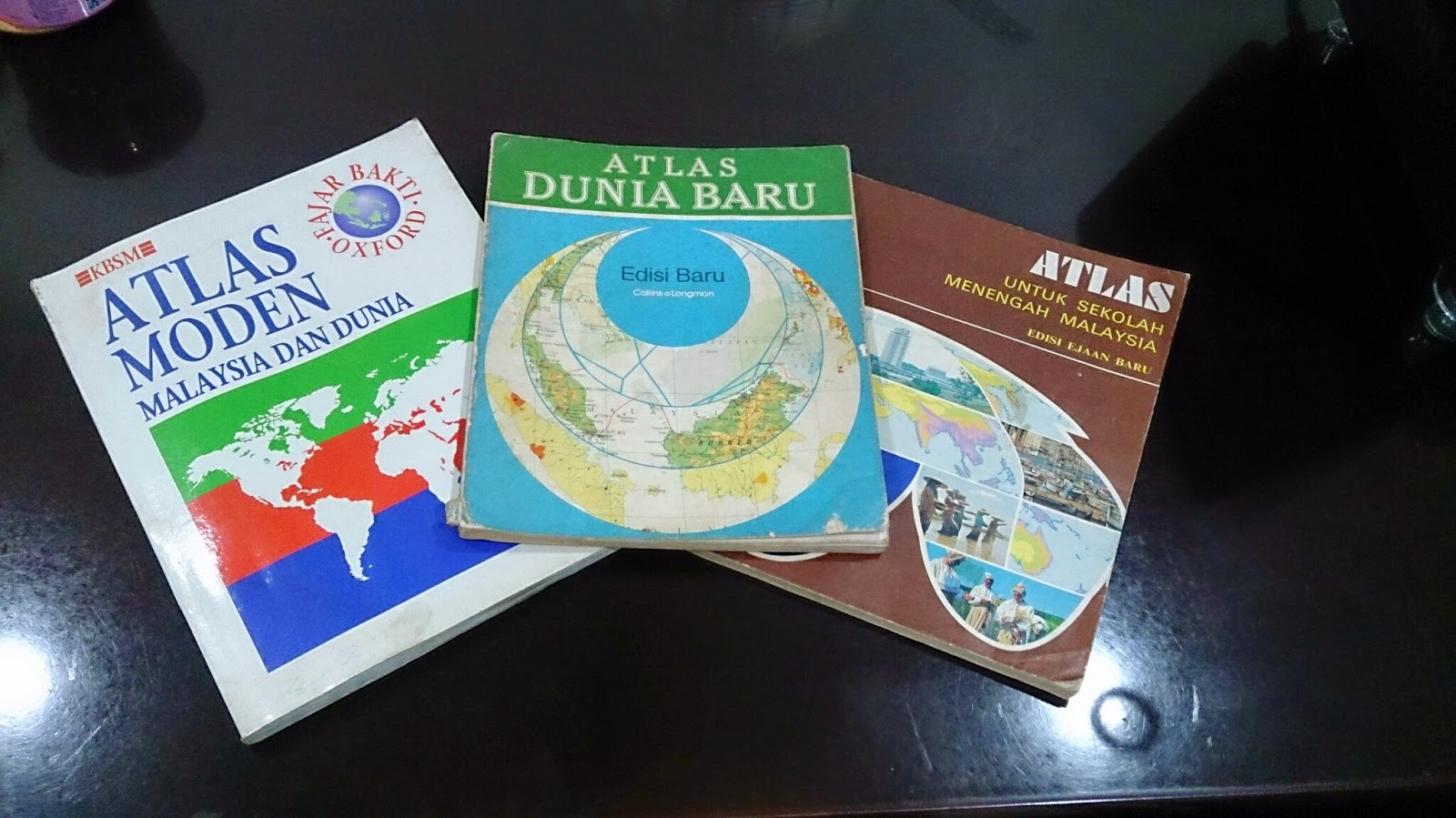
Three Atlases, Three Publishers, Three Time eras


As Malaysia recently celebrated its 57th independence day on 31st August, it is worthwhile assessing how this nation has progressed. Malaya, to be specific, got its independence from Britain in 1957 (Malaysia was formed in 1963) and hence, 57 years of independence is unique in its sense. One of the best ways to see progress and changes is to look at old and new national atlases. For this posting, I will be focusing more on Student Atlases' portrayal of Malaysia and how they have evolved over the decades. I will not comment on the production process of the atlas as the information is hard to sought by.

This study is segmented to the following parts:

Contents

Generally, I have noted the contents of the atlases from 1970s to 1990s have not changed. Most of them open up with principles of mapping (i.e. projection, scale) and proceed to Malaysian and world content. In terms of Malaysian content, it is divided into three groups: Physical Geography maps, Human Geography maps and General Reference Maps. In the General Reference Maps, Malaysian atlases do accommodate inset maps of key cities or economic activity area. These inset boxes focus on land usage and economic hotspots of the state or region. Despite constituting another half of Malaysia, Borneo Territories are not accorded with a large scale map (for general reference category). The thematic maps of atlases are generally without any years attached and if they were, they are outdated as much as 6-10 years (from the latest publication date)

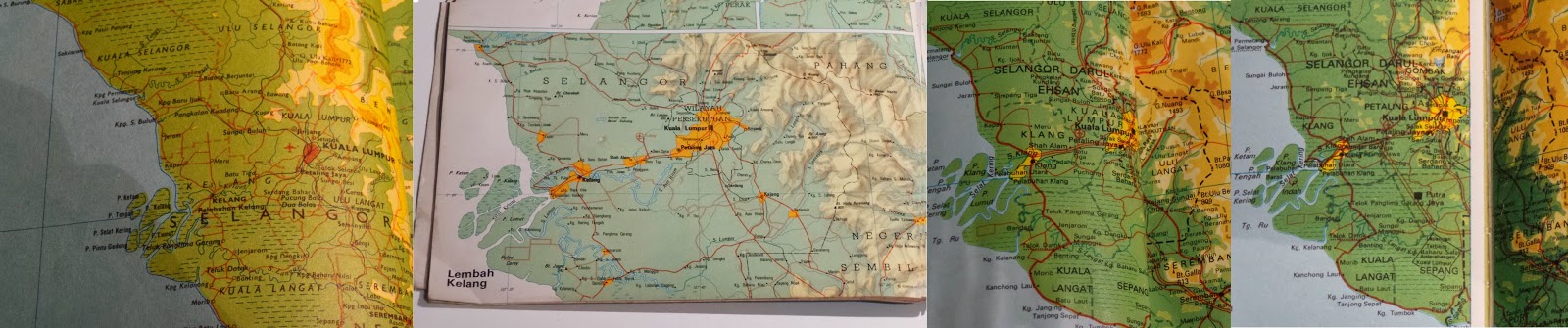
Evolution of Klang Valley (Most urbanized Area in Malaysia). From Left to Right:
1974, 1983, 1994, 1996 (2007 Edn Atlas)

New names or change of spelling for places have been reflected over the years. For example, 70s atlas used to show Muar as Bandar Maharani (primary name). From 80s onwards, Muar became primary name choice for the town on the map. District names of Sarawak (the largest state) has undergone renaming decades ago. New reservoirs appear in the 1990s maps when none existed in 70s and 80s atlases. Despite the updated height, Malaysian geography text books and atlases still carry the wrong height of Mt Kinabalu(it should be 4095 m instead of 4101 m). Emergence of highways criss-crossing the country began to appear in 1990s atlases. With the opening up of new Kuala Lumpur International Airport (KLIA) in 1998, thematic aviation maps were updated with the new location.

How did these Atlases presented the world?
Malaysian student atlases are published in accordance to the geography syllabus and textbooks. From 1970s to 1990s, the atlases had a major emphasis on Regional South East Asia (on a country-to-country basis), followed with serious coverage of Asia. For the rest of the world, these atlases gave more space for North America and Europe. As most of the atlases has their publishers one way or another related to UK, large scale maps of UK are presented in the atlases. Africa and South America, despite their sizes, are displayed in one page maps. This skews supposed Malaysian world view to Asia, Europe and North America (a bit of Australia)


Colour Scheme


My analysis and observation states that atlases produced prior to 1980s (be it Malaysian or International ones), they have strong colour contrast scheme (refer to image above). Specifically, this is very true for topographic relief. The first thing you will see on topographic maps of Malaysia and World in pre 1980s atlases is topographic relief. In this sense, this colour scheme serves the purpose. However, it makes reading of text on the map very hard. For example, Times Atlas of the World (Mid-Century Edition of 1950s) had significant contrasting colours for relief that readers struggle to deduce thousands names dotting the map. Secondly, maybe due to printer issue or other reasons, I have noticed thematic maps have colours not matching their boundary grouping. For example, if the sea is indicated white and agricultural land is yellow, it is possible to see older atlases that some white exist on the landmass. It is subtle.

From 1980s, with better technologies and other reasons, the strong contrasting colour scheme was phased out and replaced with smooth colour transitions. Colours used for topographic maps or thematic maps for atlases show gradual variation and most importantly, toned down. It still captures people attention to relief but this time, not compromising text legibility. Strong colour schemes are only used for certain cases (i.e. 3D Model - none of the Malaysian Atlases have explored this option).

Current situation of atlases


Unlike the glory days (until 80s or even 90s), number of companies producing atlases have went down in Malaysia. Prior to 90s, it was possible to see different publishers producing their own set Malaysian student atlases. Currently I believe there are two companies who produce Malaysian atlases (specifically for students or reference material)- Oxford Fajar (Oxford University Press division in Malaysia) and World Express Mapping Sdn Bhd (WEMS). Oxford Fajar updated their mid 90s Atlas Moden Malaysia dan Dunia (Modern Atlas of Malaysia and the World) until 2007. However, the update was more like changing the cover (to reflect 50 years of Oxford Fajar in Malaysia). The contents in this 2007 atlas had maps reflecting situation of late 1990s (This is a gap of a decade between the publication year and the contents)

Newer atlas from Oxford - Atlas Explorasi Geografi (Geography Exploration Atlas) released recently is more like a book with some simple maps. These newer atlas has discontinued tradition of Oxford produced maps of Malaysia and World for the past decades. The content is more geared to text and the maps were there to reinforce the geographical understanding. 

WEMS also released Atlas Geografi Dunia (World Geography Atlas) both in Mandarin and Malay. I had short glimpse on the contents of this atlas. Most of it simple topographic maps of Malaysia and World.

Conclusion


In short, Malaysia no longer has good atlases that reflect the identity of the nation. Other countries can serve a good example on continuing the strong tradition of atlases in combination with GIS and web capabilities. In Australia, hardcopy Jacaranda Atlas is updated with GIS and is accompanied with online counterpart. This atlas is standard mainstay for all geography students in Australia. Likewise, Oxford produces its Australian atlases and has similar content to Jacaranda. Malaysia no longer has any of this.

The best way forward is the existing publishing groups in Malaysia recapture the older atlas style, combined with GIS enabled updates and have online counterpart. These atlases are very dynamic, interactive and bound to make students get excited in geography.

Referred Atlases

  1. Atlas Untuk Sekolah Menengah Malaysia (Atlas for Malaysian Secondary School), 1977, Far Eastern Publishers (FEP) International Sdn. Bhd.
  2. Atlas Dunia Baru (New World Atlas), 1983, Collins So & co Ltd/ Longman Malaysia Sdn Bhd
  3. Atlas Moden Malaysia dan Dunia (Modern Atlas of Malaysia and the World), 1994, Penerbit Fajar Bakti Sdn. Bhd. (Oxford Fajar - currently it is called as)
  4. Atlas Moden Malaysia dan Dunia (Modern Atlas of Malaysia and the World), 2007, Oxford Fajar Sdn. Bhd.

Wednesday, 7 August 2013

Part 3: IMIA Conference

Two delegates holding a sample page from Earth Platinum (World largest Atlas ever)

Challenges of Print Publications

In comparison to 2010 conference, this year's conference had a focus on the situation of publication industry and role of cartographers in an increasing digital age. Today's world, the consumers of map prefer to view the maps online and the need to purchase of guide books (one of the staple industries of cartographers) have plummeted. On top of that, there is a new trend where the consumers wants to personalize their maps as their souvenirs and no longer to be dictated by publication industries or paid authors.

 In response to that, a presenter from Canada (Map Sherpa.com) presented customized solutions for publishing industry. He identified the shift of retail industries: retail industry (physically) to e-tail (electronic retail) to (M)e-tail (customized retail products for the consumer). This shift has impacted the map publication industry, retailers and map consumers. The presenter a business solution whereby it links customers, maps, publishers and retailers to produce personalized maps for consumers. Definetely, many publisher delegates took notice on this matter.
  
OnDemand is MapSherpa service for creating custom high quality maps and it links publishers (content) and retailers (selling products). I believe under this service, MapSherpa offer three type of solutions consisting of different levels of custom mapping. Users can determine the scale of the map, the size of the map and request for laminating or value-add products for the purchase. Some of the solutions require the publishers or retailers to have grasp on web knowledge. This simple business model has one plus point: MapSherpa will receive profit if the custom map product is sold through these solutions. If no selling, MapSherpa do not gain anything.

World Largest Atlas Ever

Publication Manager (at the pulpit) and the sample editing map of Asia
Examining reality, there are more users of maps than ever in history but geography illiteracy remains low. The expansion of usage of maps was largely attributed to internet and it raises the question the relevance of creating a paper atlas. The Publication Manager throw to all delegates including me: Why wouldn't you want to be part of production of the World Largest Atlas ever? This is to counter to the question: Is there any relevance for paper maps?

 Around 350 years ago, the world largest atlas was produced, it was a time capsule of the Euro-centric global view. Fast forward to 2010-2012, Earth Platinum is a time capsule of mapping technologies and how view the world as of 2012. This atlas (limited in numbers) is expected to last for next 350 years (huge responsibility for the curators). The atlas is 6 feet high and 9 feet wide. The immensity of the size (the weight is around 200 kilos) allows the user to have an amazing experience of the world we live in. Using orthographic projection (on the insistence of the Managing Cartographer), physical maps of Continents present space-like view (enhanced due to immense size). This immense size gives more space for cartographers to add words. The longest name is 84 words, NZ mountain and fortunately for cartographers, the place was close to sea. The shortest name was A in Norway, which is cartographic ideal name where text positioning is not an issue. Geographx, NZ premier hillshading mapping company provided well balanced adjusted mountain rendering for the maps.

 Producing an atlas also would involve a lot of political decision making. This includes identifying disputed borders, naming conventions and others. Due to neutrality of the atlas production, quite number of countries would not want to purchase the atlas since the borders do not fit the definitions of certain parties. This explains why the atlas was not printed in China due to scrutiny being imposed on publications there. On the question why Australia do not have one, Publication Manager said it was due to legal reasons here. Any book published in Australia needs to be submitted to 4 insitutions (National Library, Parliamentary Library, State Library and University Library) for free. This would cost him $400 000 in profit loss. On top of that, the curators of this atlas is expected to keep them for next 200-350 years (big duty). However, he is working on getting funding to bring the atlas to Australia.

 His presentation exudes his passion in hardcopy publications and he emphasized the unique experience in making and feeling this massive publications. The Earth Platinum won best award during this conference and will be submitted for global IMIA competition soon.

Friday, 18 January 2013

Analyzing A Malaysian Atlas


Atlas Moden Malaysia Dan Dunia (New Edition)


Introduction

On the process of pushing the implementation of Online Atlas of Malaysia, we need to examine some paper atlases exist in Malaysia. Unlike Australia, Malaysian geography students are not required to buy an atlas as a supplementary. From the image above, this atlas is produced by Oxford Fajar (a branch of Oxford University Press). This atlas was first created in 1992, subsequently second edition in 1996 and in 2007, a new cover was added to the atlas (to mark the 50 years of Oxford Fajar in Malaysia). Having said that, the mapping works was done by Cartographic Department of Oxford University, UK. Secondly, with the new cover of atlas, it doesn't mean any updates to atlas content. The fact is students who purchase the atlas would be seeing statistics of late 80s and early 90s.

Content Analysis

The beauty of the atlas for students and map lovers is the atlas is paper spatial portal of Malaysia. As far as I am concern, there hardly any Atlas of Malaysia for general public purpose. This atlas (image above) is no longer being produced and replaced by Atlas Geografi (Tingkatan 1 to 5)- for secondary students. The new atlas should not be even called an atlas because it has so much text as opposed to text. The main reason I could guess for the atlas replacement is to reflect the new Geography syllabus in Malaysia since 2003. The Atlas Moden Malaysia & Dunia reflects the curriculum of 90s and early 2003.

 The way atlas structure is like this:
1) Concept of maps
2) Graphics of environment
3) Maps of Malaysia and its associated thematic content
4) South East Asia studies
5) Asia studies
6) Continent-to-Continent Studies
7) Global Issues and Time Zones

Put in simple, the atlas is meant for the old Geography syllabus which was more interesting than 2003 version of Geography syllabus. However, in the context of the article, I will be focusing on Malaysiana section. As far for the content, it is much of reflection of situation in 90s Malaysia. Surprisingly, these maps were never updated since mid 90s I presume to cater rapid-changing situation on ground

The topics covered:
1) Physical Environment
2) Climate
3) Agriculture , Fishing & Vegetation
4) Geology & Mining
5) Transportation network
6) State by State economic development maps
7) Topographic maps of Malaysia

For me, there are no issues in regards with layout of the content and the geographical message crossed over. As matter of fact, we could draw lessons from the atlas in topics to be covered for national atlas. At conclusion of my final year project presentation, I have stated that a national atlas is the geographical/spatial window to a nation. The topics above fit the purpose of a national atlas. Only thing will differ a national atlas and a student atlas in content terms is a national atlas would have larger depth on geographic content of the nation.

Cartographic Design

Having said the greatness in the content, I have reservation in terms of cartographic preparation. Cartography is the science and art of making maps and it is truly the gateway of science to arts and vice versa. An Atlas prior to the era of Internet mapping could be consider as a pinnacle of cartographic products. Firstly before the Internet, an atlas is a pair of binoculars for the readers to understand the world. In 1950s, Times Reference Atlas Mid-Century Edition came in 5 to 6 volumes and specifically shown maps that are less-Euro centric. Hidden areas of former Soviet Union came to light in the post-War period (reflecting the completion of the Soviet grand mapping of Soviet Union).
In short, if an atlas wants to serve the purpose of window to the world, expectation of cartographic design is much higher.

Below here are examples of problematic Cartographic Design in this Atlas

Example 1

Economic Map of Pahang
 
 
In maps, there must be clear hierarchical ranking in the geographical data displayed. Maps in atlases are controlled painting, not simply playing with figure-ground relationship or ignoring the ranking. The above map ( press for larger) focuses on the economic situation in Pahang, the largest state in Peninsular Malaysia. Line symbols for state borders are neatly done. However, when it comes to the district borders of the state, there seems to be a confusion whether Pahang is splintered into many states. To make the situation worse, the name of districts in Pahang has the same font size to other State names.
In terms of colour, the colour distinction around the Kuantan side is not sufficiently distinctive. Light purplish-brown area shows the urban areas while dark purple lines transversing the region are the gas pipelines. For pipeline, a different symbol like a line with circles dotting along it would be a preffered option.
In this case, the map has issues with hierarchy and symbology scheme

Example 2

Agricultural and Fishing Map of Malaysia
 
The map above illustrates geographical data overload. It is fine to show in a single map to show agricultural product and fishing distribution. After all, they are all considered as a primary industry.  Firstly, there is too many town names displayed in the map especially on the coast. Secondly, the colour scheme for the rubber estates (in purple) is too strong (as in dark) which makes reading of text bit difficult. Another example would be the blue dots which shows one of the way fishermen capture fish in the deep sea. Since it is dark blue, it hides the colour of the text of city names. It makes reading not pleasant.

In this case, data overload combined with poor colour scheme demonstrate the map is poorly designed.

Conclusion

In short, the atlas serves it purpose but the map design needs a lot of work to be done. Positives of the atlas would be:
1) Content matches with geography syllabus
2) Reflects the situation in 1990s very well
3) Good accompanying topographical maps (which I did not discuss much in the atlas)

Downsides with the atlas would be:
1) Outdated maps and geographical data, being used unofficially by students till 2007+. Having a new cover in 2007 did not translate in changes in the content
2) Poor cartographic design in the thematic maps (on Malaysian section)

We came to an end of the article, we can learn that good content with good design are the foundations of good atlas making. It is rather unfortunate of atlases like above are no longer in circulation in Malaysia. One of the street directories companies in Malaysia did produce Atlas Geografi but it does not match the standard of Atlas Moden Malaysia & Dunia. My desire is that Malaysia should aspire to have good national atlases online or in hardcopy or both.


Wednesday, 16 January 2013

Opening Welcome

After some time of pondering, I have concluded I should a blog on maps related to Malaysia. It is part of grander scheme to eventually install Atlas of Malaysia by me or someone else. This blog will focus primarily on maps I have produced relating to any topics in Malaysia. I have previously contributed a lot to Open Street Map, free web mapping application especially in the Penang area.

 I have graduated in Bachelor of Geomatics- Mapping & Surveying in Australia. The blog is intend to built my profile up as a budding, passionate cartography. It is cartography, not food, that created deep sentimental attachment with Malaysia as my home.

 Please do not confuse this blog as gateway to online Atlas of Malaysia. The blog is to create an interest among Malaysians and outsiders to push for the implementation of the atlas.

 Will keep the readers posted whenever I am free.