Pages

Total Pageviews

Friday, 22 January 2016

Throwing a fishnet for an Atlas


Fishnet for an Atlas? You wonder about the title of the post - Does it make sense? By the end of the article, you will clearly understand why.

* Due to privacy issues, the name of the council and final output of this project are not shown

Problem

Recently, I was asked to print a massive (I mean massive) CAD file of all the roads and minor lanes for a council. I was given a PDF of the CAD file which had given me a context of the size of the map. This map (CAD file) is for field inspection of roads and it is full of annotation. If I were to print out from the PDF on A3 or even A0, a lot of the details (i.e. indicators) on the CAD files would remain obscure. We are talking about the high level of detail and we do realize the downside of CAD file - Text labels cannot be re-sized dynamically for different scales.

First Attempted Solution

With this problem in mind, (from my past experience), data driven pages and mapbook approach of ArcGIS is the way to go to solve the problem. We need to segment this problem of printing of CAD file into couple of parts:
  1. Can the Drawing file (.dwg) imported straight into ArcGIS or QGIS? 
  2. What is the scale of the map that it should be designed so that users can read the maps?(legibility)
  3. Does the CAD file has/ require a projection?
  4. How can I divide the council into a proper grid for data driven pages
As my computer does not have AUTOCAD, we need to address the first issue. Which software I should choose to view the CAD (.dwg) File. For ease of conversion, I opted for ArcGIS 10.3. Refer to this link for the process of conversion

Once the file was brought across, I exported selected number of useful element of CAD file into shapefiles. On the layout option of ArcGIS, I temporarily created a layout of the map and other map elements.  Meantime, I found out that dwg. file had no projection. The council could not find the projection of the file. Hence, I temporarily projected into a projection that was suitable for the region.

However, looking back on the completed the projection, this print work may not require a projection in the first place. 

As the work to design the map for print was unfolding, I felt the projection was required. This is because I will be using other projected datasets to be basis of the grid for Data Driven Pages. Hence, all the datasets including .dwg file.

I experimented with two scale levels for legibility test. One was 1:2000 and  another was 1:5000
It was clear 1:5000 does not show the information the user needs on the field. Let's look at 1:2000 example

After my supervisor agreed that 1:2000 scale was the way forward, now we reach the final question - How to divide the CAD file into multiple sheets?

My old (initial approach) was to find other freely available datasets which are suitable for large scale maps. After hours of experimenting with them and data driven pages, I wasn't satisfied. The scale of the map was either too large or too small.

Meantime, I made some moves to beautify the maps for the ease of reading. However, the question remains unanswered - how to divide the dwg. file into evenly spaced (with a good scale of 1:2000) for the entire region ?

Creating Fishnet

I googled my answer and stumbled on GIS Stack Exchange, the answer I was seeking for. The commentator suggested that we should use Create Fishnet in ArcGIS. Please watch the video below to understand Fishnet.


Bingo! The answer I was looking for is ready for implementation. I did some initial experiments for some regions and found this is workable. Eventually, I implemented the Fishnet for the entire region (after couple of rounds of experimenting) and the grid I desired has emerged.

I placed the Grid into Data Driven Pages and it generated 135 maps at the scale of 1:2500 (which is good enough). I exported them into PDF and filtered many which are not useful sections for print.

Conclusion

Looking back, Create Fishnet approach eliminated the need for me to find other dataset to create customized grid. In my opinion, this approach works well when you don't have the desired dataset for the grid formation.

Hope all of you learned one new thing in ArcGIS!

Thursday, 14 January 2016

Empowering Sales through GIS

Source: http://vectorart.org/uploads/Business-Presentation--business--businessman--businesswoman--5501.jpg


Happy New Year fellow Readers & Followers! And Happy 2nd Year for this Blog! Now the holiday season is over, I am back at blogging. Today's article is a unique story. A story where a non-GIS specialist developed a GIS application which helped the company (in one way or another) to secure a deal with a big client.

*For privacy reasons, the names of the company, the client and key person in the story will not be revealed. Moreover, the sample video for the pitch is confidential.

Context

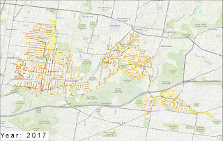
Around November 2015, I was approached by my Business Development Manager (BDM) to produce a map visualization to show the capability of the company's software. This software is a financial predictive software and churns out powerful figures in Excel or graphical format. However, two years ago, we made a decision to use these powerful figures and visualize asset conditions for next 10 or 20 years. A map is the best way to convert data into great insights! Since everyone in my company knows that I am into the GIS world, I have been producing these visualizations using ArcGIS Online. These visualizations showed the impact of two different budgets (based on predictive software) on the assets (e.g. shown in the image below). All of them are popular among the Sales team for their pitches.

This time, my BDM had a different idea. He may have been inspired by my time-based animation of Malaysian railway history. Instead of standard swipe comparative maps (refer to this example), how about visualization changes of asset condition every year for next 10 or 20 years?

The Start

Initially, I took up this project as I am always enthusiastic of pushing my GIS capabilities. I was supplied with GIS data and predictive figures from the software. My first approach on this matter is to use ArcGIS Desktop to the join and perform time-based visualization. I ruled out QGIS as the tool for this visualization due to clunky nature of the time tool.

Some issues propped up using ArcGIS:

  1. The number of assets (lineworks) were very high (went to thousands). This impacted the performance of ArcGIS time animation both on Desktop and Online counterparts
  2. There was a projection issue as the data supplied had projection file shared for multiple shapefiles. 
  3. The final product of this work is to create a video of time animation of asset condition changes (imagine colour changes for lines that are deteriorating). With so many assets, ArcGIS Online had incredible difficulty to visualize the changes. Similarly, ArcGIS Desktop had lags that are visible to our eyes. Definitely, this video of this animation doesn't sit well for a sales pitch 

The Turn Around

Using the ArcGIS approach was clearly not working for thousands of assets. What options do we have? My BDM is of civil engineering background and  have been exposed to the world of GIS. While I was working through the problems I have faced with ArcGIS, my BDM started to experiment QGIS for time based visualization. I explained to him all the problems I am facing with ArcGIS approach.

He wrote an email to me: "When you had time, come over that I show you a new way I've found to create it much easier. I'm sure you will like it :)" He had successfully overcome my issue with QGIS time tool by showing a smooth time based animation of asset condition changes. Somehow, my BDM managed to get the right time format needed in QGIS visualization.

Similar to ArcGIS, QGIS animation was also slow and unusable. However, QGIS can create an image file from each frame .Then he took the image frames (as png files) into PowerPoint using its Insert Album feature and exported the presentation as a movie file after setting the timing and transitions and also adding required labels.

What a brilliant work around for QGIS!

Did QGIS trumped ArcGIS? I will not argue on that

I know for sure that my BDM was empowered with GIS to enhance his sales pitch. While I was on holiday, he manage to secure the client. We can speculate that video of QGIS visualization captivated the prospect.

In short, if you are in business, maybe consider using GIS to enhance your sales work. Maybe consider using GIS to make your next business decision!