Pages

Total Pageviews

Thursday, 14 January 2016

Empowering Sales through GIS

Source: http://vectorart.org/uploads/Business-Presentation--business--businessman--businesswoman--5501.jpg


Happy New Year fellow Readers & Followers! And Happy 2nd Year for this Blog! Now the holiday season is over, I am back at blogging. Today's article is a unique story. A story where a non-GIS specialist developed a GIS application which helped the company (in one way or another) to secure a deal with a big client.

*For privacy reasons, the names of the company, the client and key person in the story will not be revealed. Moreover, the sample video for the pitch is confidential.

Context

Around November 2015, I was approached by my Business Development Manager (BDM) to produce a map visualization to show the capability of the company's software. This software is a financial predictive software and churns out powerful figures in Excel or graphical format. However, two years ago, we made a decision to use these powerful figures and visualize asset conditions for next 10 or 20 years. A map is the best way to convert data into great insights! Since everyone in my company knows that I am into the GIS world, I have been producing these visualizations using ArcGIS Online. These visualizations showed the impact of two different budgets (based on predictive software) on the assets (e.g. shown in the image below). All of them are popular among the Sales team for their pitches.

This time, my BDM had a different idea. He may have been inspired by my time-based animation of Malaysian railway history. Instead of standard swipe comparative maps (refer to this example), how about visualization changes of asset condition every year for next 10 or 20 years?
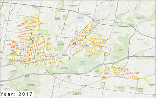
The Start

Initially, I took up this project as I am always enthusiastic of pushing my GIS capabilities. I was supplied with GIS data and predictive figures from the software. My first approach on this matter is to use ArcGIS Desktop to the join and perform time-based visualization. I ruled out QGIS as the tool for this visualization due to clunky nature of the time tool.

Some issues propped up using ArcGIS:

  1. The number of assets (lineworks) were very high (went to thousands). This impacted the performance of ArcGIS time animation both on Desktop and Online counterparts
  2. There was a projection issue as the data supplied had projection file shared for multiple shapefiles. 
  3. The final product of this work is to create a video of time animation of asset condition changes (imagine colour changes for lines that are deteriorating). With so many assets, ArcGIS Online had incredible difficulty to visualize the changes. Similarly, ArcGIS Desktop had lags that are visible to our eyes. Definitely, this video of this animation doesn't sit well for a sales pitch 

The Turn Around

Using the ArcGIS approach was clearly not working for thousands of assets. What options do we have? My BDM is of civil engineering background and  have been exposed to the world of GIS. While I was working through the problems I have faced with ArcGIS, my BDM started to experiment QGIS for time based visualization. I explained to him all the problems I am facing with ArcGIS approach.

He wrote an email to me: "When you had time, come over that I show you a new way I've found to create it much easier. I'm sure you will like it :)" He had successfully overcome my issue with QGIS time tool by showing a smooth time based animation of asset condition changes. Somehow, my BDM managed to get the right time format needed in QGIS visualization.

Similar to ArcGIS, QGIS animation was also slow and unusable. However, QGIS can create an image file from each frame .Then he took the image frames (as png files) into PowerPoint using its Insert Album feature and exported the presentation as a movie file after setting the timing and transitions and also adding required labels.

What a brilliant work around for QGIS!

Did QGIS trumped ArcGIS? I will not argue on that

I know for sure that my BDM was empowered with GIS to enhance his sales pitch. While I was on holiday, he manage to secure the client. We can speculate that video of QGIS visualization captivated the prospect.

In short, if you are in business, maybe consider using GIS to enhance your sales work. Maybe consider using GIS to make your next business decision!


Thursday, 12 November 2015

Where can I get free Datasets of Malaysia?


Recently, my post on Vegetation Maps and Stimulated Minds sparked some discussions on missing information and gaps on the maps (why the sea is red or the lakes are missing). It hit me to the core that when I produce the map, I need to ensure the maximum amount of perceived accuracy and proper cartographic representation for the maps I produce.

Hence, I commenced a continuous project to create a geodatabase of freely available of GIS data of Malaysia (since Malaysia do not practice open data - hence the search gets difficult). Coincidentally, the big GIS FB group Admin talked about collecting datasets to make it available to anyone in the group (last count : more than 5000 members)

As I am regular producer of Malaysian maps for many people, I have assembled (work in progress) a list of sources. For those who are interested with complete metadata description (terms of usage etc.), please contact me directly on the blog.

Administrative Boundaries/Electoral Boundaries

  1. http://www.diva-gis.org/  (Coarse resolution ,outdated boundaries of state, district level boundaries - Perak Boundary is inaccurate, Labuan has been omitted) - home to other coarse resolution data like roads, population density
  2. https://revolutionarygis.wordpress.com/2014/03/17/malaysia-states/ (Fairly accurate state boundaries of Malaysia - no statement on terms of usage)
  3. For Electoral boundaries, there is no freely available spatial data (please lodge the request privately to me and I will seek approval from the source)

Topography/Bathymetry/ Physical Features

  1. https://www.bodc.ac.uk/data/online_delivery/gebco/gebco_30_second_grid/ (For bathymetry for general purpose - please do not distribute the data from one person to another, download straight from the website)
  2. http://gdem.ersdac.jspacesystems.or.jp/ (Topography for non-commercial purposes)
  3. http://earthexplorer.usgs.gov/ (Topography data (coarser resolution))
  4. http://topotools.cr.usgs.gov/gmted_viewer/viewer.htm (Coarser resolution for Topographic data)
  5. http://geonames.nga.mil/gns/html/namefiles.html (For hydrographic, hypsographic features in excel format with coordinates). Those who want to access a cleaner version, please contact me privately

Water Body/Rivers

  1. http://extract.bbbike.org/ (Downloading freely available Open Street Map Data of all vector features including rivers and water bodies - not complete)
  2. http://openstreetmapdata.com/data/water-polygons (Water Polygons for coastlines, sea and oceans)
  3. http://gcmd.nasa.gov/records/GCMD_GLWD.html (Lake and Wetlands)
  4. http://www.worldwildlife.org/pages/global-lakes-and-wetlands-database (For non-commercial purposes, water bodies)

Vegetation/National Parks

  1. http://earthenginepartners.appspot.com/science-2013-global-forest/download_v1.2.html (Forest cover, changes)
  2. http://www.protectedplanet.net/country/MY  (National Parks for non-commercial purposes)
  3. http://geonames.nga.mil/gns/html/namefiles.html (Gazetteer for estate, forest reserves and other vegetation features)

Mineral Resources

Human Built Features

  1. http://extract.bbbike.org/ (For roads, railway, points of interests and other human built features
  2. For North-South Highway assets (i.e. SOS telephones, points of interest), please contact me directly for data distribution.
  3. http://geonames.nga.mil/gns/html/namefiles.html (Gazetteer for selected human built features - population areas, transportation features)
If you know any additional sources, please contact me and will update the source. For those who want the data with proper documentation and metadata, contact me via the blog. We can talk more on data distribution

Wednesday, 23 September 2015

Vegetation Maps and Stimulated Minds


Recently, I have been inspired by the Human Footprint maps of National Geographic Maps. Human Footprint map of Africa was built on four layers representative human impact on the environment -Africa Human Footprint Map. I wanted to make a map similar to this for Malaysia. Unlike National Geographic Maps continental coverage map of Africa, my area coverage was 300 000 sq km or so (100 times smaller than Africa). Hence, the difficulties in finding data needed for human footprint map of Malaysia increased.

Since Malaysia do not practice open data policy, searching GIS data needed for any map is like going for treasure hunt. Fortunately, I had access to older version Open Street Map road network dataset and DIVA GIS datasets (for the rivers, lakes etc.). The key part of the map is to show the disturbance of tree cover (this may include oil palm, rubber and general forested areas) in Malaysia. I was fortunate to stumble on Global Forest Change where I got the crucial data. Once the dataset were obtained, the remaining part of the map project is purely cartographic work. Using +QGIS , I used layer blending to highlight the density of the road of various areas. I used Print Composer to create multiple maps in one map. The above map is one example of this project.

Once I begin to advertise on social media circles, I see people's mind stimulated:
  1. Why does some areas of Peninsular Malaysia is experiencing higher loss of vegetation? Is it because of the increased oil palm plantation area?
  2. Why does some map has incomplete dataset of the lakes? If you refer to the first map of the post, some of the red areas are water areas? 
  3. Why does the Sea are is coloured green or red? It can confuse people - this has been corrected
  4. People spoke highly about the quality of the map that was produced in +QGIS 
  5. For the maps of Borneo, some raised the Indonesian state borders are not accurate. I countered that  the map focuses on changes to vegetation, not so much of anything else. However, I am willing to hear any free sources of updated boundaries.
  6. A person requested similar maps for Borneo (below are the three maps I supplied him) after seeing it on the social media
  7. These maps are the few maps I made had great social media reach in terms of sharing and liking (be it promoting QGIS or the topic it covered).


Tree Cover of Borneo


Important tips in +QGIS when I was producing the map:

  1. Print Composer (For better looking North arrow, please refer to step 28)
  2. Vector Symbology (For options to feature blending - i.e. road density, refer to Layer rendering)

Ask a map or general mapping enquiry at blog contact form

Friday, 28 August 2015

Interactive Time-Based Animation Map

This Article is work in progress
by Pemanducomm


As the Post heading suggest, I am pleased to inform you that I just launched the Railway History Map of Malaysia. It was built on solid research and powered by ArcGIS Online - Malaysian Railway History

Concept

Two years ago, I designed multiple map platform to understand the nature of the Railway. It contained operational year of the railway, number of tracks and status of operation of the tracks. Refer to Malaysian Railway Portal. However, it lacked one thing - Time capability. I revisited this project and focused to create a map of railway network evolution of Malaysia.

I believe so far no one has built such a map. Why I don't start one? Make a foray into the world of time based animation.

Data

The number one challenge of the project is the data for the operational years for the railway. As railways come and go, I need to know when they first being in operation and when they became disused. I downloaded DIVA GIS for the base railway network layer. I made a policy if there is no operational dates or years for the railway, it will not be shown on the map. DIVA GIS showed a lot of unknown railways which I have no evidence to back them.

On the Attribute part, I scouted heaps of blogs, railway fan sites, Wikipedia and every possible source available online.

Accuracy

I have made every attempt to ensure the highest accuracy of the dataset. Below here is the accuracy level of dataset
  1. Railway Network of Malaya: The opening date and closure date of the network is mixture based on the year and date level accuracy. Upgrading of the railway line to double track from Padang Besar to Gemas has resulted some of the previous tracks becoming disused. No definite year or date is found when the track got disused. Disuse status of Pasir Mas to Rantau Panjang is yet to be found. Subang Jaya to Subang Airport 1980 rail link has no disuse date.
  2. Railway Network of Sarawak: The only evident railway with opening and closing year is around Kuching.The route is drawn based on 1940s army map of Borneo. Railway from Brunei to Miri is not shown due to lack of information
  3. Railway Network of Labuan: The railway track is based on 1800s map of North Borneo. It is meant for general viewing, not determining the absolute alignment of the track
  4. Railway Network of Sabah: The only railway network in Sabah is shown in the map is the passenger based route. Since there insufficient evidence for commercial plantation railways, they are omitted in the map
  5. Railway Network of Sarawak: Significant amount of assumption is required to determine the disuse dates of networks of Bukit Timah to Tanjong Pagar (via Singapore City Centre) and Tanjong Pagar to Pasir Panjang. Various websites and blogs have placed contradictory information on the alignment histories of the networks above. 
Train Station opening date accuracy varies. Most of them have accuracy to year level with few stations with complete date level accuracy.

Sources

Malaya
1.  http://searail.malayanrailways.com/KTM.htm
2.  http://history.malayarailway.com/
3. Wikipedia
4. KTMB Railway Museum in KL Old Station (For verification of Pelabuhan Klang to Pulau Indah Railway
5. MySin Chew (For opening year of Port Weld Station) 

Singapore

1. http://searail.malayanrailways.com/KTM.htm
2. https://www.ura.gov.sg/ms/railcorridor/about/history/1932#subContainer
3. National Library of Australia Online Map Catalogue
4. http://joyloh.com/blog/?p=4715

Sabah, Sarawak and Labuan

1. http://www.lib.utexas.edu/maps/ams/borneo/ (Refer to Kuching for railway alignment)
2. http://catalogue.nla.gov.au/Record/6346822?lookfor=sabah%20{access_type:%22NLA%20digitised%20material%22}%20%23[format:Map]&offset=2&max=6 (For Labuan and Sabah Railway Alignment)
3. http://www.railwaystationlists.co.uk/pdfasia/sabahsarawakandbruneirlys.pdf (Credit to Peter A. Weenink for showing timeline of Labuan railway service)
4. Wikipedia
5. http://searail.malayanrailways.com/Sarawak/Sarawak.htm (For Kuching - Batu 10 Railway Line history
I, Danesh Prakash Chacko, hereby acknowledge completely all the source listed and unlisted below in the publication. Hence, I do not exercise the ownership of the attribute data (the operational years of the railway network and train stations). Should errors and omissions are found, please submit on the blog comments as below.

Monday, 20 July 2015

My Foray into CartoDB

 One of the significant milestones of self learning this year was developing web maps using CartoDB.

My profile for CartoDB (https://daneshchacko.cartodb.com/maps)


I first learned about CartoDB through the Spatial Vision training (during the IMIA AP 2014 Conference). In this blog post, I will explore the ups and downs of using CartoDB for web map visualization

Why CartoDB? Up to 2015, the only online GIS platform I am accustomed with is ArcGIS Online. However, I would like to brush up my skills on new areas such as CartoDB. If you look at my profile above, I have developed around 6 maps for various topics .

If you want to design simple maps without much tweaking, CartoDB is easy tool to deploy web maps. They continuously improve the options for you to have for symbology or labelling. One thing that sets apart CartoDB and ArcGIS Online (from my personal experience) is the customization of the tools available in CartoDB.

If you have good programming and web design knowledge, you can exponentially enhance the experience of CartoDB maps. Let me give you a good example. Refer to this link: Sarawak Electoral Visualization

Example 1: Electoral Visualization

I was exploring myself on how to visualize electoral issues of the delimitation exercise in Malaysia. What started out as my personal hobby project, it evolved into a fully embedded map for my NGO's Homepage (http://www.tindakmalaysia.org/)

Referring to the link (Sarawak Electoral Visualization), basic tools of CartoDB weren't of much help. As I proposed CartoDB map to my NGO, they were happy to take onboard on the idea. However, my NGO has placed some expectations on the contents to be shown. After sourcing the datasets from my NGO, I was tasked to show the interrelationship between electoral seat category, representation value and its correspondence to local boundaries.

While it sounds simple, the basic tools of CartoDB could not meet the criteria of the symbology needed (i.e. the representation value or showing the symbol of administrative boundaries). I spent a significant amount of time to research html codes and examples of CartoDB to bring the source codes needed for the  visualization.

Subsequently, with close collaboration with my NGO, I spent additional time in writing out the correct terms for the legend and other necessities for the map to be understandable. Finally, I embedded the map of my NGO's website and customize the right size for the embedding. The default embedding option of CartoDB would result of compression of items in the layout.

Example 2: Time Based Visualization

Similar to ArcGIS Online, CartoDB has ventured into time based visualization (now with new enhancement). For only point based data, Torque (and Torque with category) allows the CartoDB users to visualize time based changes (which is becoming a big trend in maps). I previously designed on ArcGIS Online (and Mango Map) a static map of all the dam locations in Malaysia. It was built on intense research every possible freely available information back in 2013.

Referring to the link (Malaysian Dams), one of the big challenges I faced initially was the original dataset did not have proper timestamp needed for CartoDB. Preferably, in your shapefile or data file, the timestamp should have proper date or date-time format. I have created this dams dataset two years ago for static map and pop-up purposes.

The second challenge was the cleaning-up of classification. It was found through CartoDB upload there were duplicate classification values (i.e. Dams/Irrigation, Dams / Irrigation). I spent some amount of time in removing the duplicates in QGIS.

Since CartoDB torque visualization works for point based data (for the moment), I chose Torque with category to visualize the construction (opening date) history of 70+ Malaysian Dams and categorized them with the purposes. This allows the user to see where the dams are being constructed and see what types of dams are being related. I customized Torque category to show cumulative changes (as dams are rarely taken down). Choosing a suitable base map was another of challenge of its own as you want your content to be the Figure.

I did spend additional time to produce a understandable symbology for the dam purposes. I will be making further changes to make it more distinguishable. The rest was history. CartoDB Torque tool worked very well and now charting history of dams.

Conclusion

CartoDB has been a great tool with steep learning curve. My advice is before you embark on CartoDB maps, do consider your level of html experience and willingness to spend time, energy and (if necessary) money to develop the map. CartoDB email support is Great! They are swiftly respond to support enquiries.

Tell me your CartoDB experience...

Tuesday, 9 June 2015

Map Projection Headache

Recently, I was thrown into map projection issue and this pushed me to my technical limit. For this article, I will not reveal the full context of the area it happened due to privacy reasons. I was tasked to identify the locations of new road intersections, geometries and other road aspects for new housing subdivision. This task is important as the organization needs to submit these new roads information to state government in a particular format (not in GIS format).

The reason this task became a map projection issue is because the drawing file that was supplied to me had a projection that was unknown to me. The organization contracted an external party who surveyed the locations of the new roads. The projection they used was customized UTM for the subdivision area. Originally, when the drawing file was supplied, the projection parameter was not visible in QGIS. For this work, I had ArcGIS and QGIS only and no FME or any other projection converter to help.

I approached the organization to supply the coordinate system that is attached to the drawing file. I stumbled upon a projection (let’s call it Projection A) that I have not encountered before. Fortunately, the organization supplied the parameters that is needed for ArcGIS/QGIS to visualize the line works.

Having said, I need to match the location of these new roads with the organization’s existing road network. Having no experience about Projection A, I made an attempt to do direct projection conversion from Projection A to one of the MGA zones (where the subdivision is located). The outcome was not desirable as the subdivision was positioned in the sea! After making some futile attempts to convert, I gave up on my own approach.

The following day, I contacted the state roads department on the projection A parameters and conversion process. The person who manages the section was kind enough to spend her time to walking the process. I had to de-project Projection A to GDA and reproject it back to MGA projection. Since I was use ArcGIS for this process, I contacted one of my ESRI contacts on how to implement this process in ArcMap. He worked out the implementation process (he was kind of puzzled by the name of the projection A).

I had a serious relook into projection parameters I initially set in Projection A and corrected any inaccuracies. Following the procedures outlined by state roads department and ESRI, I successfully brought the new roads into alignment with existing road network. It was Momentous occasion as it solved my riddle for past two days.

Below here is attached image of the new roads that pushed my mental skills.
New roads of a new subdivision which aligned well with existing road network
Due to privacy reasons, the location of the roads, the name of the projection, organization and state road department are kept hidden.

Wednesday, 27 May 2015

QGIS Sample Atlas

Recently, I have been pushing myself to test my capability in generating high quality cartographic works in QGIS. Since I took on a mini project on Malaysian state of Kedah, this atlas was truly a combination of open source data and open source software.

For data in Malaysia, I manage to obtain through third party sources for district, subdistrict and voting locality boundaries. In Malaysia, these sorts of data are super hard to find (generally all forms of datasets for large scale maps of Malaysia are not for free). The roads, railways, rivers and land use data was sourced from Open Street Map (I recommend http://extract.bbbike.org/). Avoid choosing QGIS tool for Open Street Map as you get good coverage of the dataset with minimal attributes (making them redundant). The terrain is not exactly open source as it came from ASTER GDEM and hence, it restricts anyone to produce commercial maps.

The software I used was QGIS. In order to produce 200+ page atlas (based on sub district levels), I used Print Composer. It is the equivalent of Data Driven Pages in ArcGIS. I have made full use multi map concept where I can pinpoint the reader where they are (the inset maps). The legend size remains difficult thing to adjust (now I realized there is legend customization through filter) as it dominates a significant chunk of the map. The scale is tricky part and I resorted to numeric figure as QGIS hasn't improved on the variable scale legend. Now, I also realized there are better options to choose from for the North Arrows.

How about the map itself? I used pretty much standard colour schemes for every dataset for the atlas. Hillshading worked out very well  for the Bandar Padang Mat Sirat and Bandar Yan (impressed with QGIS capability). Choosing the colour of roads required much judgment as the terrain colouring exerted its influence significantly. The text visibility has been controlled after much playing around and deliberation. The original dataset of roads showed many road segmentation, Using the blending option, I was able to show a full continuity for the highways.A lot of judgement was used to determine how many layers are relevant to the atlas and which ones need to be kicked out.

Below here are some examples of urban, semi-urban and rural settings of Kedah (viewed through maps). When the final product came out, I was impressed with QGIS capability. For more maps, please contact me here.