 |
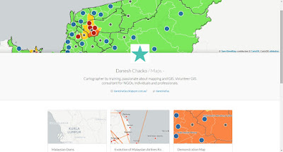
| My profile for CartoDB (https://daneshchacko.cartodb.com/maps) |
I first learned about CartoDB through the Spatial Vision training (during the IMIA AP 2014 Conference). In this blog post, I will explore the ups and downs of using CartoDB for web map visualization
Why CartoDB? Up to 2015, the only online GIS platform I am accustomed with is ArcGIS Online. However, I would like to brush up my skills on new areas such as CartoDB. If you look at my profile above, I have developed around 6 maps for various topics .
If you want to design simple maps without much tweaking, CartoDB is easy tool to deploy web maps. They continuously improve the options for you to have for symbology or labelling. One thing that sets apart CartoDB and ArcGIS Online (from my personal experience) is the customization of the tools available in CartoDB.
If you have good programming and web design knowledge, you can exponentially enhance the experience of CartoDB maps. Let me give you a good example. Refer to this link: Sarawak Electoral Visualization
Example 1: Electoral Visualization
I was exploring myself on how to visualize electoral issues of the delimitation exercise in Malaysia. What started out as my personal hobby project, it evolved into a fully embedded map for my NGO's Homepage (http://www.tindakmalaysia.org/)Referring to the link (Sarawak Electoral Visualization), basic tools of CartoDB weren't of much help. As I proposed CartoDB map to my NGO, they were happy to take onboard on the idea. However, my NGO has placed some expectations on the contents to be shown. After sourcing the datasets from my NGO, I was tasked to show the interrelationship between electoral seat category, representation value and its correspondence to local boundaries.
While it sounds simple, the basic tools of CartoDB could not meet the criteria of the symbology needed (i.e. the representation value or showing the symbol of administrative boundaries). I spent a significant amount of time to research html codes and examples of CartoDB to bring the source codes needed for the visualization.
Subsequently, with close collaboration with my NGO, I spent additional time in writing out the correct terms for the legend and other necessities for the map to be understandable. Finally, I embedded the map of my NGO's website and customize the right size for the embedding. The default embedding option of CartoDB would result of compression of items in the layout.
Example 2: Time Based Visualization
Similar to ArcGIS Online, CartoDB has ventured into time based visualization (now with new enhancement). For only point based data, Torque (and Torque with category) allows the CartoDB users to visualize time based changes (which is becoming a big trend in maps). I previously designed on ArcGIS Online (and Mango Map) a static map of all the dam locations in Malaysia. It was built on intense research every possible freely available information back in 2013.
Referring to the link (Malaysian Dams), one of the big challenges I faced initially was the original dataset did not have proper timestamp needed for CartoDB. Preferably, in your shapefile or data file, the timestamp should have proper date or date-time format. I have created this dams dataset two years ago for static map and pop-up purposes.
The second challenge was the cleaning-up of classification. It was found through CartoDB upload there were duplicate classification values (i.e. Dams/Irrigation, Dams / Irrigation). I spent some amount of time in removing the duplicates in QGIS.
Since CartoDB torque visualization works for point based data (for the moment), I chose Torque with category to visualize the construction (opening date) history of 70+ Malaysian Dams and categorized them with the purposes. This allows the user to see where the dams are being constructed and see what types of dams are being related. I customized Torque category to show cumulative changes (as dams are rarely taken down). Choosing a suitable base map was another of challenge of its own as you want your content to be the Figure.
I did spend additional time to produce a understandable symbology for the dam purposes. I will be making further changes to make it more distinguishable. The rest was history. CartoDB Torque tool worked very well and now charting history of dams.
Conclusion
CartoDB has been a great tool with steep learning curve. My advice is before you embark on CartoDB maps, do consider your level of html experience and willingness to spend time, energy and (if necessary) money to develop the map. CartoDB email support is Great! They are swiftly respond to support enquiries.
Tell me your CartoDB experience...
No comments:
Post a Comment